Webits HomePage

You can visit the working site here (be mindful it's still in development!): webits.mx/en
Also feel free to ask anything in my mail [email protected]
This is the design and development process used for the creation of my own agency's website. As the only developer/designer I had complete control over the project scope.
I'm mainly a developer so this was more of a doubled edge sword, however I had a few ideas:
- Simplicity: the website should consist on only one page.
- Responsiveness: it should be an awesome experience from any device.
- Should showcase my develop skills: It should be quite clear that i can make good animations and layouts.
- Should be in English and Spanish: I'm located in México however id like to have a more international market so the site has to be in English.
Inspiration
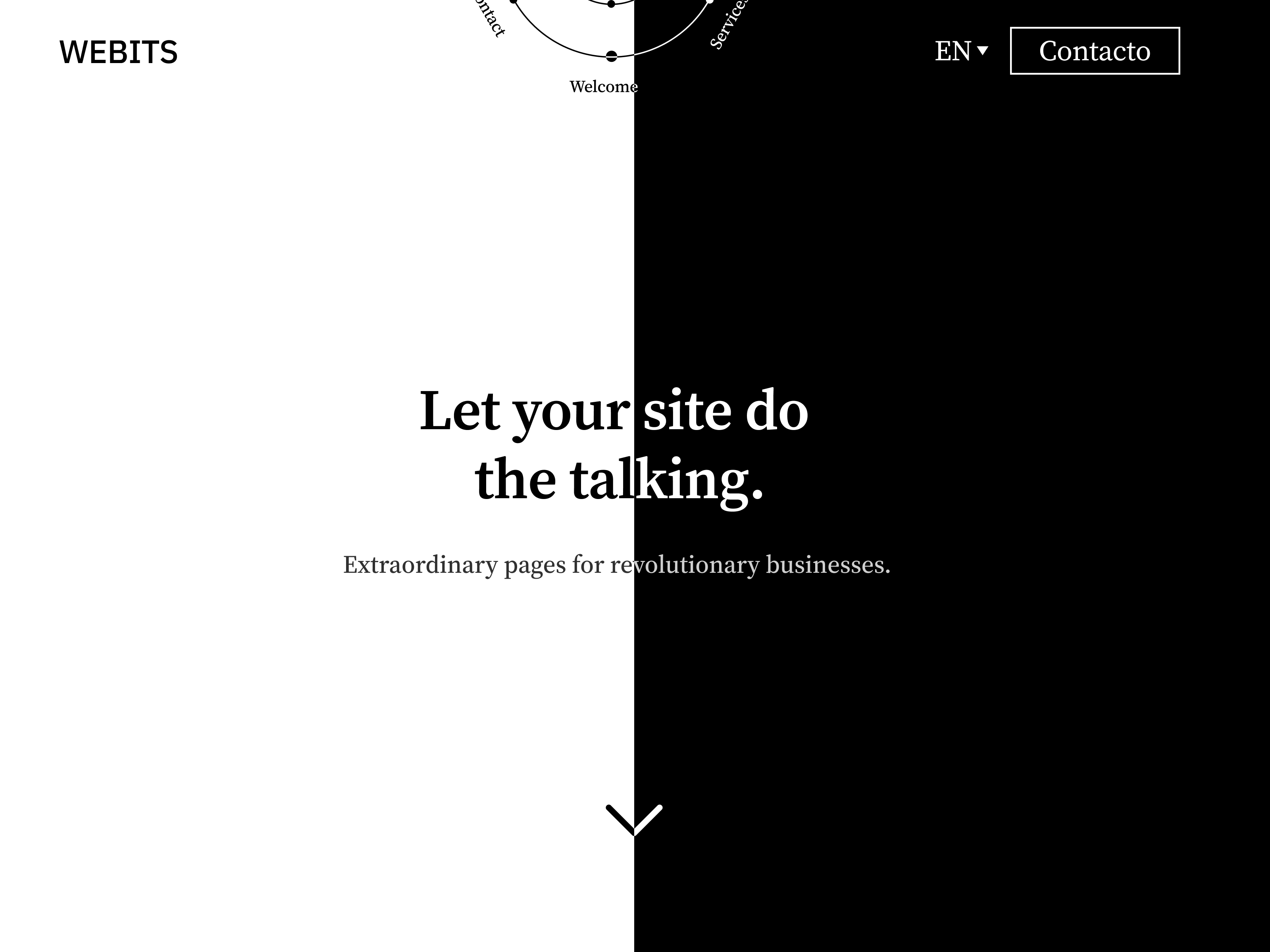
I wanted my site to had both a sense of sophistication and minimalism, that's why I opted for a serif font.

The font in particular was source serif pro, it matched the look i wanted, was in google fonts and is compatible with variable weights. (both huge extras for development)
After that I opted for a classy B&W palette that would match the vibe and be really versatile for colors plus its perfect for accessibility and contrast.
For some of the sections I got inspired by some old magazines my dad had laying around
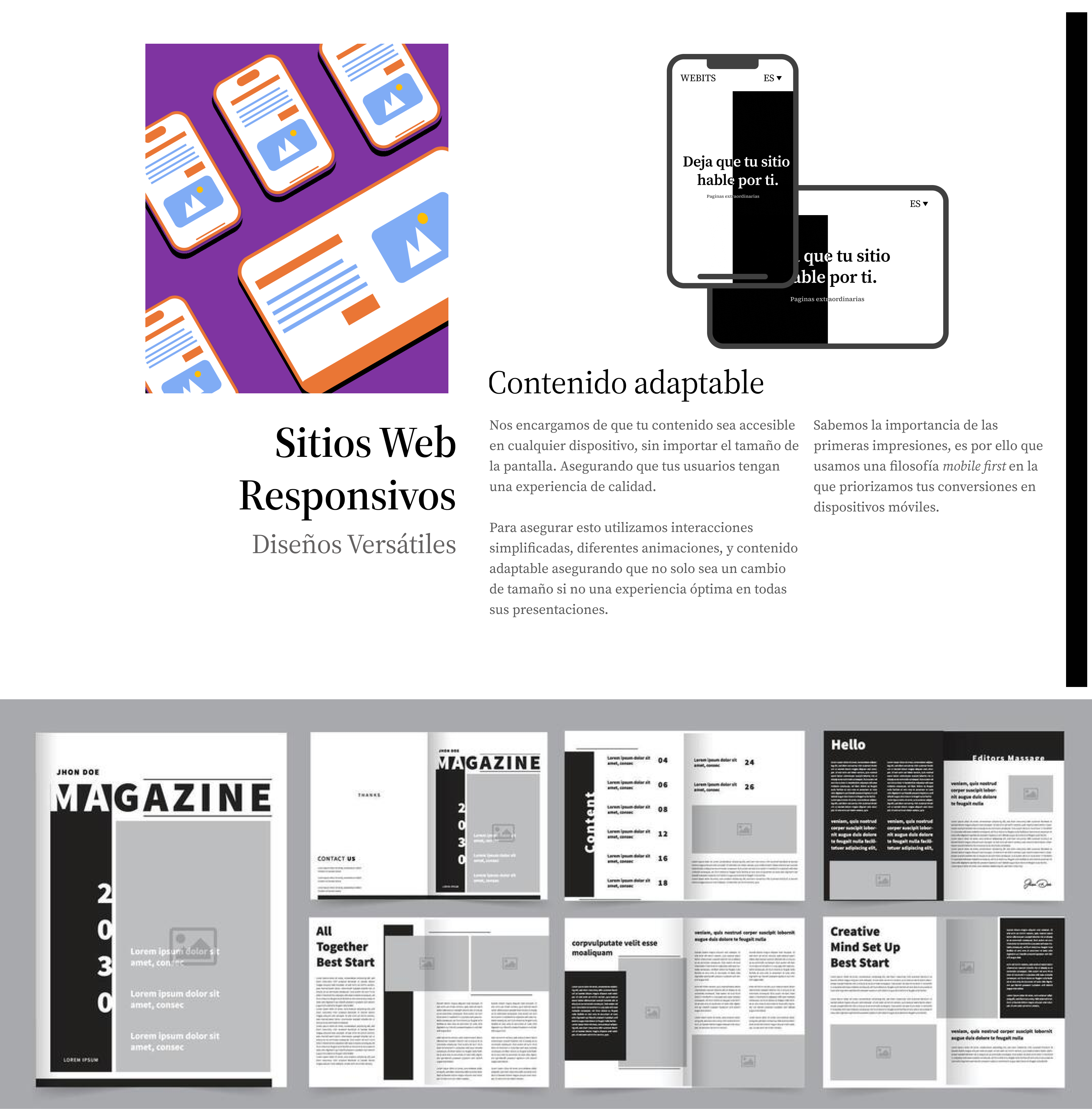
This hasn't been implemented in the page however you can clearly see the likeness also pardon the Spanish.
Animations
I wanted to have some fun with the animations, after browsing awwwards for a bit I decided on some scroll effects and some mouse effects.
Again the site is not final, but I'm quite happy with the result, you can see it for yourself here.
Some Developer Shenanigans
The site is developed in the ASTRO framework, after trying it against Next.JS I can't go back for static sites, using astro I was able to maintain performance and SEO while using heavy animations, for some of the heavier animations I used Framer Motion, for the styling I used Tailwind and for the programming bit I used the good Ol' React.
Won't bore you anymore with details, if you liked it, have some feedback or need a developer let me know!.
Thanks :)!
Reviews
2 reviews

Overall:
I like the look of it, I am missing a “team” section, because I miss the human side of the website. Who’s behind it and who can I contact and so on. Impressive that you built it and were very thoughtful with what content to add.
Some tops:
The time you put into animation doesn’t go unnoticed, it’s very sleek and modern. Love the font and how it ties in with the clean and simple black and white look. I like that the scrolling websites slow down when you hover over them. The unique selling points are also good, but they can be more engaging with some images.
Some tips:
According to other navbars on websites I thought I could click or turn the options on the very top of the page, but I see that scrolling down changes it. That could confuse other users too. The contact form didn’t have validation for a domain such as ‘gmail.com’ or ‘.org’ and so on - I’m guessing this is something still to come. Once an email is sent, there is no “sent!” Confirmation.

Hi, Daniel. I really like your landing page because it has a playful vibe! However, here are some improvements you may want to consider:
- Ensure that all your buttons use a pointer cursor.
- When selecting the running webpages, they may pause when I hover over them, and I can scroll back and forth with the mouse wheel.
- Consider using pagination for the body text under "Know Our Services." This would help indicate that there are additional pages; small circles might work well here, as the current line animation at the bottom is not very noticeable at first.
- Try slowing down the sliding animation in hero page, similar to the floating circle, to create a smoother experience and reduce the risk of triggering epilepsy due to rapid mouse movements.
- There are some instances of Spanish in the English translation.
Once these updates are made, I will consider changing my ratings.
You might also like

Auction


Accessible Signup Form


Entrant - Analytical Dashboard


Transit Cairo — Digital Mobility Redefined


Babylon Balance - Designing Financial Clarity Through Constraint


Entrant Accessible Signup and Login Forms
Popular Courses

UX Design Foundations


Introduction to Figma

Design Terminology
