Warm White Color Scheme

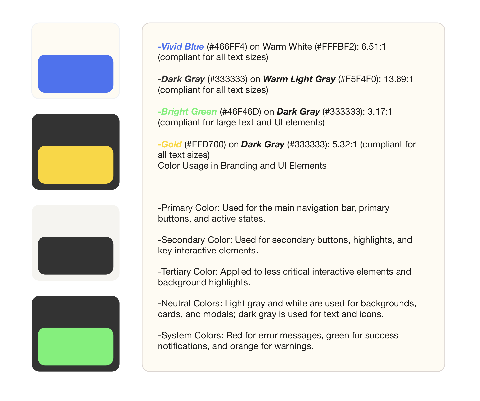
I went with something a bit more warm and inviting than my typical style. I primarily design with really dark, moody colors because I want to evoke a sense of seriousness and sophistication in my work, but going with something warmer and more vibrant allows you to be a bit more playful. This color scheme would make a nice change of pace:
-Vivid Blue (#466FF4) on Warm White (#FFFBF2): 6.51:1 (compliant for all text sizes)
-Dark Gray (#333333) on Warm Light Gray (#F5F4F0): 13.89:1 (compliant for all text sizes)
-Bright Green (#46F46D) on Dark Gray (#333333): 3.17:1 (compliant for large text and UI elements)
-Gold (#FFD700) on Dark Gray (#333333): 5.32:1 (compliant for all text sizes)
Color Usage in Branding and UI Elements
-Primary Color: Used for the main navigation bar, primary buttons, and active states.
-Secondary Color: Used for secondary buttons, highlights, and key interactive elements.
-Tertiary Color: Applied to less critical interactive elements and background highlights.
-Neutral Colors: Light gray and white are used for backgrounds, cards, and modals; dark gray is used for text and icons.
-System Colors: Red for error messages, green for success notifications, and orange for warnings.
Tools used
From brief

Topics
Share
Reviews
1 review
I believe this work could benefit from a bit more effort. It might be helpful to explore the provided templates and review the color systems and other works of your Uxcel peers to gain some inspiration. Selecting colors involves more than just choosing appealing shades; it’s about ensuring they work well together, comply with color contrast requirements, fit seamlessly into the interface, and evoke the right emotions for the brand. Paying attention to these details will enhance the overall quality and effectiveness of your design.
You might also like

Customer Journey Map for a Co-Working Space

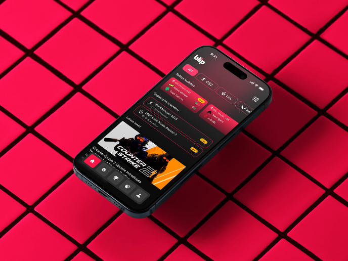
Blip - Esport app design (Light & Dark UI)

Reimagining Asana's Color System

Latios - Free Portfolio Template for UX/UI Designers

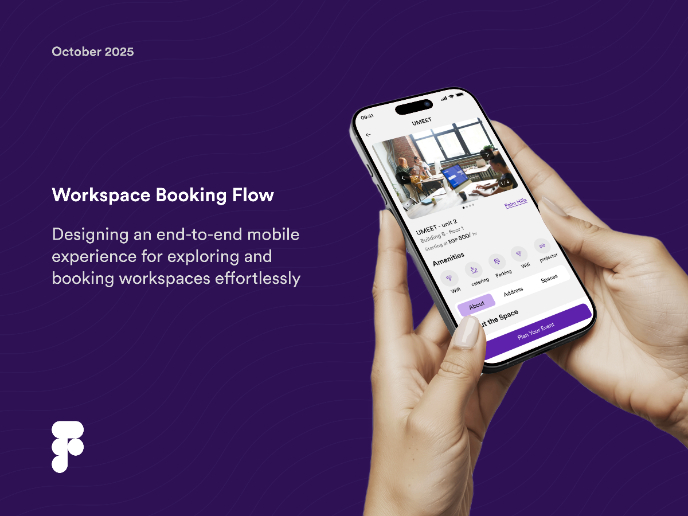
Workspace Booking Flow - UI/UX Design
Responsive Main Screen

Visual Design Courses

UX Design Foundations


Introduction to Figma

Design Terminology
