VSCO Icon Redesign
VSCO is a photography mobile app that allows users to capture photos and edit them, using preset filters and editing tools. In this work I want to redesign the tabBar icons of this app.
Before
Since I was not an active user of the app, I analyzed all its pages to understand their meaning, I also compared them with other apps to recognize the most commonly used icons. In this case icons are not very clear at first glance, forcing the user to explore the pages without knowing their function. In addition, the lack of labels makes it even more difficult to recognize them.
Minor adjustments were made to solve this issue.
The Home icon has remained the same, as has the Search icon, because they are perfect with this style.
The Profile icon has definitely changed to a simple, but common version to indicate the user's profile. This page has also changed position since it is most common to find it on the right.
The Studio icon has changed its shape, because before it could mean a frame, a work board, but basically within it you edit photos, so the cropping icon is slightly more appropriate. I wanted to look for an editing icon instead of a content creation icon.
VSCO's latest icon doesn't really identify what the Spaces page is. it's a page of photos according to a theme and with different contributors. My icon captures more something like a gallery.
Reviews
1 review
Thanks for your sub, Andrea!
I like your redesign as I think that it improves accessibility.
Great vibes only!
You might also like
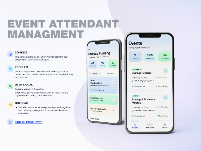
Events Managment App
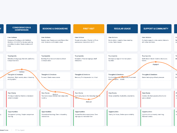
Customer Journey Map — Offsite Co-Working Experience
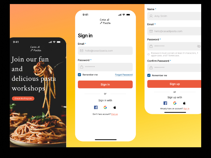
Mobile Onboarding: Casa di Pasta
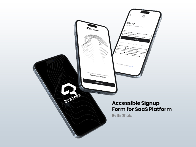
Accessible Signup & Login Experience — Brainex
Accessible Signup Form
Accessible Signup Form
Popular Courses

Common Design Patterns

UX Design Foundations


