Video Streaming Service Wireframe
Decision-Making Process
1. Objective: Improve usability and navigation on Netflix's desktop platform.
2. User Research: Identified pain points with accessing frequently used features.
3. Feature Selection: Chose the sticky quick access bar for easy access to Watchlist, Recent Views, and Profile Settings.
Rationale
1. Placement: Sticky bar on the right-hand side, always visible while scrolling.
2. Icons: Clear, recognizable shortcuts to Watchlist, Recent Views, Profile Settings, and a customizable slot.
3. Visual Design: Consistent with Netflix’s design, minimizing cognitive load with intuitive icons and labels.
Competitive Analysis
-Netflix: Solves navigation inefficiencies.
- Disney+: Offers exclusive content but limited beyond Disney properties.
- Amazon Prime Video: Great variety but sometimes cluttered interface.
Result
Streamlined, user-friendly navigation, enhancing the overall viewing experience on Netflix.
Tools used
From brief
Topics
Share
Reviews
1 review
Hi Anan, well done tackling this brief—it’s a challenging one! Your presentation is great, and I think incorporating more screenshots of your work into the project submission could attract even more reviews. You’ve designed some really engaging content, and showcasing more of it would highlight your efforts even further.
I enjoyed reviewing your project, and here’s some feedback that I hope adds value for your future endeavours:
- Idea Generation in the Brief: I noticed your brief mentions generating multiple ideas and showcasing the most compelling ones. While your solution is thoughtful and well-executed, don’t forget that the wireframe stage is the perfect time to experiment. This is where wacky or unconventional ideas can shine, even if they’re ultimately refined later. For instance, while the traditional side navigation panel is solid, exploring alternative layouts could open up new possibilities.
- Search Bar Design: I really appreciate that your search bar is always open and accessible, unlike Netflix’s current design, where it requires a click to open. This approach feels user-friendly and reduces friction, which is a strong design choice.
- Competitor Benchmarking: A helpful approach during brainstorming sessions is to set more benchmarks using different tools to understand what’s out there, as many as possible is great. I personally use Mobbin to identify designs and features I like when developing initial wireframe ideas. It’s a great way to explore trends and gather inspiration.
Your work is well done, and with a bit more experimentation and presentation tweaks, it could stand out even more. Great job, and I’m excited to see how you continue to develop your skills!
You might also like
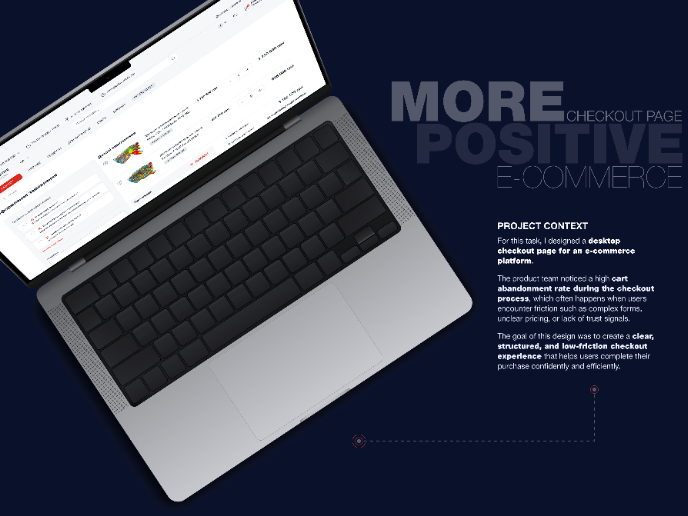
🖥 Desktop Checkout Flow Design
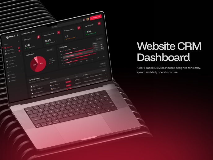
Website CRM Dashboard
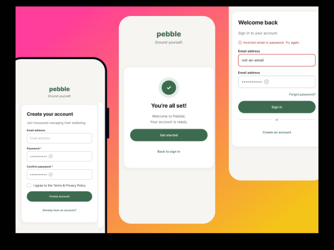
Pebble Accessible SAAS Signup Flow
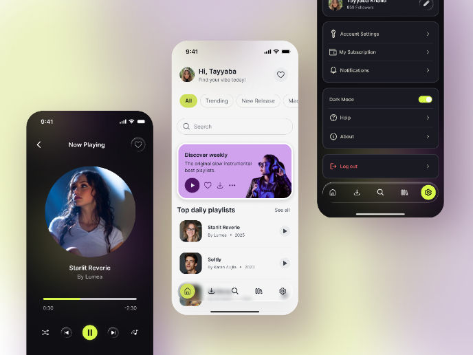
Music Player UI - Light & Dark Mode
Create a UX Research Survey
Nestra from homepage to checkout process
Interaction Design Courses

UX Design Foundations

Introduction to Figma

