Vantyx | Tech-fashion landing page
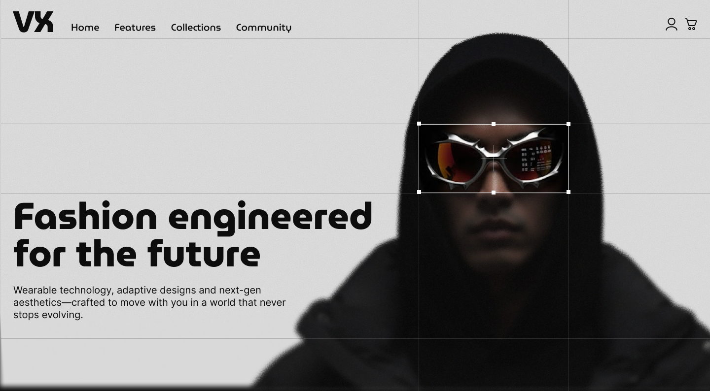
This project focused on designing a landing page for Vantyx, a fictional future-fashion brand that merges technology with high-end apparel. The goal was to create a clean, minimalist, and futuristic layout that introduces the brand, explains its value proposition, and presents sections such as the new collection and community outfits.
Reviews
4 reviews
Hey Ainara. I like your futuristic direction and the way you used grid lines throughout the design. It is smart how you highlighted them in key areas like the hero where the glasses are in focus. That part works well.
I have one visual nitpick. Your icon consistency is off. In the header, one icon is thicker and more rounded than the other and it instantly breaks the visual rhythm.
Down in the footer, the TikTok icon stands out because it is thinner than the rest. Small inconsistencies like these pull attention and make the interface look less polished.
Incredible work! I like it so much! It’s modern, discreet, and has great contrast. I’d fix one thing: I’d make the decorative lines more transparent or even remove them in the New Collection section with the cards.
Ainara, you nailed this! I see you already have the foundation of UI composition. Overall, this one is a really nice design, but I think there are some better options for the font. Keep up the good work!
Great work!!
You might also like
Loginino
Notification microcopy - Project
El Mandoub-GovTech App
MalishaEdu Counselor Workspace
Goal Creation Flow
Portfolio website
Content Strategy Courses

UX Writing

Common Design Patterns

