Uxcel- Accessible Signup Form

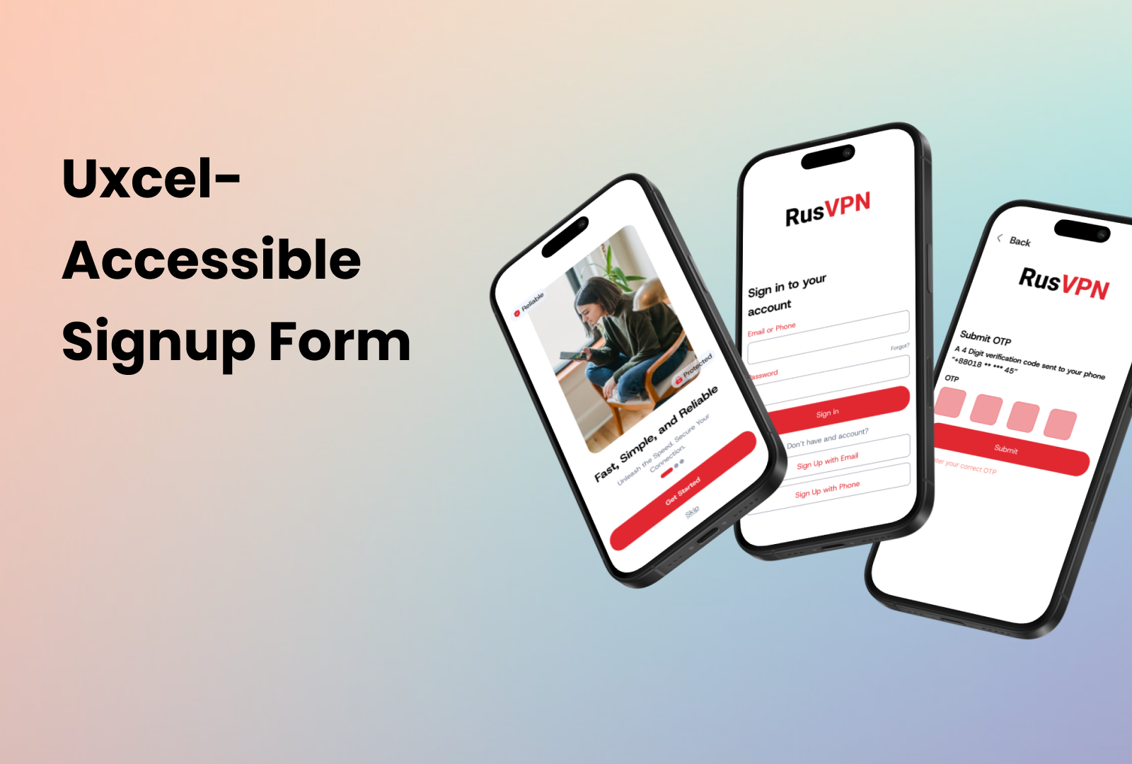
Mobile App Sign-up: Enhanced Accessibility
Key Features:
✔️ Intuitive Error Notifications
✔️ Password Display Options
✔️ Diverse Login Methods
✔️ Clear Focus Indicators
✔️ Comprehensive Language Options
✔️ Compliant with WCAG Guidelines
Tools used
From brief

Topics
Share
Reviews
3 reviews

Hi Sayeed!
The UI you proposed is a good start, you seem to have used understandable labels for inputs and clear buttons.
However, in the project presentation you need to give much more details about your thought process, demonstrating how you are covering WCAG guidelines with your design.
In order for the design to be WCAG compliant it needs to be perceivable, operable, understandable & robust. How do you ensure these?
How do you treat for example errors in inputs? You need to demonstrate how you show errors, how you help the user through the errors you give, when do you trigger the errors to be shown, also keep in mind the screen layout when you show errors. Is there enough space currently under your inputs for errors?
In the "sign in" screen I have my doubts there is enough space for an average finger to press on "forgot password".
Do you allow for your app to be used in landscape mode too? How do you treat device orientation?
You could even think & present about how you would allow support for password entry by password managers to reduce memory need. You could present somehow exactly what success criterions from WCAG you took into consideration and applied in your design.
What I mentioned are just some examples, you can take this further and investigate more yourself and come up with ideas. 😉
Keep creating and being awesome!

Hey Sayeed, I think it's a good start, i would love to see more edge cases and error message handling.
From the UI perspective, I would try to keep an eye on the Signup Otp screen alignment

Hello Sayeed,
Your submission is strong in its clear steps and focus on security and Accessibility.
- The multi-step process is clearly mapped, guiding the user through onboarding, login/signup, OTP verification, and password creation. This makes the overall flow highly usable.
- The inclusion of OTP verification and a structured Password Creation process addresses key security and reliability needs for a VPN service.
- The screens are clean, use large, legible type, and have high-contrast buttons, ensuring good Visual Design and Usability on mobile devices.
- Key features like password display options and the multi-step layout support WCAG guidelines for form design.
Areas for Improvement:
To fully meet the requirements, especially regarding Accessibility and Usability for complex flows, the following points need refinement:
- Colour Semantics (Accessibility/Usability): The primary CTA buttons are coloured red(#E12730). In UX design, red is reserved for errors, deletion, or critical warnings. Using it for the primary action (Submit, Log In, Create Account) can dilute the meaning of true error states, reducing the accessibility and usability of error messaging.
- Better demonstration of WCAG compliance within the visuals or rationale. Explicitly show or state how the design adheres to WCAG: Keyboard Navigation (logical tabbing order) and Screen Reader Text (use of aria-labels on icons) must be documented.
- The design needs a visible "Resend OTP" button and a clear timer to communicate the wait time, enhancing usability. Error states for an incorrect or expired OTP should also be shown with explicit text.
- Implementing a single-channel authentication (user enters one piece of data, and the system directs them) would simplify the flow, improving usability, reducing cognitive load & redundancy in Login/Signup.
You might also like

edX Sign-Up Page Redesign


Beautify Login page WCAG principles


Design Prioritization Workshop


Notion Login Page Accessibility Optimization


Sanyahawa - Landing page Design


Healthy Dashboard

Visual Design Courses

UX Design Foundations


Introduction to Figma

Design Terminology
