TouchFlow Button System

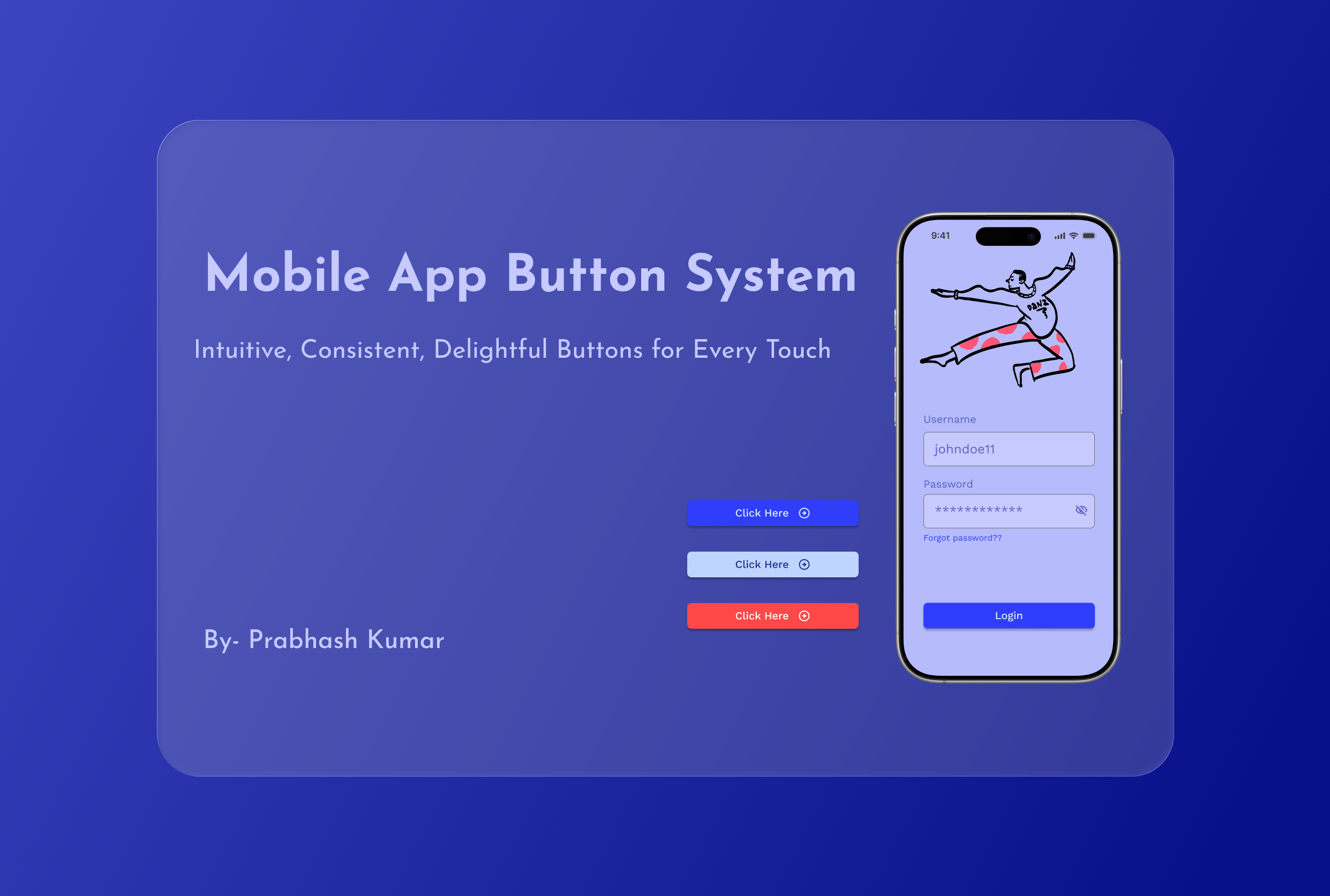
This project presents a clean and flexible button system designed for a mobile app. Focusing on clear colors and easy-to-use shapes, I aimed to create buttons that look good and are simple to interact with. The design uses straightforward layouts and basic states (like pressed or disabled) to ensure buttons are always clear and accessible. My process was hands-on and intuitive, making design choices that felt right for usability and appearance without heavy research or overcomplication. The button system is built dynamically using components, making it easy to scale and adapt for different app needs.
Special care was taken to select button colors and contrasts that follow WCAG (Web Content Accessibility Guidelines), so text and icons on the buttons remain readable for everyone, including users with vision impairments. By meeting these accessibility standards, the button system ensures that all users can easily recognize and interact with buttons, creating a more inclusive user experience. The result is a practical, modern, and scalable button system that’s easy to use in real app scenarios.

Reviews
3 reviews

Great work, I can’t access your project at the moment, it seems the link is still restricted.

Hey Prabhash,
Looks like the project link isn’t accessible, it seems the sharing settings in Figma might still be restricted.
You can update it by going to Share > Anyone with the link > Can view.
Looking forward to checking out your work once it’s accessible! 👏

Nice work Prabhash, your button system feels clean and accessible.
You might also like

edX Sign-Up Page Redesign


Beautify Login page WCAG principles


Design Prioritization Workshop


Notion Login Page Accessibility Optimization


Sanyahawa - Landing page Design


Healthy Dashboard

Visual Design Courses

UX Design Foundations


Introduction to Figma

Design Terminology
