Titan Fitness Landing Page
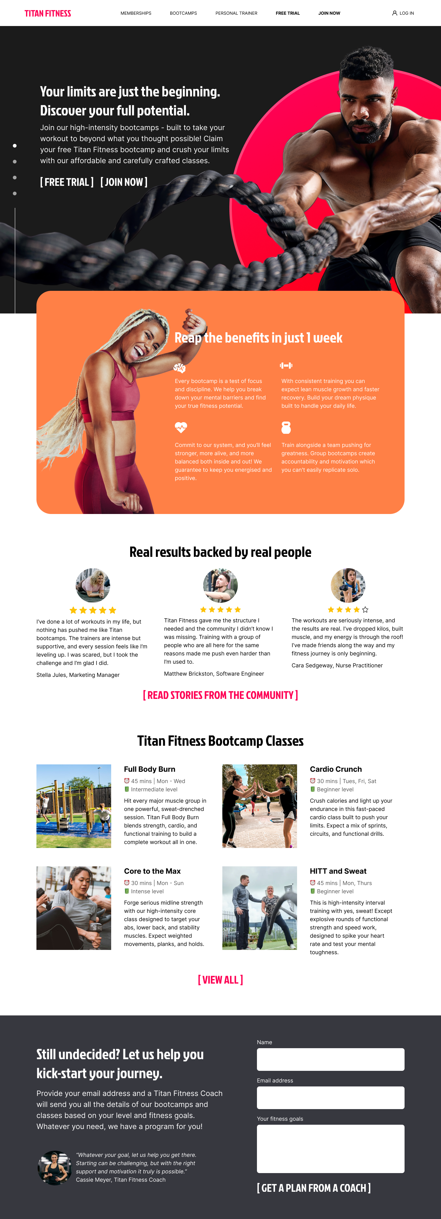
Welcome to my single landing page project! The main goal is to write compelling microcopy using the principles shared in the lessons to motivate visitors to take action and join the Titan Fitness bootcamps. Let me share how I believe I achieved this 💪
Here is the full page project:
Background:
It’s good to know the brand tone to check that the copy matches the message. Titan Fitness is brand for the ambitious, everyday fitness lover looking to push their limits both physically and mentally. The tone is high energy, motivating with a coach-like approach that communicates a sense of "you can do this too"! It’s not just for gym bros! A persona of the kind of customer Titan Fitness is looking for:
Content:
The content is geared to convert landing page visitors into loyal customers. The idea of a community is spread around the copy and the reviews from real customers conveys trust and shows social proof.
To avoid sounding pushy, there is a [FREE TRIAL] option, and at the end of the landing page the copy “still undecided?” gives a lower barrier of entry for visitors who want more information before committing fully. This repeat call to action will reinforce conversion.
Clarity:
It’s no doubt what the product is here! Bootcamps! Information about the classes and its various levels also guides the visitor to explore their options before signing up. There is also copy about benefits just below the fold and within the classes. No marketing speak, just truth about what visitors can get from joining. Its written in short sentences with icons for scannability.
Visual Design:
The visuals aim to show fitness and the benefits of gaining confidence by pushing past your limits.
🖼️ Imagery
The main header image speaks to the focus of good results and discipline. The image of a happy jumping lady shows the benefits of fitness - endorphins rising and the joy of success at meeting goals.
🖊️ Typography
The bold fonts communicate confidence and assurance that you’re signing up with experts. The hard edges on the font show the defined body you are looking for and the grit of the bootcamps.
🎨 Color palette
The bright shades of fuchsia and orange are for energy, drive and positivity. Its not as aggressive as red and it shows that you’re here to hit your goal on the bullseye. It feels modern and fearless with black backgrounds to show boldness and courage.
Overall:
The copy is still the main focus here and with clear call-to-actions [FREE TRIAL] [JOIN NOW] and benefit-driven messaging, it succeeds in presenting scannable content with a motivational and friendly tone. With strategic choice of words such as "push" "crush" "beyond what you thought possible" - it gives the visitor something to aspire to and get excited about. The bold colours and imagery support the narrative and overall presents the visitor with a compelling product.
---
✨ Thank you for reviewing my project, I look forward to your feedback!
Tools used
From brief
Topics
Share
Reviews
6 reviews
Hey Nicole! Great job!
I would suggest some tweaks:
- imagine the user scanning the page, it would be great to have some words highlighted in bold in the feature description and testimonials.
- The buttons don't look like buttons, I know the idea is to be different, but a CTA button is super important and the user can’t feel confused about that. So I would create something that looks more like a button, and even make the most important button stand out, maybe use a different color.
That's it, great job! The page looks amazing.
Perfect
Love how it tells a story
I really like the title. It’s impactful and speaks directly to people who may feel stuck or discouraged in their fitness journey. It offers both motivation and relatability, which is a great hook. The subheading does a great job of expanding on what the user can expect from the website, giving helpful context and drawing them in further.
One suggestion: consider making the call-to-action buttons stand out more visually. Since these are the key actions you want users to take, they should be unmistakably clear and attention-grabbing. Overall, great work!
This project has a beatiful UI, just one observation. You can improve the format of CTA in the hero section to engage more clicks.
You’ve created a compelling, energetic and well-branded landing page that clearly speaks to its target audience. The copy feels motivational, clear, and easy to scan. The strong visuals and engaging copy together give a sense of excitement and possibility, exactly what a fitness-brand should aim for.
With a few refinements around CTA prominence, you’ll elevate the user experience and conversion potential even further. 💪
You might also like

edX Sign-Up Page Redesign

Beautify Login page WCAG principles

Design Prioritization Workshop

Sanyahawa - Landing page Design
Uxcel Halloween Icon Pack
eWallet App Development Project
Content Strategy Courses

UX Writing

Common UX/UI Design Patterns & Flows

