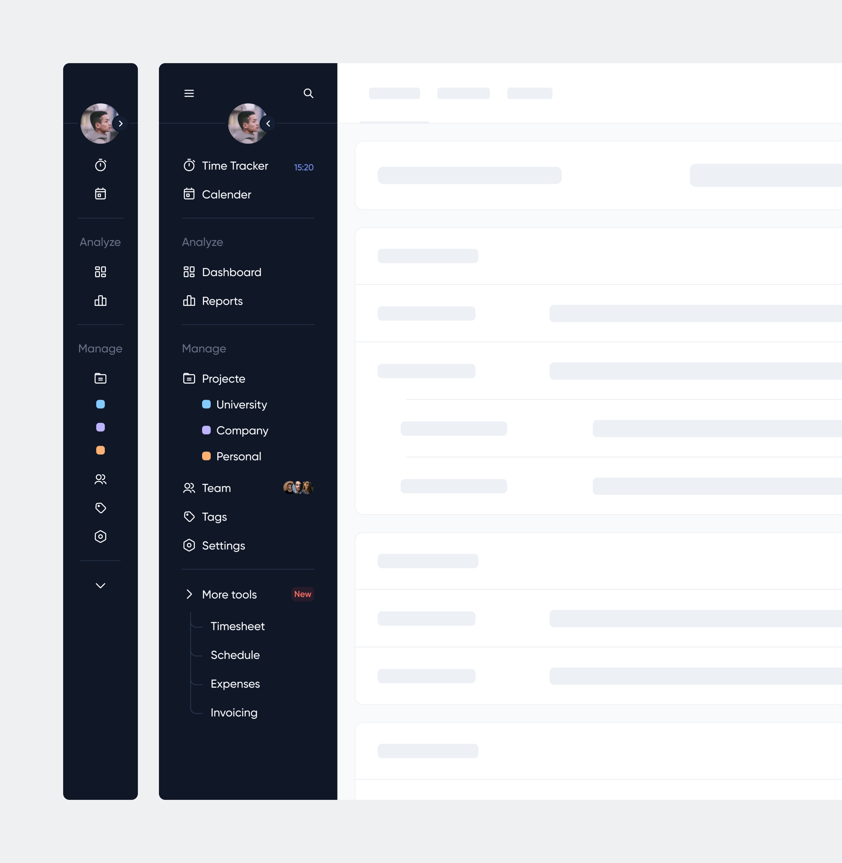
Three-tier sidebar navigation

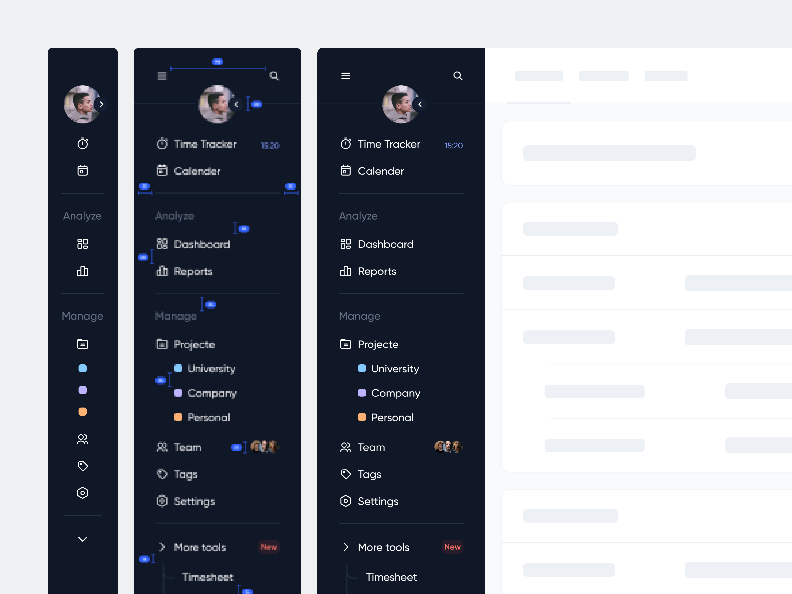
Hey guys. This is my first post on Uxcel. The design of sidebar navigation in a task tracker app.
Sounds good and useful? Please share your opinion with me🤍
Thank you for scrolling 🙌
Contact Me: Linkedin | Instagram | sadparizad.design@gmail.com
Reviews
3 reviews

Hello! Visually everything looks very good. Thank you for indicating the distances. Now it is not clear what the states of the menu items will look like. This is very important because depending on the design of the states, for example a solid with a fill, you will have to reconsider the distances between elements.
Are badges expected to be used, such as missed calendar events? If so, what will it look like?
Thanks for the work! Visually attractive, it’s interesting to see the update of the work.

You did a great job putting together this project — the visuals are outstanding. What I would have liked to see is some explanations behind why you made such decisions. One of the most important aspects of a design is to clearly explain the why. If you edit your project, please let me know and I'll edit my review.

I liked the detail of the description, a worthy project
You might also like

PLANTIST


Lumen

NORTHSIDE - Coworking space Customer Journey Map


Accessible Signup Form for Monkey Survey


Crave Corner - Bakery App Design


Wealthsimple 404 Page

Popular Courses

UX Design Foundations


Introduction to Figma

Design Terminology
