Therabills
Billing app for therapists to simplify their billing process, reduce administrative work, and improve the patient experience, ultimately increasing revenue and satisfaction
Tools used
Share
Reviews
4 reviews
You're so talented! What a wonderful and great case study! Very impressive!
Perhaps it would be beneficial to emphasize specific pain points therapists face with current billing solutions and tie them to real world quantifiable metrics that I guess you could Google quite easy in order to drive the business case and how your solution is better than competitors for instance. Especially if you want to use this a Product Design case study and not just a UX case study so to speak. It's a subtle differentiate but important.
The user persona section could perhaps benefit from more detailed demographic information or behavioral traits.
The mapping of the user journey could possible be done more visually (e.g., with empathy maps or journey flows).
It's great to see accessibility mentioned, as it's a crucial aspect of product design.
To strengthen this section even further, consider detailing specific accessibility guidelines followed and connecting them to the user persona (e.g., color contrast ratios, screen reader support, etc.).
It might be helpful to summarize key learnings or insights gained throughout the project in a more narrative form, highlighting personal growth or the impact on design thinking.
GREAT JOB! Keep it up!
Anastasia, this case study is fantastic! 🎉
Amazing job detailing every stage of your work and describing your exploration and research so thoroughly. I really enjoyed reading through your project, it’s engaging and well-written, and the visuals are spot-on. 📚✨
The design is equally impressive. I love the colour choices and the overall look and feel of the UI, it’s clean and inviting.
Truly extraordinary work! 👏🌟
The design is clear and simple, guiding users smoothly through billing tasks. Fonts, spacing, and buttons are consistent, making it easy to read.
Colors and icons highlight key actions. Some small improvements on button feedback and text clarity could make it even stronger.
Amazing case study. The concept for the app is fantastic, and I believe it can really benefit your target audience of therapists. The revenue dashboard is a particularly useful feature.
That said, here are a few areas for improvement and clarity:
- The copy could be more succinct and positive. For example, "Don't forget to schedule appointments" feels a bit long and pushy. Something like "Schedule appointments" would be more effective and to the point.
- Make sure to proofread for grammar and spelling in the UX copy, as there are some areas that need attention.
- It's not entirely clear what the "Synchronize Bills" feature does. Adding more explanation and making the CTA copy more intuitive would help users understand its purpose.
- The scheduling feature looked more user-friendly before the changes, where you displayed the sessions for the day with a simple "+" button to create a new one. Consider revisiting that design for better usability.
You might also like
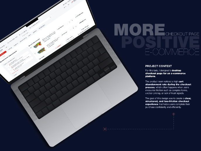
🖥 Desktop Checkout Flow Design
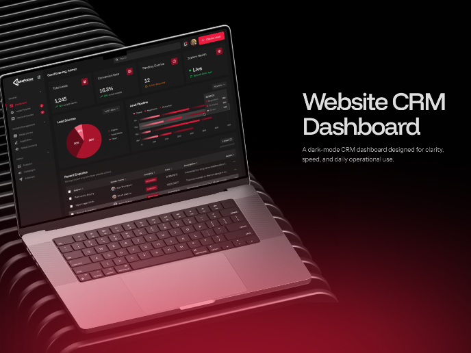
Website CRM Dashboard
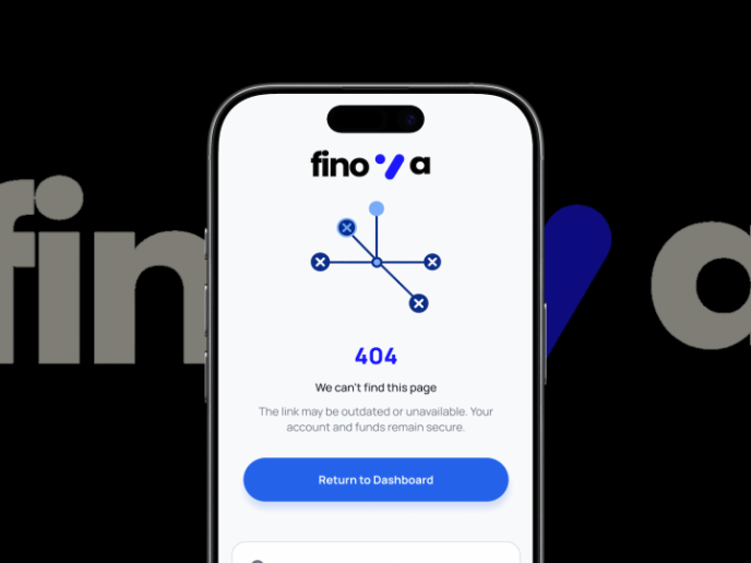
Helpful 404 Error Page for a Fintech Mobile App
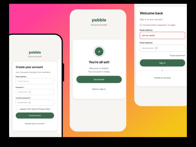
Pebble Accessible SAAS Signup Flow
Music Player UI - Light & Dark Mode
Create a UX Research Survey
Popular Courses

UX Design Foundations

Introduction to Figma


