The Posh Pixie Landing Page

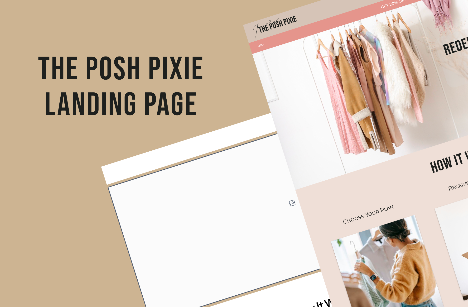
For the fashion landing page project, I chose to create a modern boho/eclectic-esque fashion subscription brand, using bolder, retro colors.
I wanted the style of clothing to stand out first thing on the website, so I designed the header to be the main focus point by using a wide-screen image.
I began the project by designing the brand board. I chose the colors specifically because they had the retro vibe I was going for, while being warm & inviting, yet still feminine. Because the colors create so much noise, I added in very few decorative elements, and used more simple fonts with added letter-spacing to increase readability.
For the styling photos, my focus was on adding some neutral space while showcasing the theme of the brand, so I created a few outfit layouts with off-white backgrounds and plenty of spacing around the margins.
I also made the FAQ's page interactive to show how a typical user would use that section.
Tools used
From brief

Topics
Share
Reviews
2 reviews
Hey Stephanie,
Love the looks and overall feel. There are multiple things you can improve, sharing a few that caught my attention first:
- Try to design with no shadows (or make them way softer), they make your designs look dirtier
- Try to avoid hard lines (sometimes they are used when not really needed)
- Add much more white space in between sections, and let it breathe.
- Try experimenting with a font system (maybe a different typeface combo)
Happy to review again once you improve & provide more feedback!
It's a good start. Thank you for sharing with us Stephanie!
Here are my thoughts:
I like the color palette you've chosen, but it could use more accents.
The "Take Quiz" call-to-action is confusing to me. It's not clear why users should take a quiz and what they will get in return. I suggest adding a short subheading below the headline, explaining the purpose of the quiz, such as "Take a quiz to share your style preferences and get personalized recommendations."
I feel that the "Shop" action is very important for this page, but it's not very prominent in the top navigation bar. Consider making it the primary button and making "Take Quiz" the secondary option. Also, it's not clear where the "Shop" link leads users - is it to a catalog?
In terms of navigation, "My Profile" and "Cart" are usually grouped together as part of the utility navigation. You may want to consider looking into our Information Architecture course for guidance on this. Using icons could also enhance the user experience.
Including a section with feedback from users who have used the service would significantly boost engagement.
Thank you and keep it up!
You might also like

Entrant Accessible Signup and Login Forms

A/B Testing for Bumble's Onboarding Process


CJM x Mindspace case study - Ester Cinelli

Dark mode Main page
LUMÉRA - Checkout Flow


Tripit's Login and Sign Up Flow

Content Strategy Courses

UX Writing


Common Design Patterns


Building Content Design Systems
