The Forward Podcast
[Real Project] SmartOSC Podcast Rebrand – The Forward Podcast
I had the opportunity to lead the branding for the SmartOSC podcast rebrand, transitioning it into The Forward Pod. This podcast brings together eCommerce leaders, CEOs, and industry pioneers to share insights and strategies for success.
Branding Concept:
The new identity embraces minimalism, dynamic geometry, and a bold yet professional color palette. Inspired by the word Forward, the design reflects innovation, movement, and leadership—all key attributes of the podcast's guests and audience.
Key Design Elements:
✅ Logo System – Built with geometric simplicity and negative space for flexibility across platforms.
✅ Color Palette Refresh – Balanced hues maintaining brand continuity while adding modern energy.
✅ Typography – A clean, contemporary sans-serif for a sharp yet approachable look.
✅ Visual Applications – Adaptive branding for social media, thumbnails, and video content.
✅ Accessibility Checked – Ensuring inclusivity across various forms of color blindness.
This project was an exciting challenge, blending brand evolution with modern design trends. Would love to hear your thoughts!
In collaboration with...
Tools used
From brief
Topics
Share
Reviews
2 reviews
The rebranding for The Forward Podcast is exceptionally well-executed! The minimalist yet dynamic logo system, combined with a bold color palette, effectively captures the themes of innovation and leadership. The geometric simplicity and negative space usage make the branding highly adaptable across platforms. Great work, Quang!
I have only one word, "Wow!". Great job and excellent reasoning.
You might also like
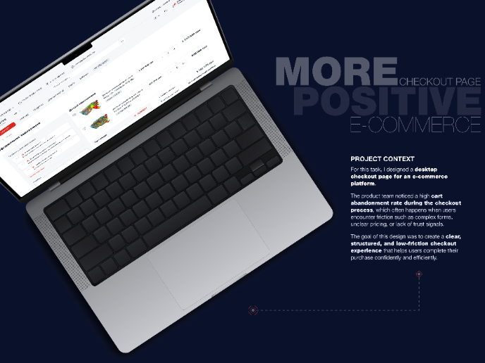
🖥 Desktop Checkout Flow Design
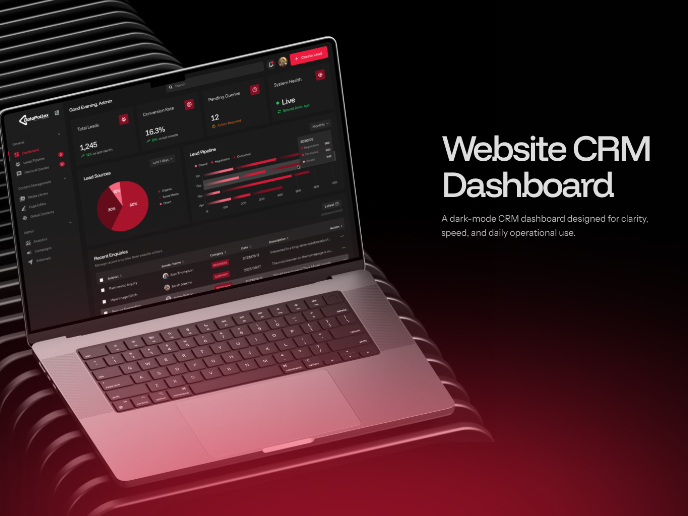
Website CRM Dashboard
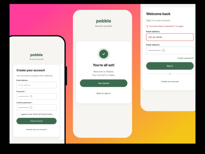
Pebble Accessible SAAS Signup Flow
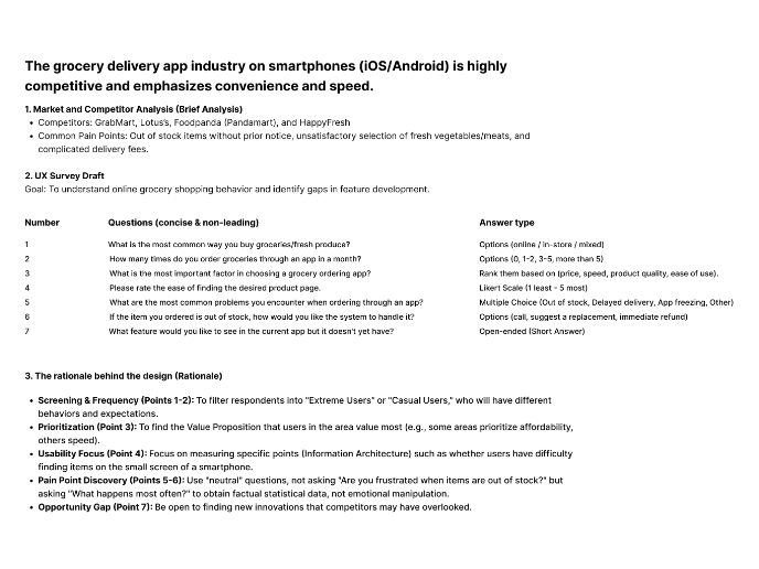
Create a UX Research Survey
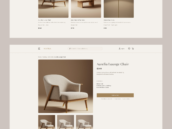
Nestra from homepage to checkout process
QuickScan Onboarding
Visual Design Courses

UX Design Foundations

Introduction to Figma


