ယဉ် (Yin) The Clothing Brand Project
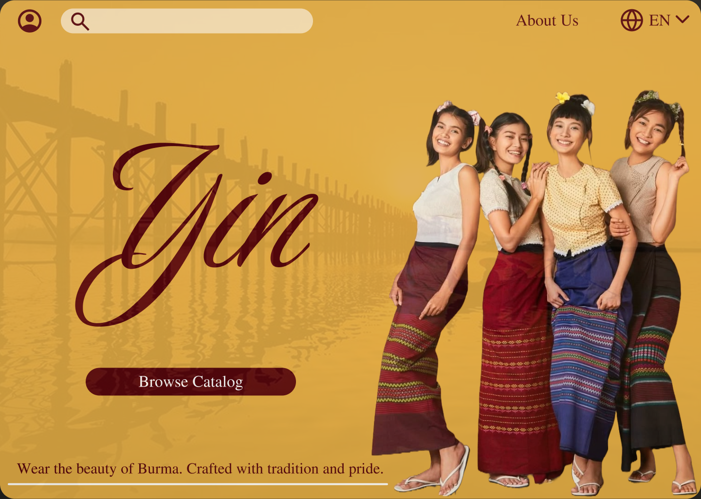
This is my Figma brief project focused on creating a high-impact landing page for a clothing website. As a Burmese designer, I wanted to highlight the beauty and heritage of traditional Burmese clothing, blending cultural authenticity with modern web design.
The images used are for reference only and do not own them. My goal is to showcase how design can bridge tradition and digital presence in a meaningful way.
I’d love to hear your feedback and suggestions to help me improve. Thank you for taking the time to view my project!
Reviews
1 review
The vibe you bring with this landing reminded me of small shops on the streets of Yangon, or mostly how they look in Mandalay. Best first impression, Hsu Labb Wai!
But it feels like a bit of a missed opportunity because you stopped at the hero section instead of expanding into a full landing page. I hope you’ll update this or show us more in your future work.
Now, for the design itself, if I were you, I’d use ယဉ် for the main display font and “Yin” or “ယဉ် (Yin)” in subheadings or descriptions. Why? Because I’m all about cultural differences and diversity. We’re already in 2025 after all, there’s no single truth of style anymore, and people are far more open to respecting differences (gender, preferences, culture, and so on). You should wear that with pride and truly bridge “tradition and digital presence in a meaningful way”. A small step like using Burmese-script type can help people become more aware of its beauty.
Of course, it’s a different story if the entire page were written in Burmese script but aimed at a global audience 😄 For most cases, though, you can use it sparingly. For the rest of the text: About Us, Browse Catalog, tagline, and future body copy, it’s generally easier for users to scan sans-serif fonts. Since you’re building an online store, readability becomes one of the most important factors. Simply put, if users struggle to read, they’ll leave and the store owner loses income :(
Assuming this is just the hero section, the yellow-brownish color choice feels safe. But if it were extended to the whole page, it might tire the eyes. Consider toning it down, or better yet, use white for a neutral base and draw color from the clothing selections: the htamein, ယင်ဇီ, and other traditional fabrics to bring warmth and authenticity.
You’re already celebrating heritage beautifully through imagery and tone. With a few structural tweaks and thoughtful typography, this could easily evolve into a standout modern-meets-tradition fashion page.
You might also like
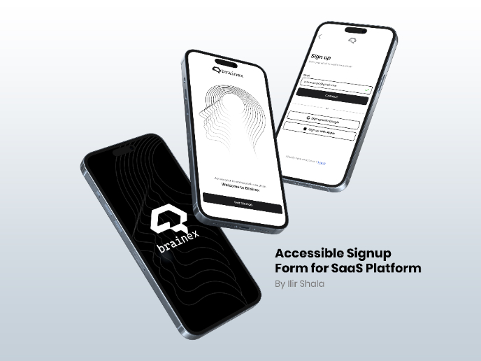
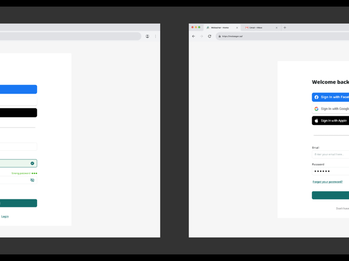
Accessible Signup & Login Experience — Brainex
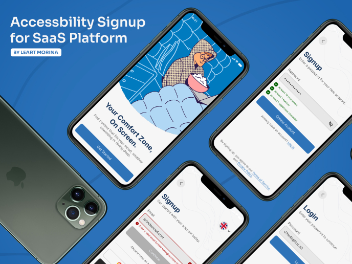
Accessible Signup Form
Auction

Entrant - Analytical Dashboard
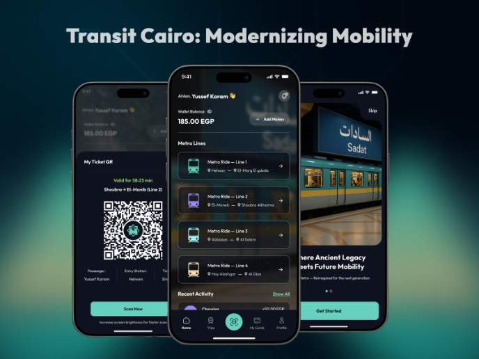
Transit Cairo — Digital Mobility Redefined
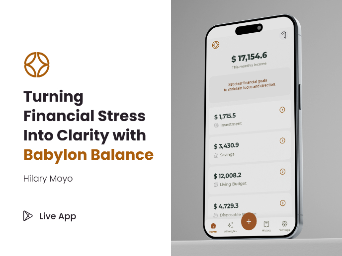
Babylon Balance - Designing Financial Clarity Through Constraint
Content Strategy Courses

UX Writing

Common Design Patterns

