TaskTrack Mobile Signup Page

1. Target Audience & Goals
I wanted to design something simple and intuitive, aiming for users who value efficiency. When people land on the sign-up page, they should be able to quickly create an account without any confusion. My main goals were to:
- Minimize complexity: I focused on what’s absolutely necessary.
- Ensure accessibility: I wanted the design to work for everyone, including users with disabilities.
- Streamline the user experience: The layout had to be familiar and smooth, so users instantly know what to do without much effort.
2. Design Decisions
Minimalistic Layout
I went for a clean and straightforward layout because I didn’t want to overwhelm users with too much information or unnecessary elements.
- Simple structure: Everything is in a vertical order, making it easy to follow from top to bottom without needing to think too much.
- Logical flow: The user moves from branding, to account creation, to login options in a way that feels natural. No need to guess where to go next.
- No distractions: I avoided adding excessive graphics or unrelated content. I wanted the focus to remain on the task — signing up.
Essential Input Fields Only
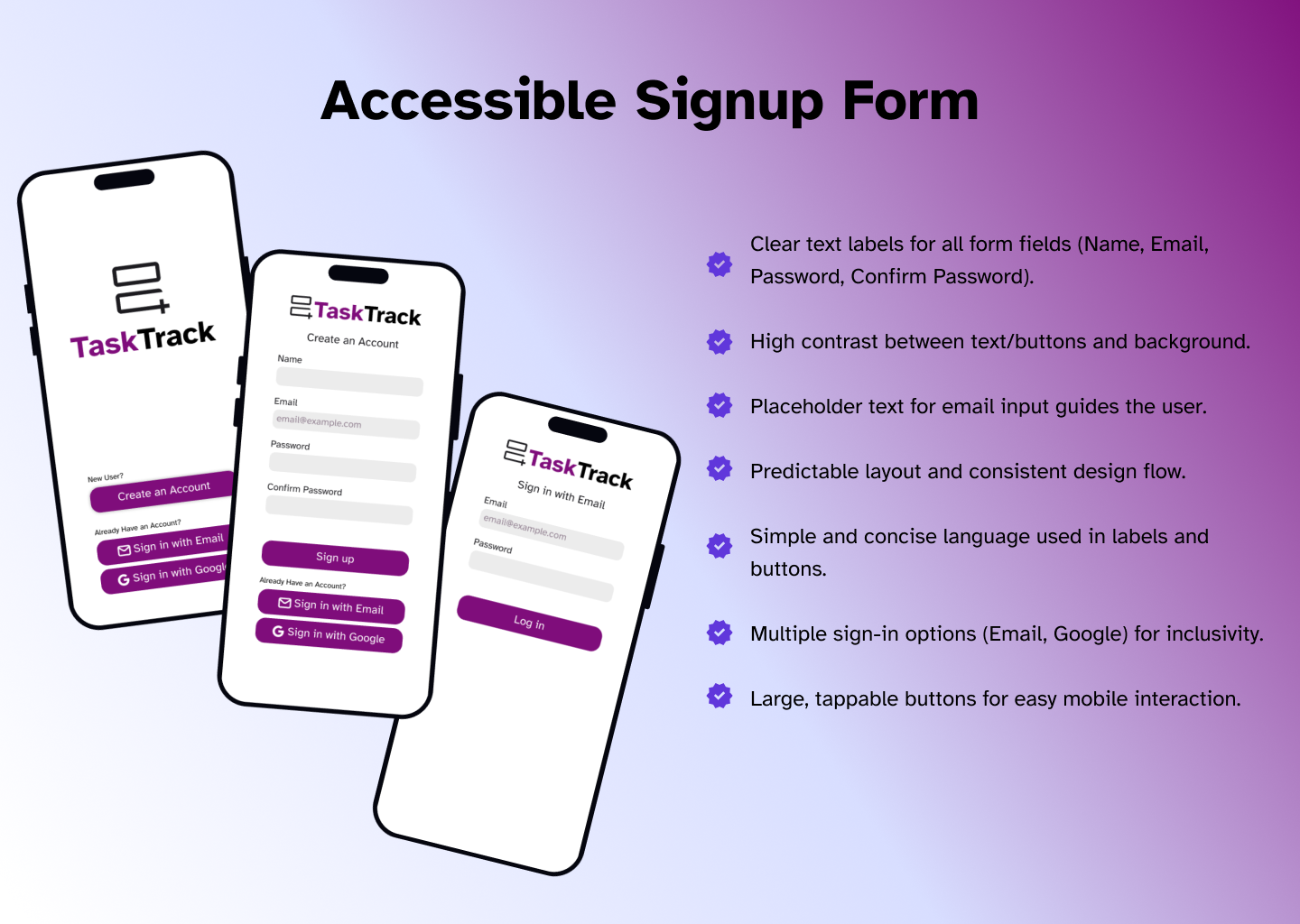
I only included the bare minimum fields: Name, Email, Password, and Confirm Password.
- Quick process: Most users don’t want to fill out a long form just to sign up. By keeping the number of fields small, I’m making it fast and easy.
- Respecting privacy: I avoided asking for unnecessary data (like phone numbers) which users might feel uncomfortable sharing at this stage.
Visual Hierarchy
I was deliberate in how I structured the content to guide users:
- Branding and Call-to-Action: The TaskTrack logo and the bold “Create an Account” heading immediately tell users what they’re here for.
- Form Inputs: Each form field is spaced well and labeled clearly, so there’s no confusion about where to type.
- Sign-Up Button: The bold purple button is impossible to miss. It’s big enough to tap easily on mobile, and its color stands out against the white background.
Color and Contrast Choices
I chose colors that ensure everything is easy to see:
- Purple for buttons and branding: It contrasts well with the white background, making the buttons stand out.
- Readable text: I kept the text black or dark gray on a white background for strong contrast, which is important for people with visual impairments.
- Clickable buttons: Each button is distinct but fits the overall clean look, making it obvious where to tap.
Mobile-First Approach
I designed this page with mobile users in mind, knowing that many people will sign up using their phones:
- Large tap targets: I made sure that buttons and fields are big enough to tap easily without frustration.
- Vertical flow: The layout works perfectly on a mobile screen since users naturally scroll downward.
- Responsive design: I made it simple, so it’ll adapt well to different screen sizes without breaking.
3. User Experience Considerations
I wanted the experience to be frictionless so that users can easily sign up without hurdles.
Simple, Intuitive Inputs
I used clear labels for each field and added a placeholder in the email input to guide the user. I didn’t want to overwhelm them with too much information:
- Password fields: While I debated whether to include the “Confirm Password” field, I decided to keep it because it’s a common convention. It helps avoid user errors and makes sure they know exactly what their password is.
Multiple Sign-In Options
I know that many users prefer quick sign-ins using services like Google, so I added this option:
- Convenience: Offering Google sign-in gives users a faster alternative to filling out the form. This can save time for users who want to get started right away.
- Flexibility: Some users don’t want to create new passwords for every app, and offering Google sign-in allows them to skip that step.
Call-to-Action Buttons
I kept the Sign-Up button as the main focus, bold and at the center of the screen. But I also added alternative options for existing users, like “Sign in with Email” or “Sign in with Google”:
- Primary action first: The main goal is for new users to create an account, so the “Sign Up” button is the most prominent.
- Secondary actions: For returning users, I included “Sign in with Email” and “Sign in with Google” buttons underneath, making them easy to find but not overwhelming the main flow.
4. WCAG 2.0 Accessibility Considerations
Lastly, I made sure to follow WCAG 2.0 guidelines:
- Text labels: All form fields are labeled clearly, which is essential for screen readers.
- High contrast: I used colors that meet the contrast ratio requirements for accessibility, ensuring readability for all users.
- Tap targets: I made sure that the buttons are large enough for users with motor impairments to easily tap on mobile devices.
Overall, I kept everything simple, functional, and accessible, making sure that users can sign up quickly without any confusion or barriers.
Tools used
From brief

Topics
Share
Reviews
1 review

What could be improve:
- Adjusting the Left & Right margins to give a more balancing the white space.
- Realigning the text & icon in the button as there were some inconsistency with the padding.
- All buttons are using the same primary color, there's no distinction & hierarchy.
- All input fields are a bit too small giving user a small touch area.
That's all the comments I have for now.
Keeps the good works 👏
You might also like

Pulse Music App - Light/Dark Mode


Designing A Better Co-Working Experience Through CJM


Monetization Strategy


Button System for Mobile Web Platforms Brief


Zoom Sign in Screen


Mobile Onboarding

Visual Design Courses

UX Design Foundations


Introduction to Figma

Design Terminology
