TaskFlow - Project Management SaaS

I've created an accessible login/signup page for TaskFlow, a project management SaaS platform, that works seamlessly across desktop and mobile devices. Here's how it meets WCAG accessibility standards:
WCAG 2.1 AA Compliance Features:
1. Perceivable (Principle 1)
- Color Contrast: All text meets WCAG AA standards (4.5:1 ratio minimum)
- Visual Indicators: Form validation uses both color AND text/icons
- Responsive Design: Adapts to different screen sizes and orientations
- High Contrast Mode: Enhanced contrast for users who need it
2. Operable (Principle 2)
- Focus Management: Visible focus indicators with proper outline styles
- No Time Limits: Forms don't auto-submit or timeout
3. Understandable (Principle 3)
- Clear Labels: Every form field has descriptive labels
- Consistent Navigation: Predictable interaction patterns throughout
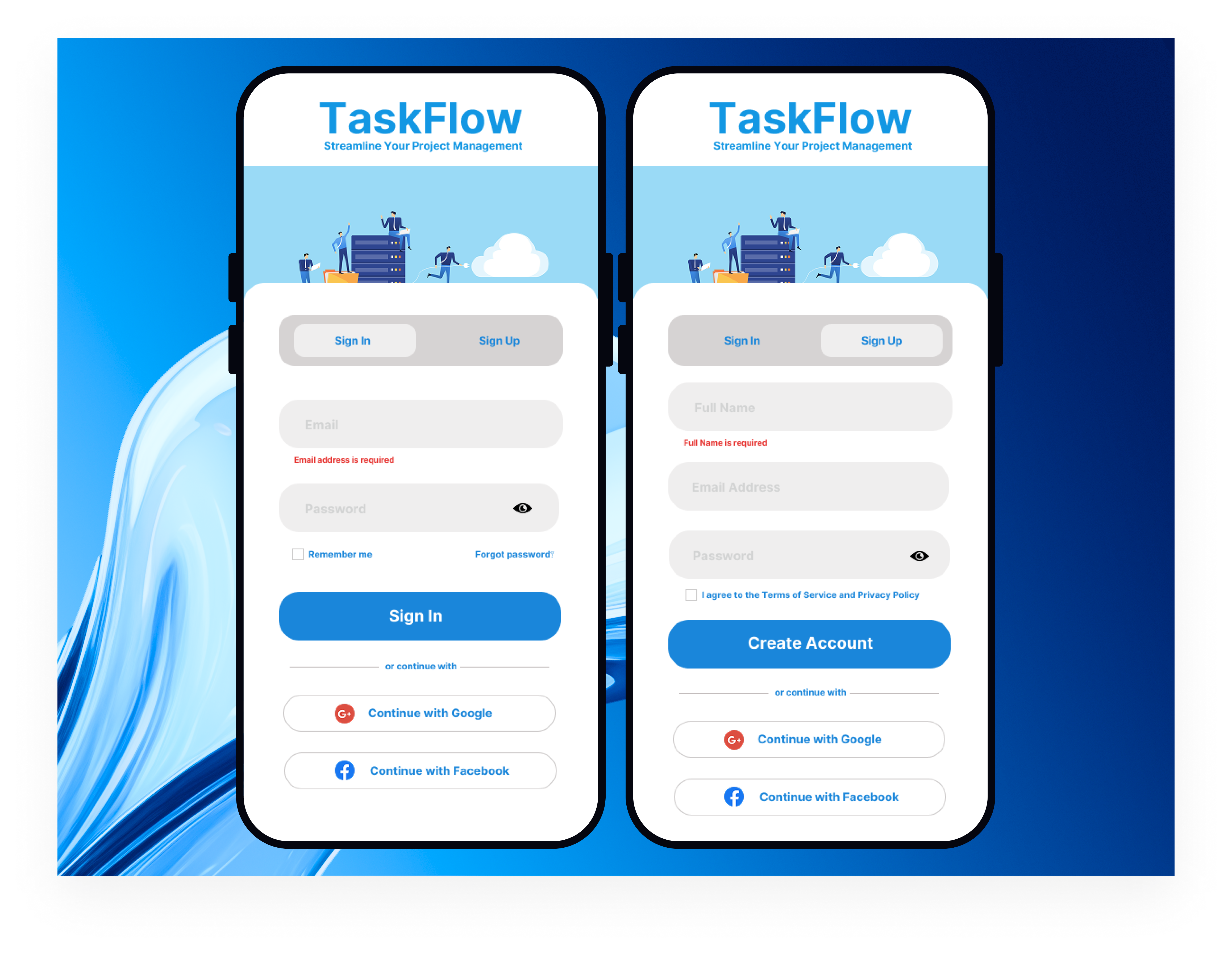
TaskFlow Mobile Authentication Design Summary
The TaskFlow mobile authentication design prioritizes professional trust-building through its gradient blue background and isometric business illustration, which directly communicates the platform's project management capabilities while maintaining enterprise-level sophistication. The dual-screen mockup demonstrates thoughtful responsive design with generous white space, clear typography hierarchy, and strategic placement of social login options (Google/Facebook) to reduce friction and leverage existing user trust for higher conversion rates.
The interface balances user experience with conversion optimization through smart interaction design choices: toggle states that use visual elevation to indicate context, password visibility controls for complex business credentials, and specific error messaging positioned for logical information flow. Legal compliance elements like Terms of Service checkboxes are strategically placed to meet requirements without disrupting the primary conversion funnel, while the overall clean aesthetic reinforces security and reliability - essential qualities for business software where data protection is paramount.
4. Robust (Principle 4)
- Semantic HTML: Proper use of form elements, headings, and ARIA roles
- ARIA Attributes:
aria-describedby,aria-invalid,aria-live,roleattributes - Progressive Enhancement: Works without JavaScript, enhanced with it
Tools used
From brief

Topics
Share
Reviews
1 review

This is a good start! The CTA button is prominent, the colors fit the project management theme, the password fields have the show/hide toggle, the errors are right underneath the fields improving speed of correction and social login/signup is easily recognizable thanks to the logos.
On the other hand, some of the design choices don't seem to fully align with the principles you mentioned. Don't be afraid to explain in your own terms the decisions and rationale behind your work! ☺️
A few ideas to consider in order to refine what you already got:
- Watch out for colored texts. Especially blue text. The rule of thumb is that normal texts should have a neutral color (black, gray or white). Colored texts usually make users think of links instead.
- On the same note with colors, the tabs and the placeholders might not pass the contrast check. Both tabs need to have accessible text, not just the active one, just a heads up!
- Consistency. The buttons and text fields have various heights here, try to stick to a certain height. That helps create a unified look. Not sure if the corner radius is the same (the varying height can play visual tricks), but do check that too.
- Typography. Some texts here seem to be sort of tiny compared to button labels for example. Unless we're talking about headings, the rest of the texts should be similar in size, 1-2px apart. Text field labels, text field input, button labels, body text, captions, they are similar if not the same size at times. Also, do check that font size is a minimum of 16px (maybe 14px for captions, but used very sparsely)
- How could we make the errored input be more distinguishable? What about the focused input? How would you imagine it to look like? How can we make them accessible too?
- Do you think the social login/signup section could be improved? Text wise, or maybe even how the buttons are displayed? Try to avoid text repetition where possible.
Fine-tuning these and going over the lessons one more time as a checklist will make this good to go! ✌️
You might also like

Islamic E-Learning Platfrom Dashboard


Pulse — Music Streaming App with Accessible Light & Dark Mode

SiteScope - Progress Tracking App


Mobile Button System


FlexPay


CJM for Co-Working Space - WeWork

Visual Design Courses

UX Design Foundations


Introduction to Figma

Design Terminology
