Spotify Reimagined

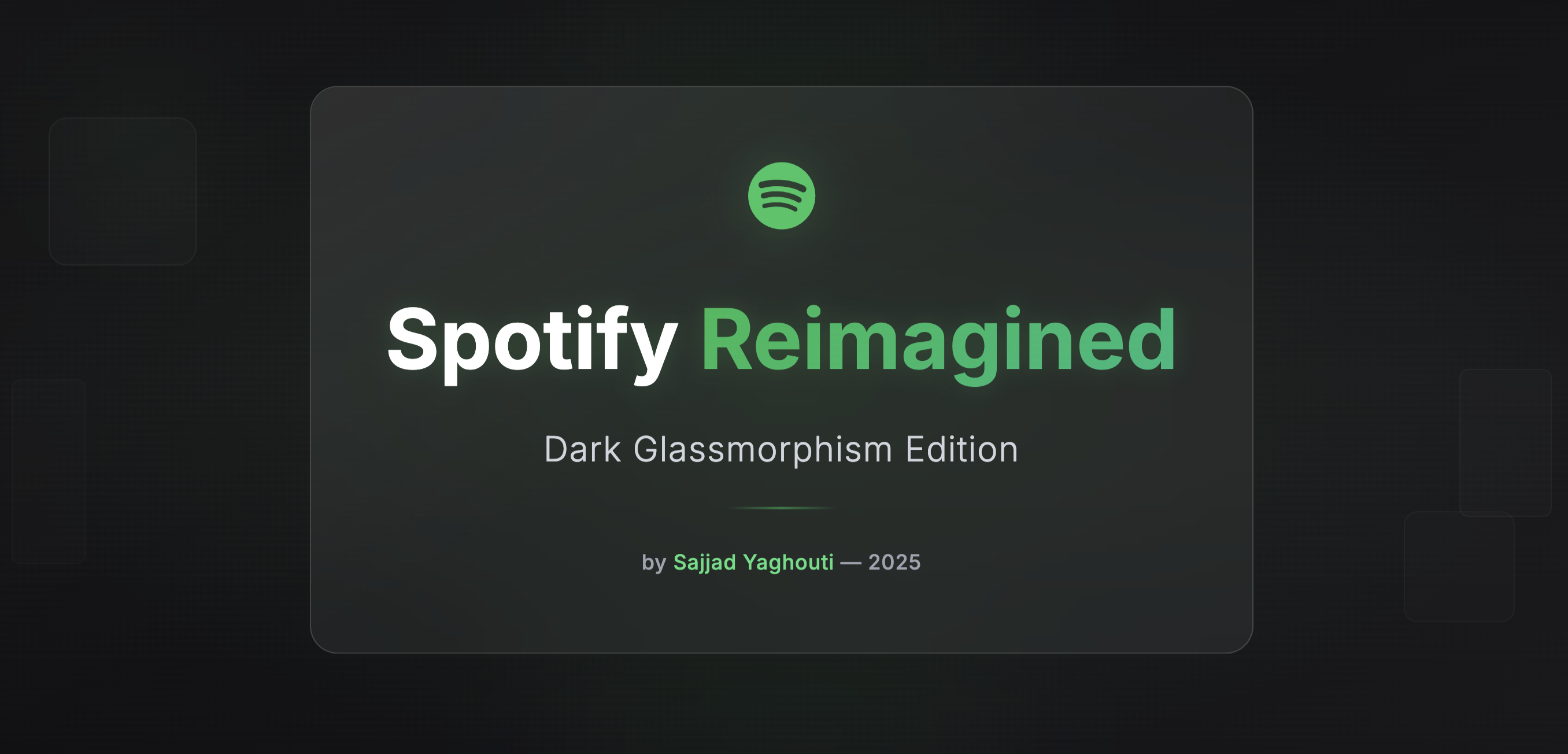
I chose Spotify because its structure is familiar yet full of room for improvement.
My goal was to reimagine it with a calmer, dark glassmorphic look that feels more emotional and focused.
The process started in UXPilot, where I built low-fidelity wireframes for the main user flow and then refined them into high-fidelity screens — all inside the same tool for consistency.
Each layout was tested and adjusted until the experience felt simple, clean, and cohesive.
AI Prompt Strategy:
Every screen was generated through structured prompts in UXPilot, using one shared design-system prompt for spacing, blur, and typography.
I refined the outputs by controlling blur depth (20–24 px), limiting glow intensity, and keeping type scales unified.
All wireframes, final UIs, and the exact AI prompts are available in UXPilot as part of the project documentation.
Challenges & Key Learnings:
Keeping a consistent visual rhythm across multiple AI generations was the hardest part.
I learned that well-structured prompts and early design-system tokens save hours of rework — AI can move fast, but it still needs a designer’s sense of balance and restraint.
------------------------------------------------------
UXPILOT PROMPTS – GLASSMORPHIC SCREENS
1. Welcome / Onboarding
Product Requirement: Spotify Glass – Onboarding
Purpose: Create a cinematic, glass-layered welcome experience.
UI Components:
- Centered Spotify logo with soft neon glow
- Headline: “Feel the Sound.”
- Subheadline: “Your music, beautifully redesigned.”
- CTA: “Get Started” (green gradient button with glass reflection)
- Secondary: “Log In” (outline white)
- Visual Style:
- Background #0E0E10 with radial light vignette; frosted glass card behind text; fade-in + up motion 300 ms.
2. Sign Up / Login
Product Requirement: Spotify Glass – Authentication
Purpose: Minimal frosted login for calm focus.
UI Components:
- Glass card (blur 24 px, radius 20 px) containing Email & Password fields
- Social login icons on translucent bar
- Primary button “Continue” (glowing green gradient)
- Subtext: “Forgot password?”
- Visual Style:
- Input background rgba(255,255,255,0.08); focus ring green glow; consistent 16 px spacing; soft drop highlight.
3. Home / Discover
Product Requirement: Spotify Glass – Home Screen
Purpose: Clean exploration hub with floating playlist cards.
UI Components:
- Top glass search bar
- Section headers: “Good Evening,” “Made for You,” etc.
- Playlist cards (semi-transparent panels showing album art)
- Bottom nav bar (glass panel with blur 20 px)
- Visual Style:
- BG #0E0E10; cards glass opacity 0.08; glow shadow; all spacing 16 px; active nav icon green.
4. Search / Explore
Product Requirement: Spotify Glass – Search
Purpose: Unified glass grid for genre discovery.
UI Components:
- Search bar (frosted glass, white icon)
- Category chips (gray inactive / green active)
- Genre cards with blur overlay + minimal photo tint
- Visual Style:
- Grid 2-column, card radius 16 px; hover brighten 5 %; consistent shadow depth.
5. Playlist Details
Product Requirement: Spotify Glass – Playlist View
Purpose: Showcase playlist art elegantly.
UI Components:
- Large header image behind blurred overlay
- Playlist title + description on frosted panel
- Play / Shuffle buttons (green gradient glow)
- Song list items (mini cover, name, artist)
- Visual Style:
- Background derived from art colors; glass overlay rgba(0,0,0,0.25) blur 24 px; consistent typography.
6. Now Playing
Product Requirement: Spotify Glass – Player Screen
Purpose: Immersive glowing playback.
UI Components:
- Full-screen album art behind translucent blur overlay
- Title + artist text centered
- Play/Pause/Next buttons on glass surface
- Progress bar (glow gradient green)
- Visual Style:
- Blur 28 px; subtle inner glow ring under buttons; motion = breathing pulse 3 s loop.
7. Queue / Up Next
Product Requirement: Spotify Glass – Queue
Purpose: Floating glass list of upcoming tracks.
UI Components:
- Title “Up Next”
- Glass list items with subtle dividers
- Current track highlight = green glow border
- Drag handles white translucent
- Visual Style:
- Background constant; opacity 8 %; consistent text hierarchy; row spacing 12 px.
8. Library
Product Requirement: Spotify Glass – Library
Purpose: Organize saved content in translucent cards.
UI Components:
- Tabs: Playlists / Albums / Artists / Podcasts
- List items (thumbnail + name)
- Sort dropdown
- Visual Style:
- Tabs highlight green underline glow; cards frosted; consistent blur 24 px; typography Inter 16 px.
9. Profile / Settings
Product Requirement: Spotify Glass – Profile
Purpose: Manage preferences with glowing toggles.
UI Components:
- Avatar + username
- Settings list (Notifications, Theme, About)
- Toggles (green glow active)
- Visual Style:
- Glass panels stacked; dividers subtle; consistent padding 24 px; animation fade-right 250 ms.
10. Mini Player / Persistent Bar
Product Requirement: Spotify Glass – Mini Player
Purpose: Maintain lightweight floating playback bar.
UI Components:
- Album thumb + song title + controls
- Tap to expand → Now Playing
- Visual Style:
- Floating blurred bar opacity 0.08; top border rgba(255,255,255,0.08); glow under active; smooth expand transition 250 ms.
From brief

Share
Reviews
2 reviews

Wow, how beautiful it is! I love the modern style, smooth effects, and strong contrast, it feels really fresh and well-balanced.
I’d fix a few small details. Please check the icon sizes on the “Your Library” page, especially in the “Liked Songs” and “Downloads” cards, as they seem a bit inconsistent. Also, the small text on the playlist page looks a bit weak, it might be due to the low contrast with the gradient background.
In the Preferences section, the switch buttons currently look the same even when they represent different states that might confuse users. Making the active/inactive states clearer would really help.
Other than that, I really like how the app looks and feels. Great job!

good job
You might also like

Smartwatch Design for Messenger App


Bridge: UI/UX Rebrand of a Blockchain SCM Product


Pulse Music App - Light/Dark Mode

Uxcel Halloween Icon Pack


Monetization Strategy


Designing A Better Co-Working Experience Through CJM

Product Thinking Courses

Ethical & Responsible Product Design

Product Vision & Strategy


Product Management Foundations