Spotify login

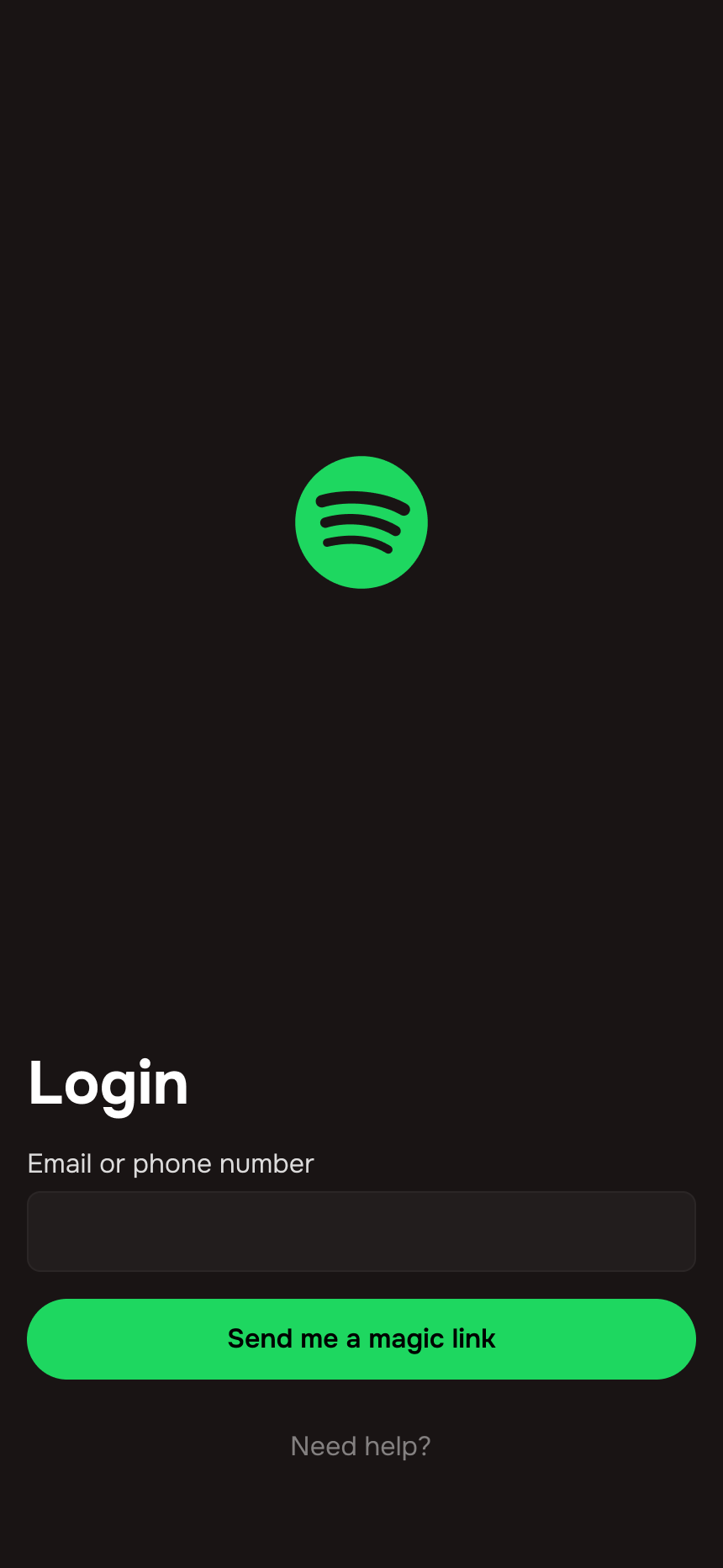
This is a simple login for Spotify. Since most users are almost always logged into their devices, they won't find it bothersome to open a text or check their email for a password link, rather than having to create and remember a password that they'll hardly ever need to use. Magic links are an efficient way of eliminating the need to create and remember a password.
- Interactive elements are located at the bottom of the screen so that they are within thumb range
- The Spotify logo is centered between the form and the top of the screen for better visual balance
- Input label is located outside of the input field and has sufficient contrast
- Input field has a light border for added visual clarity
- Input placeholder meets 4.5:1 contrast ratio
- Input field has sufficient padding for text input
- The button is styled appropriately for dark mode and meets brand color guidelines
- Microcopy is descriptive and accessible
- Users have access to support if needed

Reviews
3 reviews

Hello Samuel, great to see your showcase. In overall I think the layout and the position of inputs make sense. Your explanation for the design is also detailed. However, there are quite a few of things I think you could take into consideration:
- There's no page title or any signal so that the user could have immediate understanding of where he/she is. Is it login or signup?
- The placeholder text of the input field is duplicated from the field label, which is making the screen's information a bit overwhelmed.
- If the UI is following Spotify Design System, the CTA button should be in solid green and black text and it's even fully rounded.
- Be aware of appropriate information grouping by spacing. The CTA should be a bit closer to the above input field in order to be seen as one group. For now, the input field, the CTA button and the "need help" button seem like 3 different groups of information.
Hope this sharing could help you improve the design better :D

Try adding some social logins, like Google or Apple. Also, although the straightforwardness is great, the size difference could be diminutive. Try making the bottom elements (like the login field) a bit larger, and the "Send magic link" button more rounded.
The "Spotify" logo is a little bit uncentered as well.
Consider changing the login field text to "Enter your login details" or "Enter your login credentials" instead of "Enter your email and phone number" to not be repetitive.

This is a super clean and straightforward design, which I love.
The magic link approach makes total sense, no one wants to deal with passwords they barely use. The button placement is great for reachability, and the contrast and padding make everything easy to read and interact with. The "Need help?" link is a nice safety net too.
That said, a couple of things could make it even smoother.
Offering alternative login options (like Google or Apple) could make the process even faster for some users. Also, what happens if someone enters the wrong email or phone number? Some inline feedback would help avoid confusion. One small tweak, "Send magic link" could sound a bit more natural as "Send me a magic link." Feels more human.
You might also like

Events Managment App


Mobile Onboarding: Casa di Pasta


Accessible Signup & Login Experience — Brainex


Accessible Signup Form


Accessible Signup Form

WellNest

Visual Design Courses

UX Design Foundations


Introduction to Figma

Design Terminology
