Sports Streaming Platform Buttons

I wanted to model this project as a streaming platform for NBA; specifically designed for TVs.
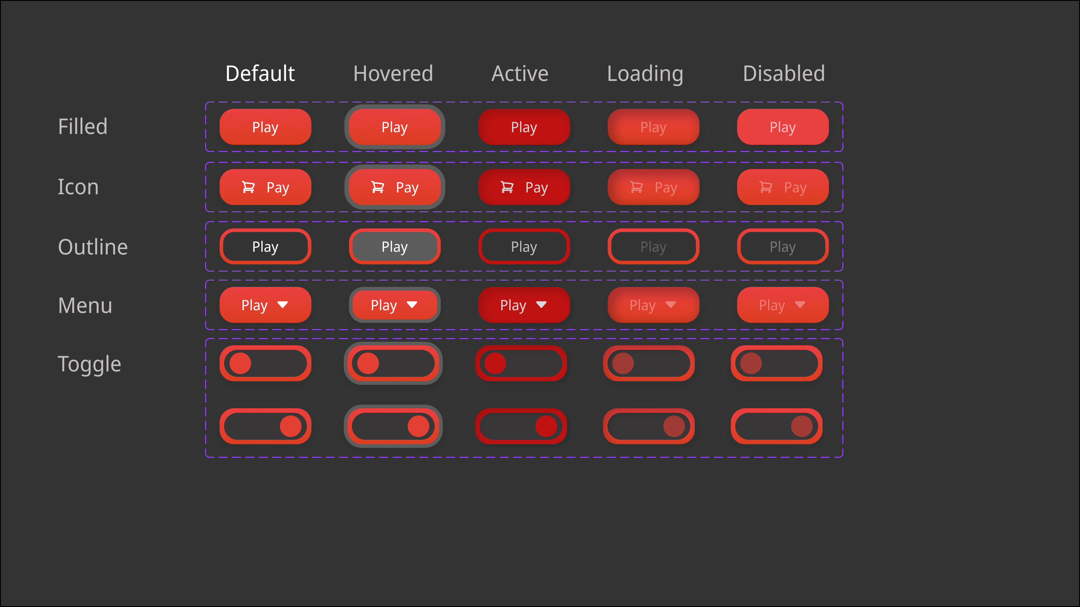
Many variants (as rows) and states (as columns) are present to account for the many different scenarios in which these buttons may be used. Specifically,
- Loading and Disabled states are similar; I don't really know how to differentiate them but since loading usually occurs after a user action I doubt this would be an issue. Regardless I'm open to suggestions :)
- I added Toggle buttons as it was suggested in the how to design buttons page.

Reviews
1 review

Hi Eren! Thank you for posting your project. This is a good first step in designing UI.
I suggest learning more about WCAG accessibility standards- as the foreground white and background red in your default, hovered, loading, and disabled states do not meet AA compliance. I think using a higher contrast color for the background of your buttons would be helpful, and using white or another color could better differentiate different states in your toggle buttons.
Overall a great project! Good work.
You might also like

Loginino


Notification microcopy - Project


El Mandoub-GovTech App


MalishaEdu Counselor Workspace


Goal Creation Flow


Portfolio website

Visual Design Courses

UX Design Foundations


Introduction to Figma

Design Terminology
