Spodnium - Eco-fashion service landingpage


In response to the growing demand for sustainable fashion solutions, Spodnium emerges as a beacon of eco-conscious style and personalized wardrobe curation. As a UI / UX designer, I embarked on crafting a captivating landing page tailored to engage users, communicate the essence of our service and foster seamless navigation.
Design approach:
In crafting the landing page, I adhered to a modern, minimalist aesthetic, mirroring Spodnium's brand ethos. Leveraging the harmonious blend of green primary hues, beige shades (secondary colors) and accentuating coral tertiary tones, the design fosters a sense of serenity while subtly signaling our commitment to sustainability. Typography plays a pivotal role, with the bold presence of Koulens for headings and buttons, juxtaposed with the crisp clarity of Nunito Sans for body text and captions, ensuring optimal legibility and visual hierarchy.
Interactive elements:
The submission features interactive wireframes and prototypes to enhance user engagement, offering a dynamic preview of the seamless user experience awaiting visitors to the Spodnium platform. Through intuitive navigation cues and strategically placed calls to action, users are beckoned into a world where sustainability meets style effortlessly.
The Spodnium landing page epitomizes the fusion of sustainability and style, beckoning users into a realm where conscientious consumption meets sartorial splendor.

Reviews
4 reviews

I absolutely love the way this project was prototyped. Almost everything I wanted to click actually had an interaction. Michalina is obviously an expert in Figma. One thing I found could be improved is the styling of the calls to action. It is hard for me to distinguish which one of the red or green buttons are the primary buttons, since both are strong colors. There are also instances where the green button gets lost in an also green background. Overall, great work!

I'm really loving your landing page! It grabs attention right away with a clear and compelling value proposition, and the visuals, structure, and copy all work together beautifully. You've done a fantastic job making everything feel welcoming and engaging.
That said, there's a little room for tweaking the visual hierarchy to make it even better. Right now, it feels a bit overwhelming because everything — headings, call-to-action buttons, and text — seems to compete for attention. This can make it hard for visitors to know where to focus first. Maybe playing around with different sizes, colors, or fonts could help distinguish these elements from one another a bit more. This way, visitors can easily spot what’s most important and navigate your page more intuitively.
Your design is visually fresh, green and captivating. This is in line with your product vision. Your UX writing enhances the user experience.
Your document illustrates well your design thoughts. Awesome!
The prototype works well enabling audiences to understand your design better and more effectively.
Surely, there is always rooms to improve in design. Would be more excellent if possible to consider for example the following aspects:
- Accessibility design: Currently, some button labels and background color contrast desires more contrast
- Mild and soft shadows would appear better to eyes
- Fonts combinations
- Hierarchies
Overall, I like your design work. Brilliant!
Overall its looks good,
Few things can be improved like.
- Font Pairing not going well with the design also it would have been great with a combination font.
- Shadow seems harsh, keeping it soft also not necessary to shadow everywhere.
You might also like
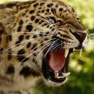
💊 Healthcare Desktop & Mobile App UX/UI Design

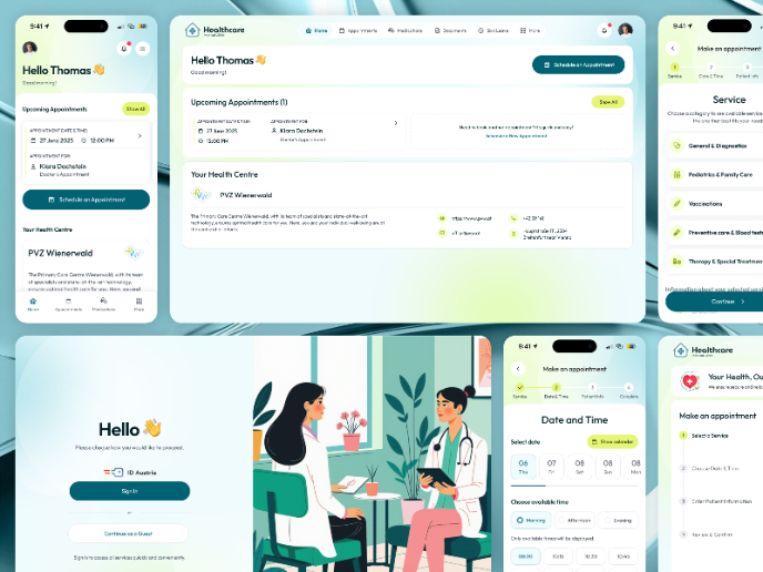
Fitness Challenges App

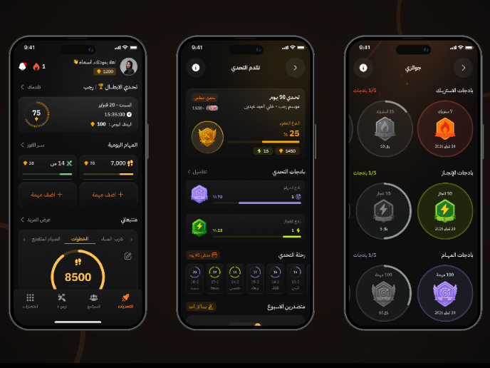
Personal Wellness Dashboard


Events Managment App

SaaS Signup Design


Customer Journey Map — Offsite Co-Working Experience
Content Strategy Courses

UX Writing


Common Design Patterns


Building Content Design Systems
