SouLingo: AI-Powered Voice Learning Platform

Excited to share the landing page design for SouLingo, an AI voice learning platform that helps users perfect their pronunciation! 🎙️✨
Reviews
5 reviews

Great job, Enes! This looks really impressive—I love how you achieved a dark background without relying on harsh or flat dark tones.
One small suggestion: You can try muted accent tones and maybe you could experiment with text hierarchy a bit more by varying the opacity or shades of white in the body text. That way, it won’t feel too uniform or rigid across all sections.

Really cool concept for Soulingo – AI-Powered Voice Learning Platform! The UI feels modern and engaging, with a clean layout that keeps things intuitive. Love the emphasis on voice learning. Maybe ensuring strong contrast between text and background in key areas could enhance readability, but overall, great work!

Hi Enes,
Soulingo has such a fresh and engaging design! The clean layout makes navigation effortless, and the focus on voice learning is seamlessly woven into the experience. Fine-tuning the contrast between text and background in key areas could further enhance readability and usability. Great work—keep pushing your ideas forward!

Amazing job, I really liked the whole design and how well you combined all the elements on the page!

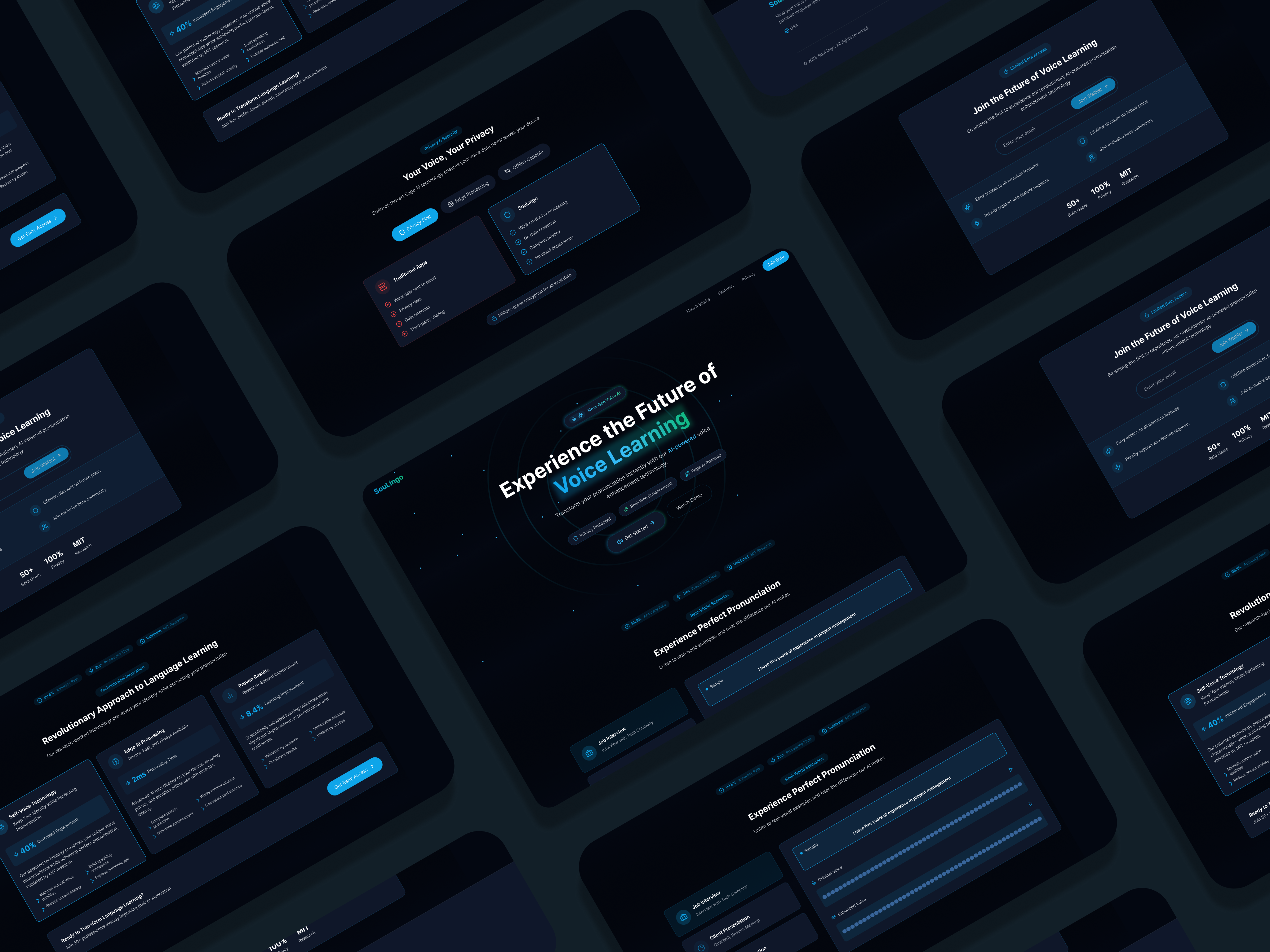
The cosmic dark theme is executed beautifully! You've managed to create depth with that starry background without falling into the trap of flat, harsh blacks that many dark UIs suffer from. The gradient blues add a sense of immersion and technology that aligns perfectly with an AI-powered voice learning product.
The information architecture flows naturally, guiding users through the value proposition, key features, and metrics that build credibility (85% accuracy, 2.3s response time). I especially like the visual demonstration of the voice learning interface in the middle section – it gives users a clear preview of what they're signing up for.
Those metrics displays with the circular progress indicators are a nice touch! They communicate technical benefits in a visually appealing way that non-technical users can immediately grasp.
Suggestions for Improvement:
While the design is strong overall, here are a few thoughts that might help elevate it further:
- Text Hierarchy: You could experiment more with varying the opacity or shades of white in the body text. Right now, there's a somewhat uniform brightness across different text elements. Creating more distinct visual hierarchy through text treatment would help users scan content more efficiently.
- Contrast in Key Areas: While the dark theme looks sleek, ensure there's enough contrast between text and background in all sections, particularly in the feature descriptions. Some of the light blue text might be challenging to read for users with visual impairments.
- Call-to-Action Emphasis: Your primary CTAs ("Get Started" and "Early Access") look good, but you might consider making them slightly more prominent or adding subtle animation effects to draw more attention to these conversion points.
Summary:
Overall, this is a polished, professional landing page that effectively communicates SouLingo's value proposition. The dark cosmic theme creates a modern, tech-forward impression while the clear section organization makes the product benefits easy to understand.
With just a few tweaks to text hierarchy and contrast, this design will be truly exceptional! Great work on creating a compelling digital home for an innovative product. 💪🫡
You might also like

Pulse — Music Streaming App with Accessible Light & Dark Mode


Islamic E-Learning Platfrom Dashboard

SiteScope - Progress Tracking App


FlexPay


Mobile Button System


CJM for Co-Working Space - WeWork

Popular Courses

Information Architecture


UX Design Foundations


Introduction to Figma