SocioFortaleza Sign Up Page Acessibility Optimization

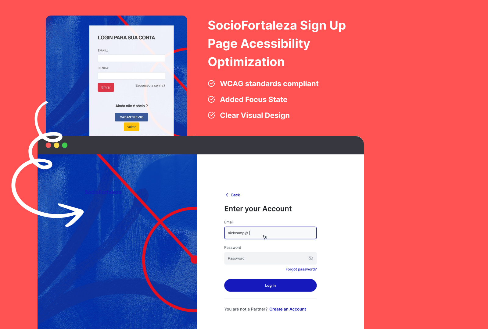
Overview: This project focused on optimizing the accessibility and enhancing the user experience of the SocioFortaleza login screen. The original design had accessibility issues that could negatively affect user interaction, particularly for those with disabilities.
Key Issues Identified:
- Color Inconsistency: There are many colors being used across different buttons (for login, sign up and go back).
- Input Placeholders Visibility: The "Email" and "Password" input fields lack assistance.
- Password Hide/View Visibility: The password field lacks visual indicators regarding requirements (e.g., special characters, length) until an error occurs, leading to potential frustration and higher error rates.
- Focus and Error States: The design doesn’t appear to have prominent focus indicators, making keyboard navigation harder for users relying on screen readers or tab navigation. Similarly, the error messages might not stand out enough for quick user recognition.
Implemented Solutions:
- Color Inconsistency: We could use only 1 color as interactive color. This will reduce the cognitive load for users and create a consistency for the product.
2. Input Placeholders VIsibility: It was added placeholders, potentially helping users with visual impairments or cognitive difficulties in distinguishing form fields.
3. Password Hide/View Visibility: It was added a Eye Toggle that will help users to check their password in real time and avoid possible error and frustration.
4. Focus Indicators and Error State Visibility: Added clearer focus indicators to help keyboard and screen reader users navigate forms more easily. Also, improved the visual hierarchy of error states with color contrast and icons, ensuring quick identification and resolution of form errors.
Conclusion: This redesign illustrates the importance of integrating accessibility and user experience into every stage of the design process. By addressing key issues like contrast, field clarity, and real-time feedback, the login page was made more inclusive and user-friendly. These small but meaningful changes can greatly improve the experience for all users, including those with disabilities.
Tools used
From brief

Topics
Share
Reviews
2 reviews

This was great! Good job!
Using a single interactive color improves consistency and reduces cognitive load, especially for users with visual impairments or cognitive disabilities. This change enhances visual predictability and helps users focus on key actions like login and sign-up.
Ensure that the chosen color for interactive elements complies with WCAG 2.1 AA standards for contrast (minimum contrast ratio of 4.5:1 for normal text and 3:1 for large text or graphics). It's important to also account for users with color blindness by providing alternative cues (e.g., icons or text labels). You could've visualize or written about it in your description. Basically a Before & After shoot that could showcase a story with Old = "Non-compliant" to Your design = "Being compliant".
Ensure placeholder text is distinguishable enough from form data, using good contrast so that it doesn’t blend into the background. From where I'm looking, I don't think the contrast is enough in its current state.
Consider implementing error messaging with contextual tips (e.g., “Password must include at least one number”) directly below the input field as users type. This will proactively prevent mistakes instead of solely displaying errors after submission.
Ensure error messages are announced by screen readers, so they are accessible to users who rely on assistive technology.
Run automated and manual accessibility tests (e.g., Lighthouse, Axe, or WAVE) to verify the effectiveness of changes. These tools can provide detailed feedback on color contrast, screen reader compatibility, keyboard navigation, and more. Might be hard to do this in Figma, but you can tell a story about it in your description/case study in order to showcase for a future employer that you are applying a holistic approach when designing.
The overall case study highlights a thoughtful approach to improving accessibility while maintaining a clean and functional design. The changes made address fundamental accessibility barriers and significantly enhance the login experience for all users.
Good job! Keep up the great work!

Hey Nicholas, it's a completely improved revamp from the original design of SocioFortaleza login screen. It's nice to see that you also included button states and mobile version of the design in Figma file.
Some suggestions for improvements:
- Let's user more concise language for the title. For example, using "Login your account" instead of "Enter your account". Currently it's a bit confused with Sign up screen if the user does not look at the button "Log in" beneath.
- What if the user want to clear the inputted email. Should we have a "Clear" Icon in the typing input field? That's would more accessible for people who would like to use "Tab" key for navigation for voice command.
- I can see the the demonstrated error states
- The Brand name in blue color is almost blended into the background of the left visual! That lacks a lot of contrast yet visual hierarchy.
That's still a good improvement overall. Keep up the great work, Nicholas.
You might also like

Smartwatch Design for Messenger App


Bridge: UI/UX Rebrand of a Blockchain SCM Product


Pulse Music App - Light/Dark Mode


Monetization Strategy


Designing A Better Co-Working Experience Through CJM


Design a Settings Page for Mobile
Visual Design Courses

UX Design Foundations


Introduction to Figma

Design Terminology
