Slack Color System

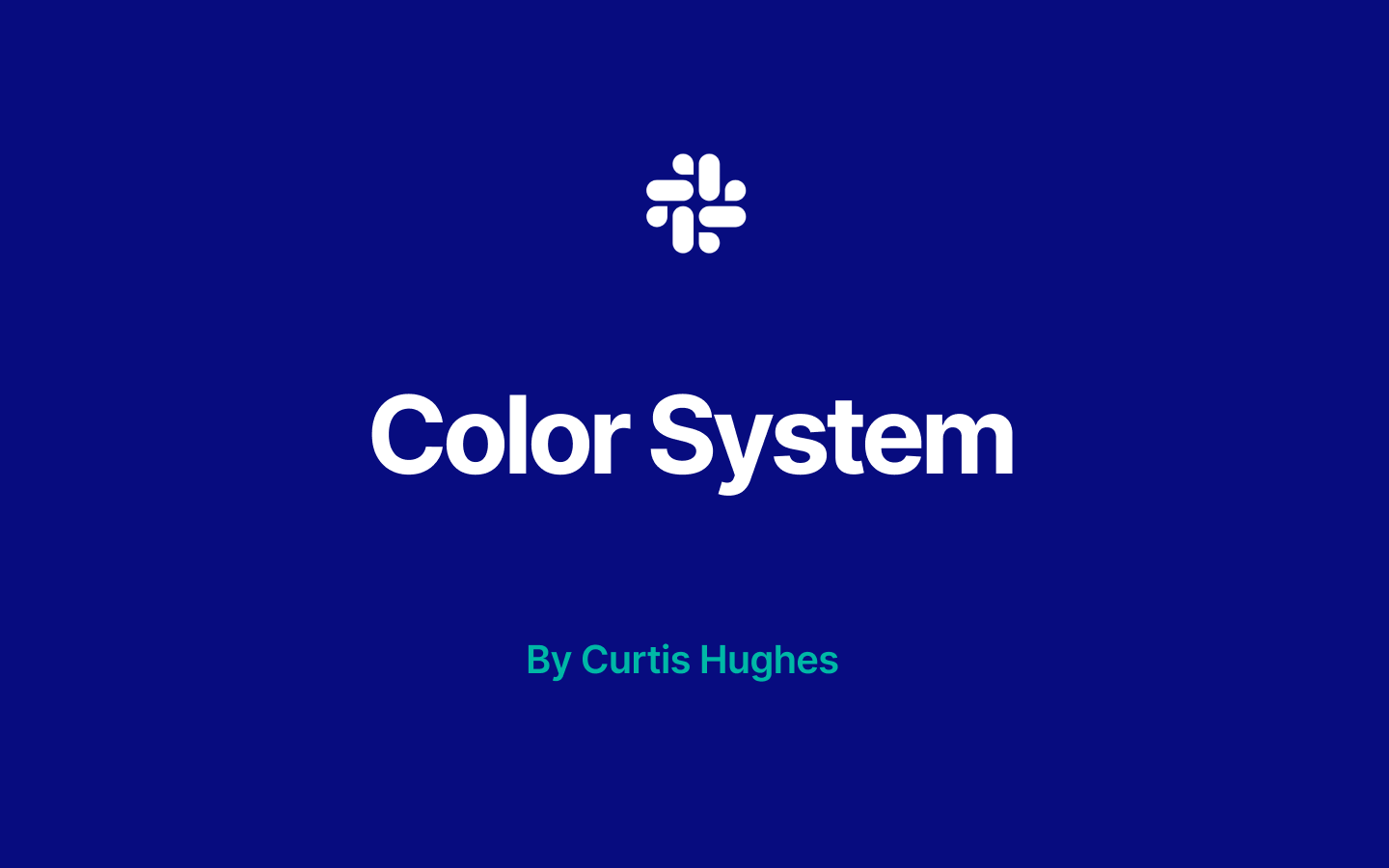
In crafting the design system for Slack, I've introduced modern vibrant tones in the foreground, accented by shades of greens and apricots, aimed at drawing attention to interactive elements.
The vibrant yet not overpowering greens infuse the design with sophistication and calming energy, inviting users to engage, while the apricots and muted yellows serve to ground them, creating a conducive environment for deep concentration and focus. These colors work together harmoniously, avoiding visual overload and ensuring a balanced experience for the user.
Moreover, the design prioritizes accessibility, with high contrast ratios ensuring legibility for all users. This visual approach not only fosters a welcoming space but also injects a modern, vibrant energy into anyone's workday.

Reviews
1 review

Hey Curtis!
Nice work on the presentation!
I think overall the color system is bright and colorful and conveys the message you laid out in your presentation.
I have some feedback for you to consider:
- Depending on the context, some of the more vibrant or saturated colors could cause eye strain on some users and potential conflict between your primary and secondary color elements. Consider slightly reducing the saturation and introducing some dark values. This will also help more with accessibility :)
- I would love to see some examples of the tertiary colors being used. Consider designing some screens where that is used as well. Currently, it's unclear where this color would be used
- Consider making each slide deck clickable as some viewers may not know how to proceed to the next slides :)
Overall great work!
Keep on learning and designing!
You might also like
SaaS Signup Design


Events Managment App


Customer Journey Map — Offsite Co-Working Experience


Mobile Onboarding: Casa di Pasta


Accessible Signup & Login Experience — Brainex


Accessible Signup Form

Visual Design Courses

UX Design Foundations


Introduction to Figma

Design Terminology
