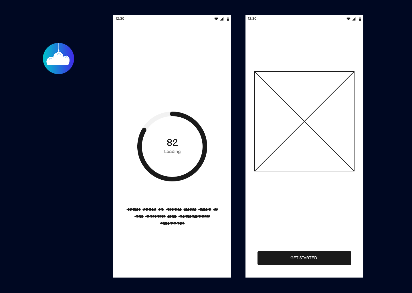
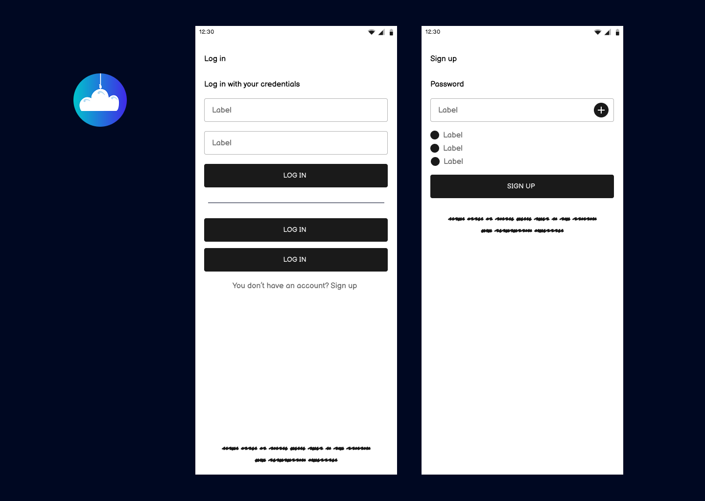
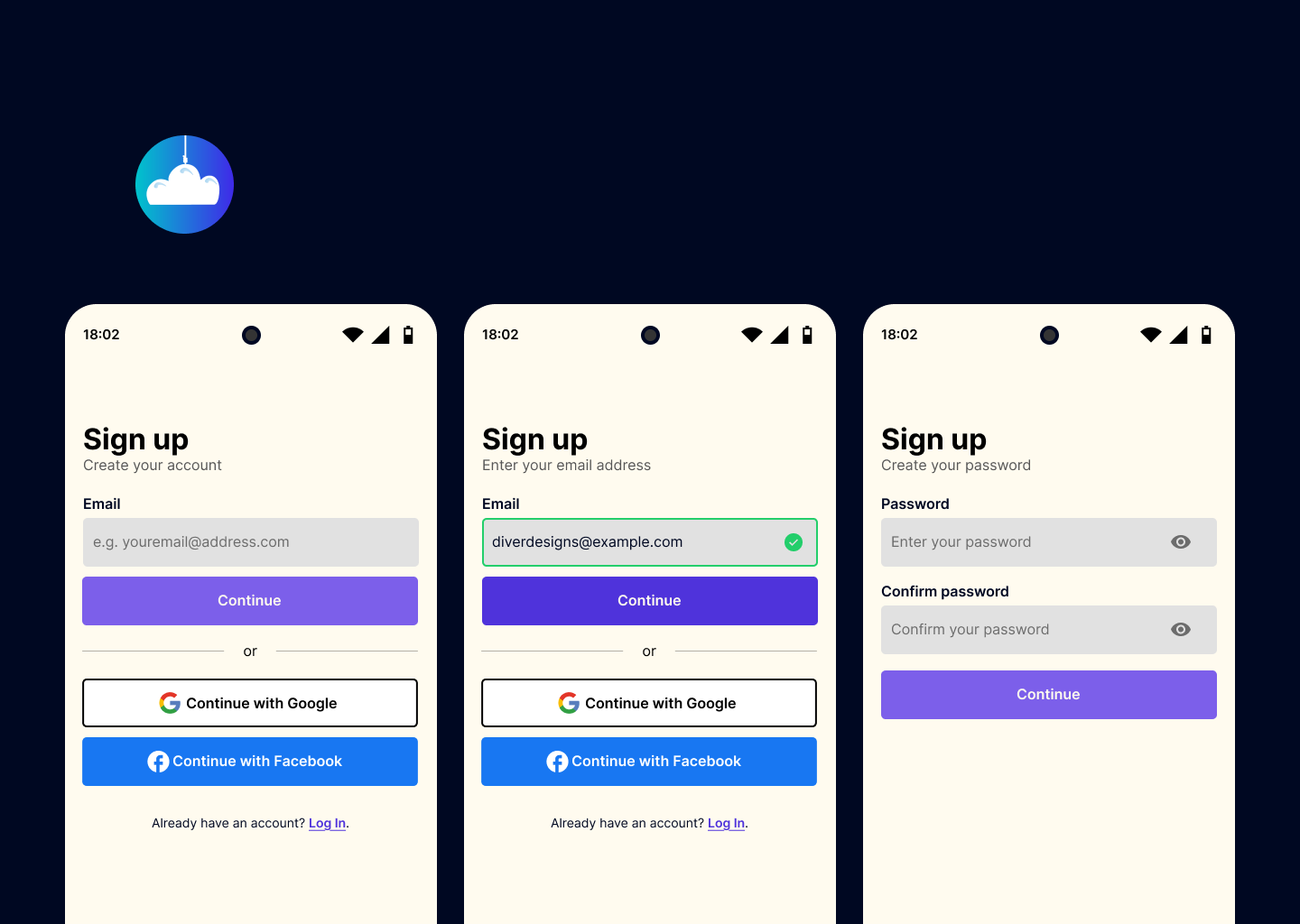
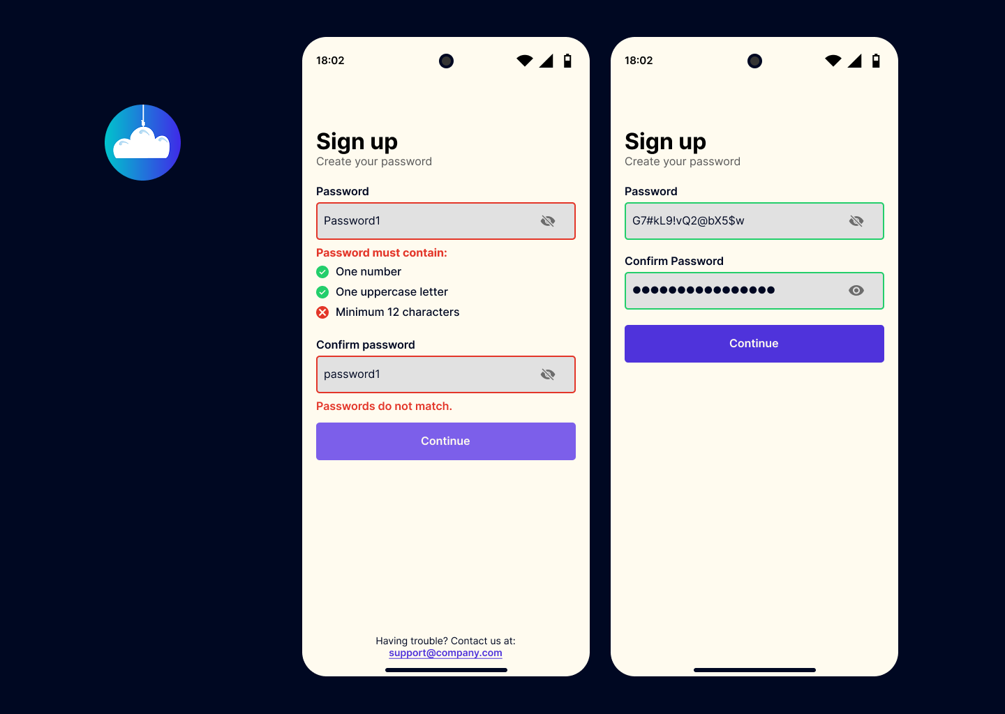
Sign Up Process

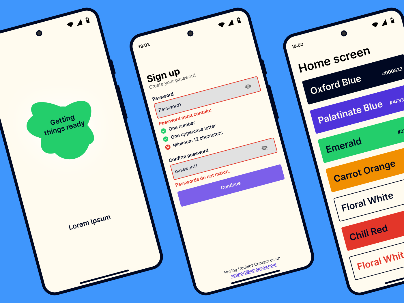
The sign up and log in pages of my app.


Reviews
2 reviews

Hey Norbert,
Nice job on your submission. I really like how friendly and inviting everything looks. Also, special mention for the effort you put into your presentation—it’s well-structured and engaging.
You should consider prototyping this project—it would go a long way in communicating your vision more effectively. Right now, readers have to compare screens and imagine the flow, whereas a prototype would make interactions much clearer. Also, great job showcasing your design process—that adds a lot of value. In terms of brief requirements, you did well.
A Few Tips to Elevate Your Work Even Further:
- Title & Subtitle Spacing: A bit more space between them would improve readability.
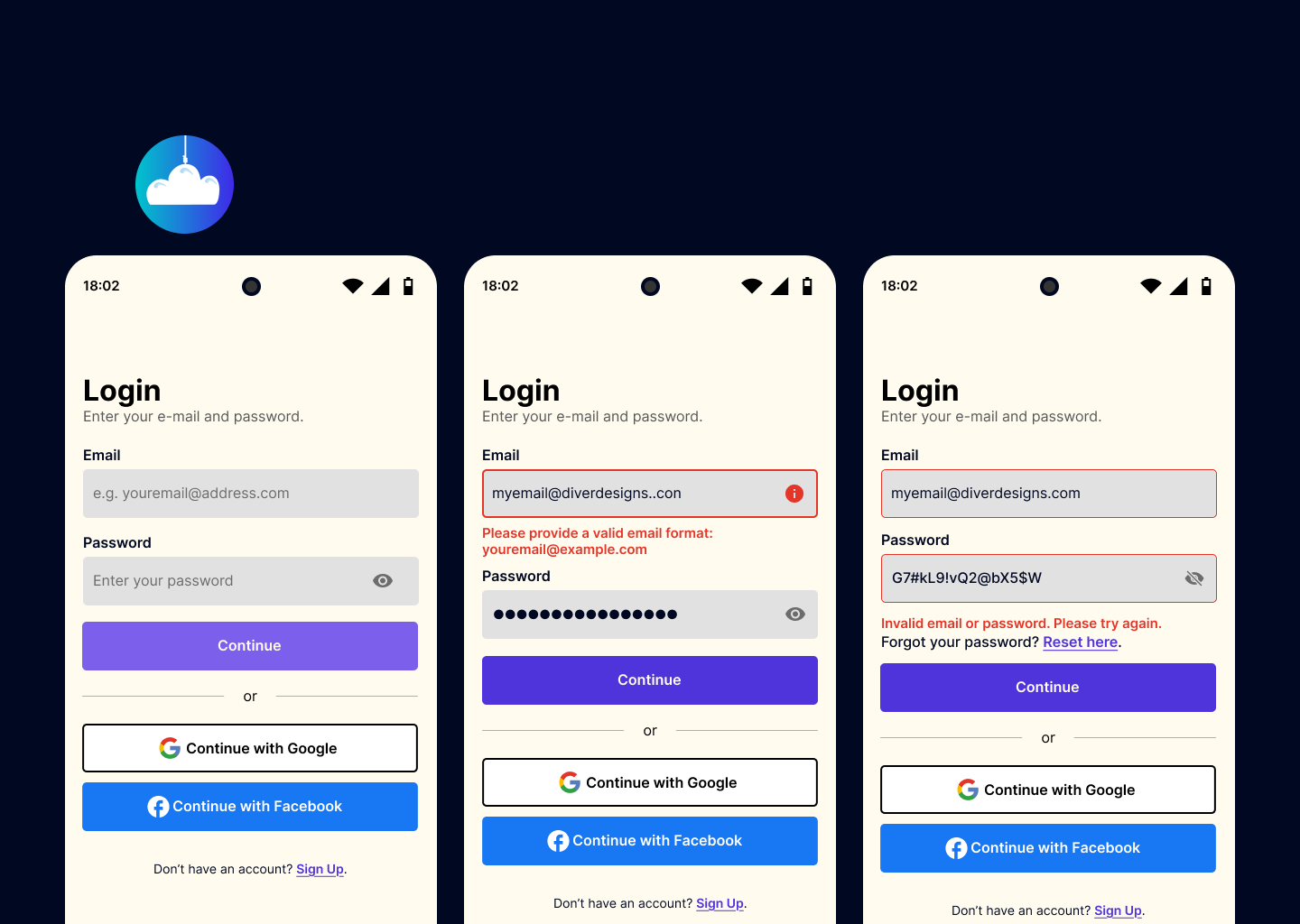
- Password Hint: The "e.g." isn’t needed—the demo address alone works fine, as this is a common convention users already understand.
- Facebook Icon Spacing: Not sure if this comes from the Meta media kit, but the FB icon looks a bit too close to the button label—some extra padding would help.
- Create Password Screen: It’s always better to display password requirements upfront instead of only showing them when an error occurs—this small change greatly improves UX and user confidence.
Nice work overall. Keep refining and experimenting!

Your signup process and design are well-structured, demonstrating strong usability principles. However, there are a few areas that could lead to friction for users. Below are key observations and recommendations based on usability research and best practices.
1. Signup Process: Areas for Improvement
🔹 Email Verification Feedback Could Be Clearer
- There is no explicit feedback after the email entry regarding whether verification is needed or if the email is already in use.
- Recommendation: Add a message indicating if the email requires verification or is linked to an existing account. This aligns with Jakob Nielsen’s "Visibility of System Status" principle and reduces confusion.
🔹 CTA Button Behavior is Inconsistent
- The “Continue” button is sometimes enabled with empty or invalid fields, while other times it is disabled.
- Recommendation: Ensure consistency by keeping the button disabled until all fields are valid. This follows Fitts’ Law, which emphasizes clear action cues to guide users.
🔹 Password Entry Could Be More User-Friendly
- Some password fields have an eye toggle for visibility, while others do not.
- Recommendation: Maintain consistency by including the eye toggle on all password fields. Studies show that users are more likely to enter passwords correctly when they can see what they’re typing.
2. Design & Presentation Feedback
🔹 Text Density in Some Slides is High
- Large blocks of text reduce readability and may overwhelm viewers.
- Recommendation: Use concise bullet points and visual hierarchy to highlight key takeaways. This aligns with Cognitive Load Theory, which suggests reducing unnecessary complexity.
🔹 Contrast in Error Messages Could Be Improved
- Certain error messages have low contrast, making them harder to read.
- Recommendation: Ensure text meets WCAG 2.1 AA contrast standards for readability. Tools like WebAIM Contrast Checker can help validate accessibility.
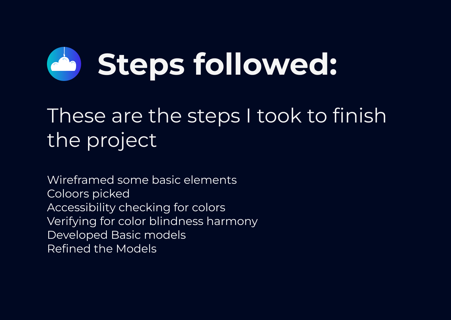
3. Wireframes: Areas for Refinement
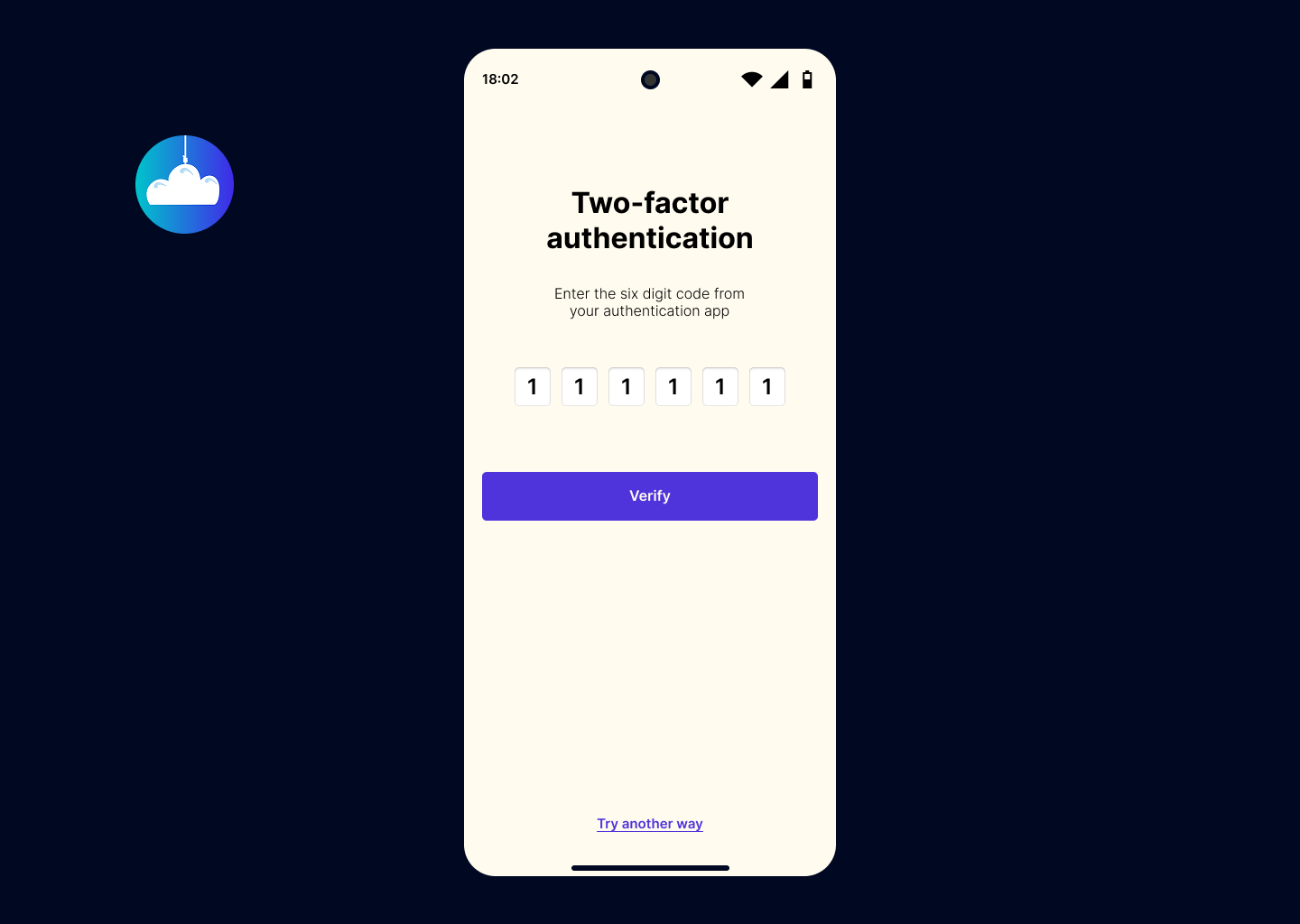
🔹 Lack of Interaction States
- Wireframes effectively outline layouts but do not show hover, focus, or disabled states.
- Recommendation: Add state-based wireframes to represent different interactions. UX research suggests that interaction clarity reduces user uncertainty by 32%.
Your design is strong, but improving feedback mechanisms, ensuring button consistency, and enhancing accessibility will create a smoother user experience. These refinements will enhance usability, making the signup process more intuitive and user-friendly.
You might also like

Improving Dating App Onboarding: A/B Test Design

FORM Checkout Flow - Mobile


A/B Test for Hinge's Onboarding Flow


Accessibility Asse


The Fitness Growth Engine

Uxcel Halloween Icon Pack

Visual Design Courses

UX Design Foundations


Introduction to Figma

Design Terminology
