

Reviews
4 reviews

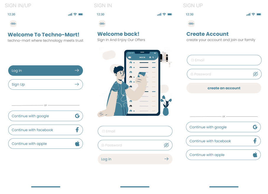
Congratulations on the project, Fatma. The illustrations communicate the brand identity very well. One important point to keep in mind is the visual weight of these illustrations within login and signup forms. In these flows, it’s important not to compete for the user’s attention. Bringing more focus to the login inputs could help reduce cognitive load and improve usability. Overall, it looks great — congratulations!

This is a good start! The UI is clean, the colors are aesthetically pleasing, and information hierarchy is clear.
However, the presentation is a bit confusing since there's not really separation between the screens. Also, there does not seem to be an option for users that forgot their password or any inline error / success messages considered for users creating a new password.
I also would have liked to see more of the process (research, design rationale, ideation, etc.) to consider this a polished case study.
Keep it up! I definitely see a lot of potential here.

Hi Fatma!
When I look at this sign-in / sign-up flow, what stands out to me is the restraint. It feels calm, and that’s important. Authentication screens are moments of commitment users are either trusting you with their data or deciding whether they should. Keeping the interface simple and focused shows maturity.
I also appreciate that the structure seems intentional. The hierarchy appears clear, and the flow doesn’t try to impress with unnecessary visual noise. That’s a good instinct. In my experience, strong auth design isn’t about creativity it’s about removing hesitation and reducing cognitive load.
If I were mentoring you on this, I’d encourage you to think even deeper about emotional reassurance. Small details like supportive microcopy, helpful error feedback, and visible security cues can transform a “functional” auth flow into a trustworthy one. Overall, this feels solid and grounded a good foundation built with the right priorities.

Nice, clean mobile flow Social sign-in options are easy to scan, and the password visibility toggle is a good usability touch
You might also like

Pulse — Music Streaming App with Accessible Light & Dark Mode


Islamic E-Learning Platfrom Dashboard

SiteScope - Progress Tracking App


Mobile Button System


FlexPay


May.Da.Ma Candles & more

Visual Design Courses

UX Design Foundations


Introduction to Figma

Design Terminology
