Seeded - Argicultural Catalog Page


Design decisions
1. Prioritizing user urgency and value
- The Decision: To place a high-visibility promotional banner with a countdown timer directly below the main navigation.
- The "Why": This immediately grabs the user's attention. The "25% Discount" is a clear value proposition, while the countdown timer creates a sense of urgency. This psychological trigger (known as FOMO or "Fear Of Missing Out") encourages users to make a purchase decision more quickly, boosting conversion rates.
2. Enabling effortless product discovery
This design brilliantly caters to two types of users: those who know what they want, and those who are browsing.
- The Decision (For Browse Users): A comprehensive and particular filtering system in the left sidebar.
- The "Why": The target audience (farmers, agriculturalists) has particular needs. Generic filters wouldn't work. By including relevant categories like "Crop Type" and "Soil Condition", the design shows a deep understanding of the user's workflow. This builds trust and makes a potentially huge catalog feel manageable. The accordion-style collapse keeps it from feeling overwhelming.
- The Decision (For Goal-Oriented Users): A prominent and simple "Search products" bar at the top of the content area.
- The "Why": This is the fast lane for users who already know they need "corn seeds" or a "specific tractor part." It respects their time and provides the most direct path to the product.
3. Designing for scannability
The product cards themselves are a masterclass in providing just the right amount of information.
- The Decision: To use a card-based layout where each card contains an image, category, name, rating, price, and clear calls-to-action (CTAs).
- The "Why": Visual Hierarchy: The image is the largest element, as visuals are key. The price is bold and clear. This allows users to scan the page and compare items.
- Building Trust: The star rating and review count provide social proof. A user is much more likely to trust a product that others have purchased and rated highly.
- Clear Actions: The primary CTA "
Add to cart"is visually distinct. The secondary action "More like this" isa brilliant way to aid discovery and keep users on the site if a particular item isn't quite right.
4. A Clean, thematic, and trustworthy visual identity
- The Decision: To use a clean layout with lots of white space and a green accent color.
- The "Why": The uncluttered design makes the page feel professional and easy to navigate, reducing cognitive load. The color green is intentionally chosen to align with the "Seeded" brand and the themes of agriculture, nature, and growth, creating an immediate and subconscious connection with the user.

Reviews
1 review

Nice job on the Seeded Agricultural Catalog Page! The layout is clear and easy to navigate, with a nice balance between product visuals and info. The earthy color palette fits the theme really well. Maybe try tightening up the text alignment or adding subtle hover effects for a bit more interactivity—but overall, clean and functional design! 🌱
5 Claps
Average 5.0 by 1 person
You might also like

Project
eWallet App Development Project

✨ Experience the future of digital payments with our innovative eWallet App design! Our concept combines powerful fintech capabilities with
Project
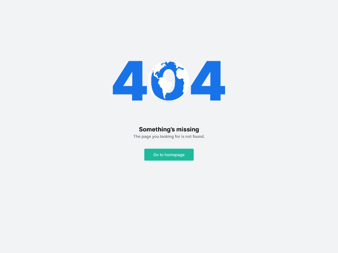
Design a 404 Error Page

Showcase your skills in designing a succinct, useful, and inclusive 404 error page that is in line with a brand voice and style.

Project
🖥 Desktop Checkout Flow Design

Designing a friction-free checkout experience to reduce cart abandonment 1️⃣ Project ContextAs part of the product design team for an e-comm

Project
Website CRM Dashboard

When designing the DataPollex CRM dashboard, the core question I kept asking was: what does a person actually need to do in the first 60 sec
Project
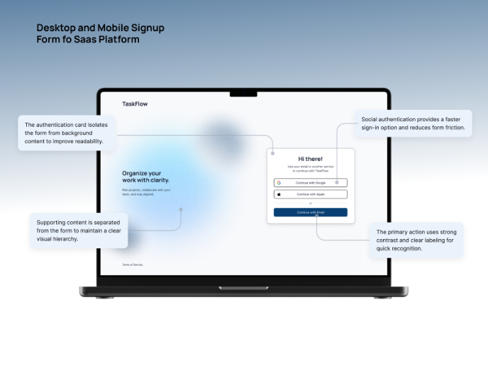
TaskFlow Authentication Flow

This project presents an accessible authentication flow designed for a SaaS platform called TaskFlow. The interface was designed with WCAG 2

Project
Helpful 404 Error Page for a Fintech Mobile App

Project ContextError pages are often overlooked in product design, yet they play an important role in maintaining trust and guiding users wh
Visual Design Courses

Course
UX Design Foundations

Learn UX design fundamentals and principles that create better products. Build foundational knowledge in design concepts, visual fundamentals, and workflows.

Course
Introduction to Figma
Learn essential Figma tools like layers, styling, typography, and images. Master the basics to create clean, user-friendly designs

Course
Design Terminology

Learn UX terminology and key UX/UI terms that boost collaboration between designers, developers, and stakeholders for smoother, clearer communication.