Sease E-Commerce Log In/Sign Up Form | Project Brief
Design Objective
The goal of this project was to create an accessible and intuitive login/signup experience for Sease, a SaaS e-commerce platform. The design prioritizes minimalism, accessibility, and usability, ensuring inclusivity for all users while maintaining a professional and modern aesthetic.
Design Features:
Minimalist Visual Theme:
A black-and-white palette was selected to enhance contrast and readability, aligning with accessibility standards. The choice also reflects inspiration from widely used login pages, balancing simplicity with functionality. Whenever I used other colors, I made sure that the contrast is correct, which leads me to...
WCAG Accessibility Compliance:
All elements meet contrast ratios of 4.5:1 and 7:1, ensuring readability for users with various visual impairments.
Tested using accessibility simulators for:
- Eye strain and light sensitivity.
- Slight to severe visual impairments.
- Red-green color impairment and total color blindness.
(represents total color blindness; slight visual acuity; eye strain and light sensitivity in the respective order)
Usability Enhancements:
Social sign-in options (Google, Apple, Facebook) were included to reduce interaction costs and simplify the sign-up process.
A seamless user flow from login to sign-up was achieved by adding intuitive navigation prompts like the “Don’t have an account? Sign Up” button.
While error and success states for the input fields were considered, they were not included in the final mockup for this submission.
Typography and Layout:
The Satoshi font was chosen for its simplicity and readability, enhancing the clean and professional design.
Standardized spacing ensures a balanced and user-friendly layout across mobile and desktop devices.
Presentation and Interaction:
Created in Figma, the project includes interactive prototypes that allow users to test the flow. Access the interactive design by clicking the “Full Project” button within the submission platform.
Tools used
From brief
Topics
Share
Reviews
1 review
Hello Wiktor,
I hope you're doing well. I have a couple of suggestions to make:
- If you place the "Already have an account?" section at the bottom of the screen, where it's easily reachable when using a mobile phone, it will enhance accessibility. This placement is often used as a best practice in mobile design. You can refer to the best practices mentioned in the article I shared.(https://uxdworld.com/12-best-practices-for-sign-up-and-login-page-design/)
- If you increase the spacing between sections and follow a grouping logic, the design will appear neater and more organized, making it easier to understand which details belong to which section. I recommend taking UX Laws courses to gain more insights into this.
Implementing these suggestions can make your design more functional and user-friendly.
You might also like
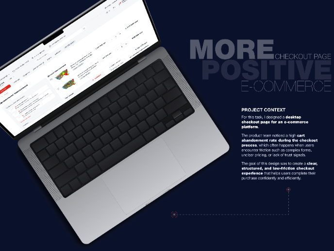
🖥 Desktop Checkout Flow Design
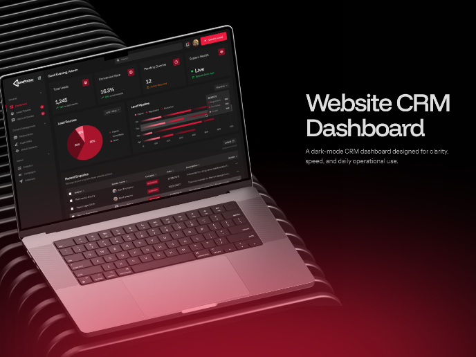
Website CRM Dashboard
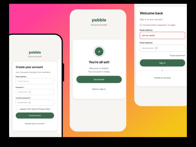
Pebble Accessible SAAS Signup Flow
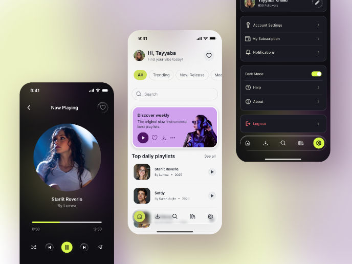
Music Player UI - Light & Dark Mode
Create a UX Research Survey
Nestra from homepage to checkout process
Visual Design Courses

UX Design Foundations

Introduction to Figma


