Safecation

Overview:
This is a case study following my approach to the creative design process for Safecation - a health and safety travel application that helps create informed travelers by providing COVID-19 information and restrictions.
Context:
This was a student Project addressing each step in the design process.
Timeline: 6 weeks
My Role:
Although my classmates and I worked together closely throughout the entire design process, I mainly assumed the roles of mediator and visual designer.
The Brief:
My design team and I were tasked with creating a mobile solution to help travelers make arrangements for their trips.
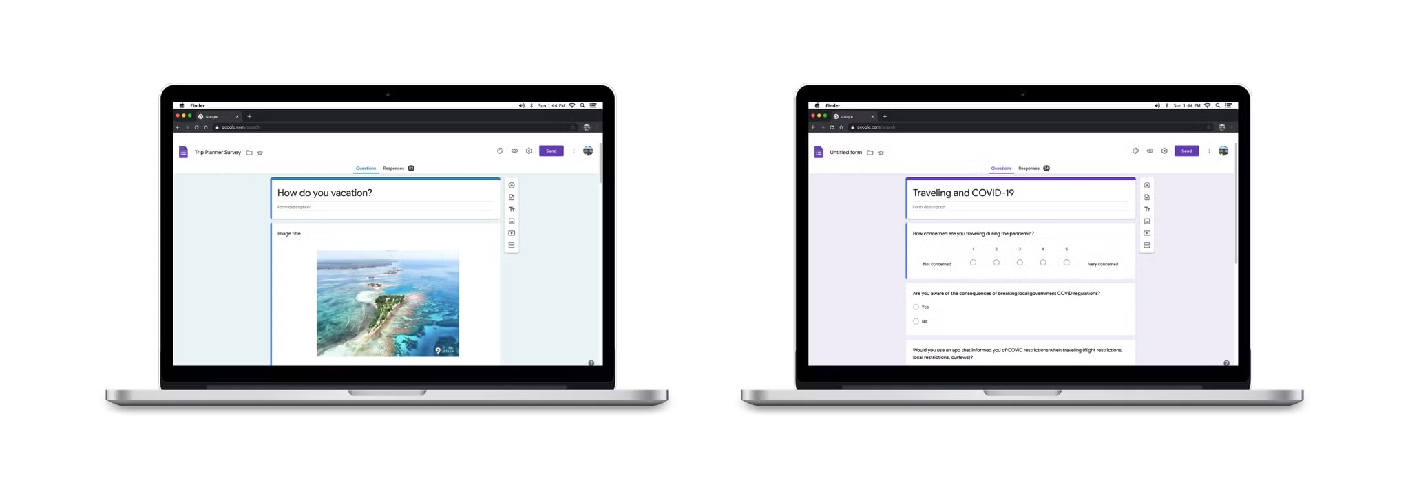
Surveys
With travel being such a broad topic, we had to rely on the user to tell us their problems and concerns and what mattered most to them. The first survey provided an understanding of how people travel and how they plan vacations. The second survey was focused on health and safety and gauging how concerned people were with COVID-19. We also asked some identifying questions that helped drill down on who our user target group would be in this sea of endless personas.
66% of people weren’t concerned about contracting the virus as a result of traveling during a pandemic.
90% of people believed safety was the most important factor when traveling to a new location.
99% of people jumped between different websites and applications to better understand COVID-19 regulations and mandates.
Interviews
From our two rounds of surveys, we identified our user target group to be individuals from ages 25-60 who travel 1-3 times a year with family and friends. We were able to conduct 9 interviews with people who fall into our user target group focusing on safety while traveling, how COVID has affected travel, and how often they stay up to date on COVID-19 guidelines.
- Concerns ranged from wandering into unsafe areas to being victims of kidnapping. These concerns are valid while keeping with the global context in which our product would live. While some people are concerned about extreme scenarios, others just want to make sure the route they take from the airport is safe enough for themselves and their family and friends.
- Everyone wanted to stay up to date on COVID-19, but why? What was their motivation behind tracking the global pandemic? The surface level assumption that no one wants to contract the virus was quickly formed, but would this hold for our user target group?
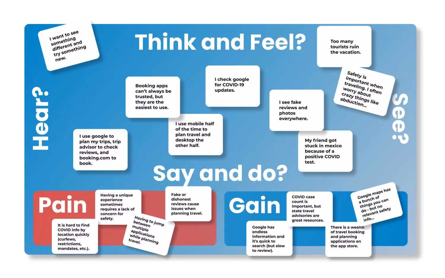
Empathy Mapping
Utilizing an empathy map allowed deepened understanding of user concerns. Due to the wide range of feedback received from surveys and interviews, I believed it would help organize multiple pain points into a few focused user frustrations.
- Most people desired a local or unique experience, but not at the expense of comfort or safety.
- Safety was a major concern, but contracting the virus was not.
- COVID-19 was an inconvenience more than a threat.
“COVID-19 was a concern, but not because of the risk of contracting the virus. Instead, being cited or fined with breaking restrictions or being stuck in a foreign country due to a lack of available tests was more of a worry”.
The User
Shawn Davis is the culmination of our users’ frustrations and goals. He represents the explorative nature of our users as well as their cautious approach while experiencing new places or things. He is concerned about COVID-19 guidelines and restrictions. This concern is born out of two motivations - remaining safe as a traveler, and making sure he isn’t inadvertently breaking laws and being held accountable for them due to poor research. He finds himself jumping from app to app trying to find good reviews or accurate information and wishes he could spend less time reading lengthy reports on COVID-19 restrictions and spend more time planning or enjoying his travel.
- Adventurous, yet cautious.
- Wants to remain safe while still exploring the world.
- Wants to make sure he isn’t inadvertently breaking laws and being held accountable for them.
Pivoting the Product
Although hypothesized by earlier data, this was the moment we determined that our solution was not a simple travel planning application. We believed ignoring COVID for the sake of a creative brief would have been a missed opportunity and a disservice to the user.
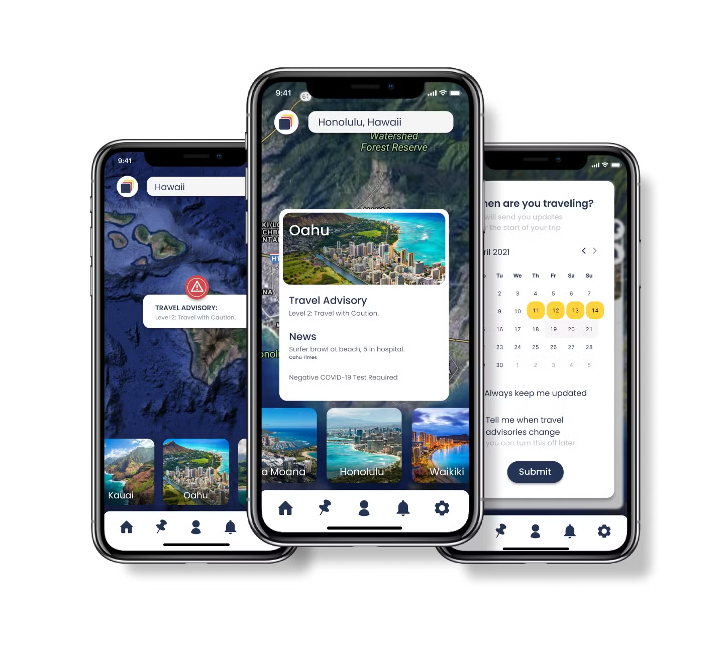
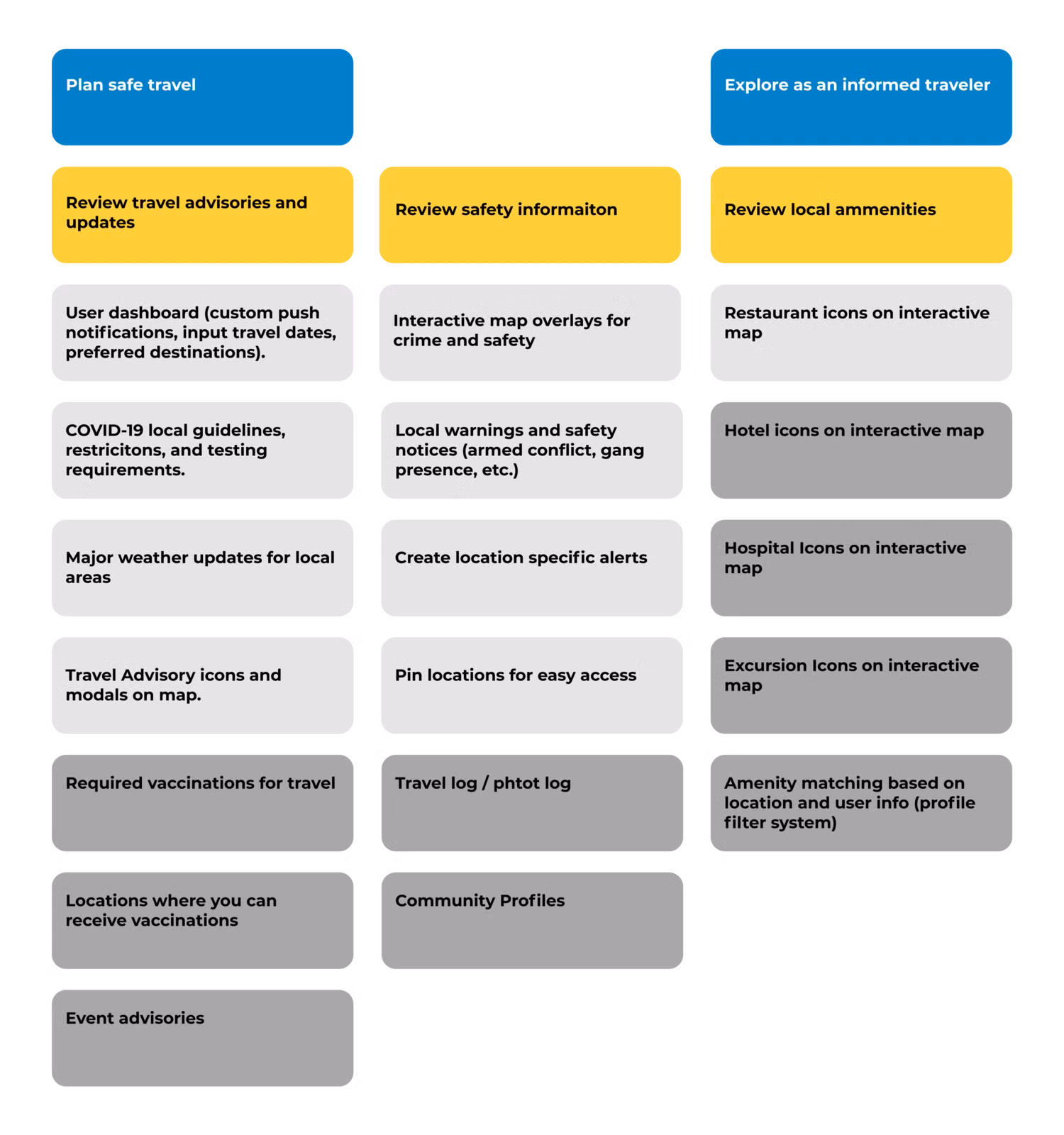
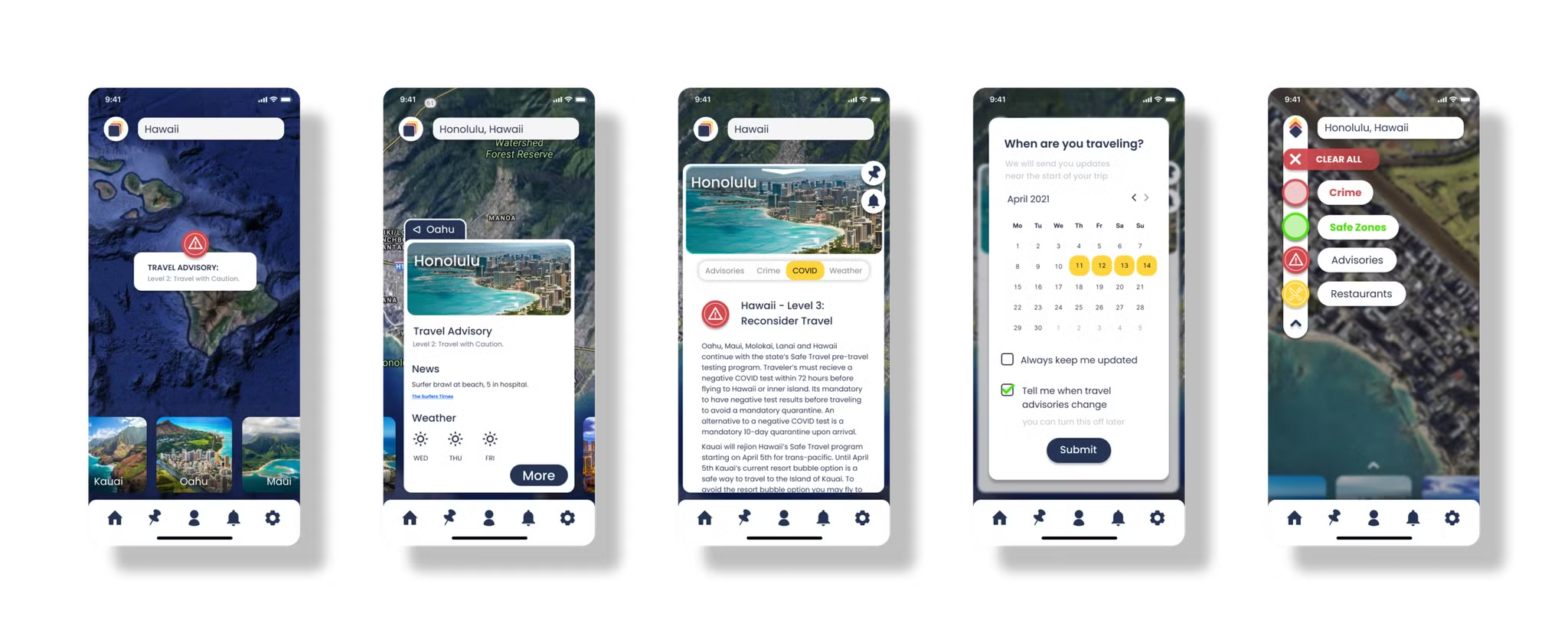
So, we pivoted the product from a simple itinerary planner to a health and safety application aimed at creating an informed traveler by providing real-time data on COVID-19 restrictions, outbreaks, and regulations in a central location. Users would also have access to local amenities and excursions with reviews so they could plan their travel confidently in the same location they receive their updates on global conditions.
“As a traveler, I want to understand local COVID guidelines so that I can travel safely and without fear of penalty or inconvenience”.
“As a traveler, I want to strike a balance between Exploration and safety so that I can have unique experiences while being confident in the safety of my surroundings and decisions”.
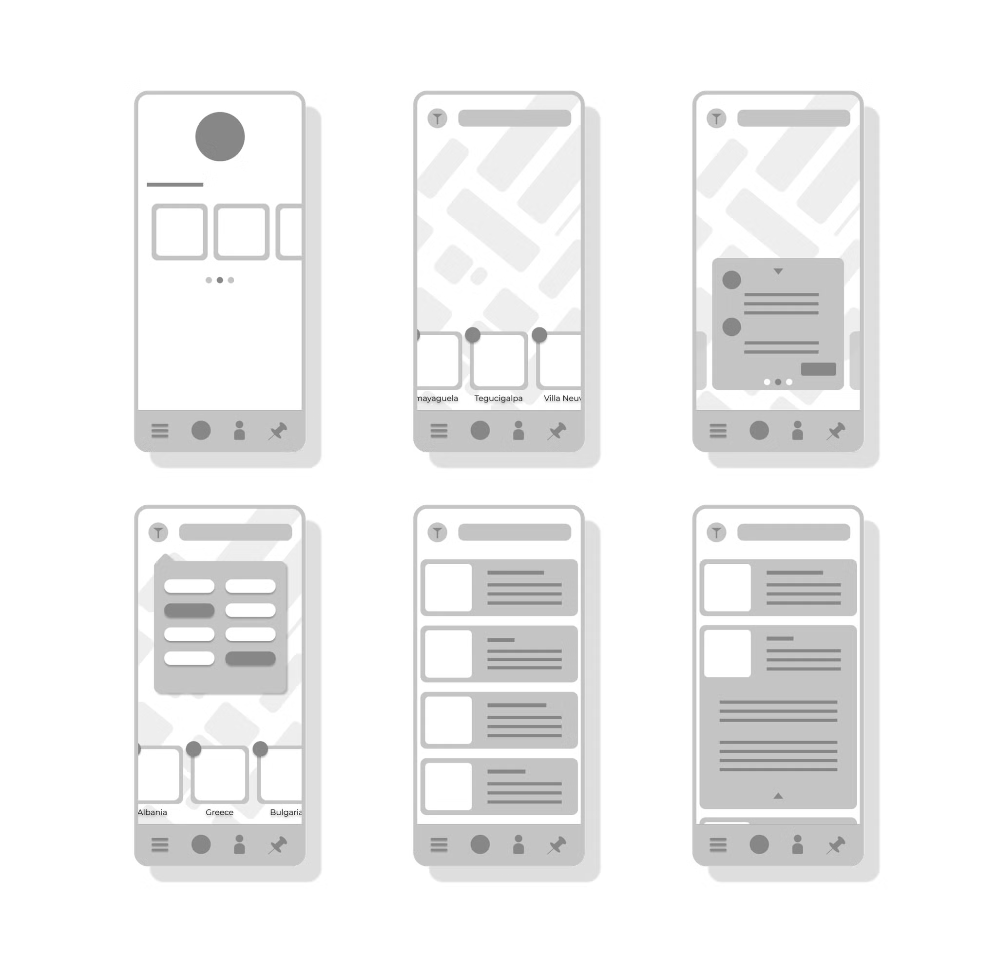
Wireframing and low Fidelity
Due to the large amounts of data that would live in the application, we began sketching some visual-heavy wireframes focusing on navigation. Although it looked clean, its visual nature and the amount of information it would have to display would create an interesting struggle between information architecture and visual hierarchy.
After some deliberation, we settled on a balanced interface that utilized an interactive map with floating modals where user interaction would mostly take place, coupled with predetermined animated micro-interactions that signified where the user was within the application. Once we had a clear vision of how we wanted the navigation to work and how the user would interact with the product, we pushed it out for usability testing and received some great insights.
Testing
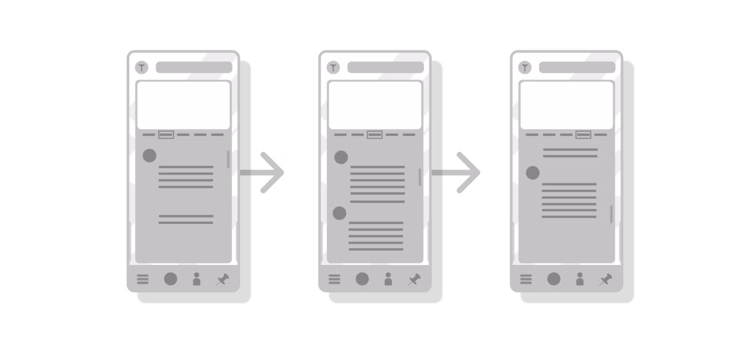
I discovered that the final level of interaction while researching a location, which was an informational page, was confusing the user. Because the user went from a floating modal to a full page of text it cost them the affordances and signifiers of multiple functions like going back to the previous modal, creating alerts, and pinning locations.
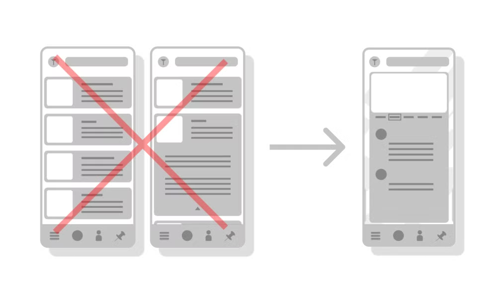
Inner-modal navigation was originally proposed to be a vertical scroll with all the content on one page but users constantly had issues navigating the content. During the second round of testing, we identified some user conceptual models regarding a tabular navigation bar on the top of the page. Users either selected the tab in the navigation for the content to appear or swipe left and right to move the selection indicator accordingly.
After the first round of testing, I decided to condense the final level of interaction to fit into the location modal to create a more cohesive experience. This allowed the user to remain immersed in the interactive map while still digesting large amounts of data.
User feedback indicated a swipe gesture moving content in and out from the left or right was preferred. We kept the navigation headers as users attempted to select them to review the corresponding content. After this simple change in gesture interaction, none of our users dropped interaction on the modal page.
What’s Next?
Given more resources and time we would move forward with some specific action items:
- Based on user feedback, I would perform a/b testing on our pinned locations and create alerts functions. These are core functions of the application, but currently are lacking some depth of interaction and user controllability.
- The modal interaction is well built and has received good feedback during usability tests, but the organization of the content within the final modal needs some refinement. If I had more time I would perform some closed and open card sorting exercises to best identify the order and hierarchy of information in the location modal.
- There were some additional content issues and some color theory issues I would like to revisit and possibly deploy alternatives.
- Finally, I would have devoted much more time to building out more visual communication in the place of text. Although this has made it onto our backlog, the original vision was to avoid text-heavy pages and communicate clear and accurate information to the user through as many visual assets as possible. There was a need to create precise consistency across all modals and locations, rules on how the data might adapt in the absence or excess of certain information, and how the user could interact with these visuals more deeply. This step would take me back to wireframing some specific modals to see how the users respond to the change from textual information to visual information.
📣 Shout out to some free assets and resources found in the Figma community:
- Calendar - Auto Layout
- Coolicons | Free Iconset
- Flat Map </aside>
In collaboration with...

Tools used
Topics
Share
Reviews
0 reviews
You might also like

Pulse — Music Streaming App with Accessible Light & Dark Mode


Islamic E-Learning Platfrom Dashboard

SiteScope - Progress Tracking App


Mobile Button System


FlexPay


CJM for Co-Working Space - WeWork

Popular Courses

Introduction to Customer Journey Mapping


UX Design Foundations


Introduction to Figma