SaaS Accessible Signup

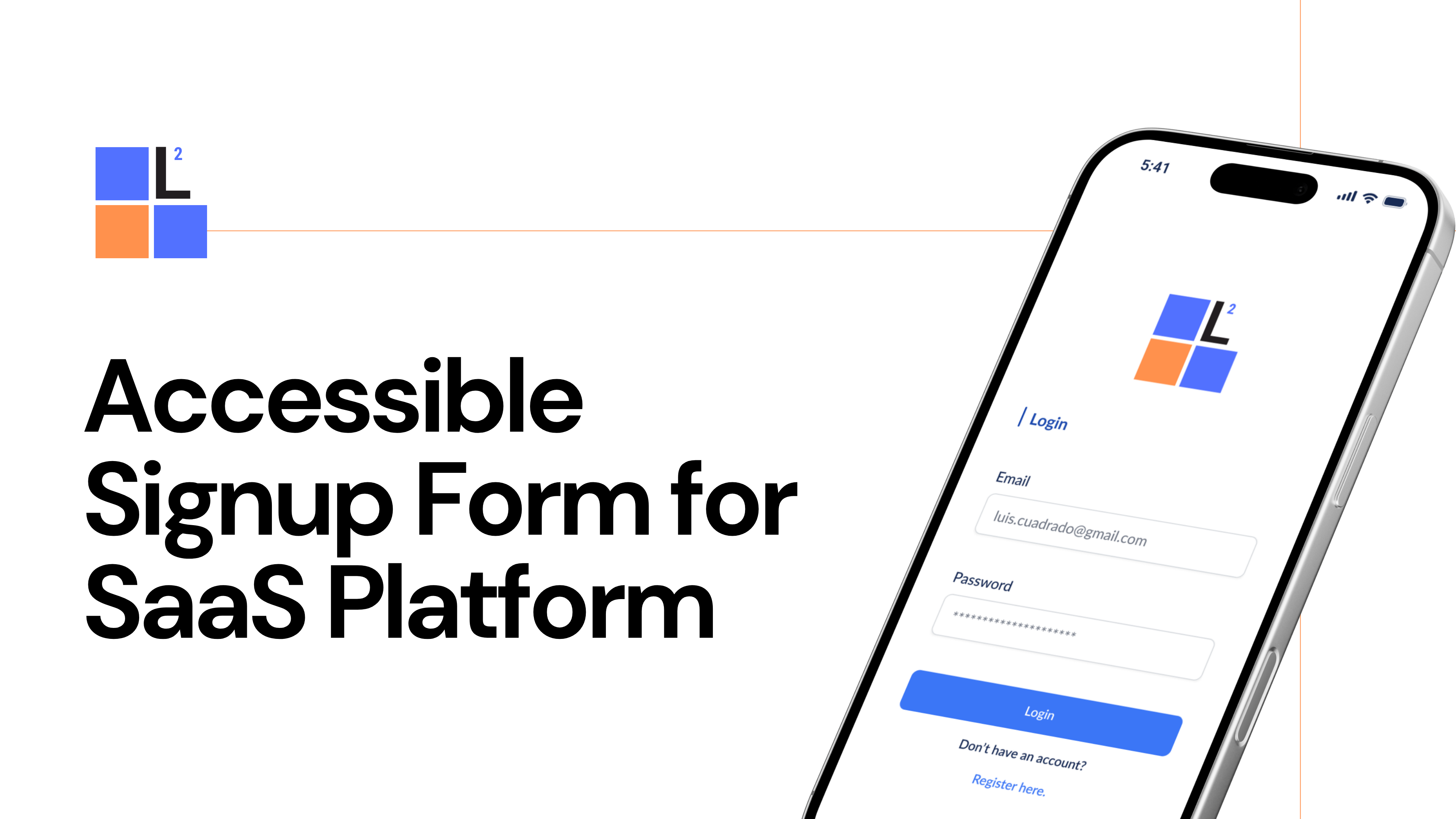
Prototyped two forms, one for login and one for signup where the user can quickly identify the input needed and receive the necessary validation step by step to complete the process. Taking into consideration the following features:
- Login Error - tap login button to display error message.
- Signup process - click register here to start the signup process. Tap each text box to complete and validate.
- Password error criteria - tap password box to display error message. Tap again to correct and validate.
- Accept Terms and Submit - tap checkbox to accept privacy and terms then tap submit to finish register process.

Reviews
2 reviews

Great job! I think your project is very well done.
If I were to recommend any changes, it would probably be regarding spacing - the elements seem to be spaced in similar pixel amounts, which isn't creating a visual hierarchy or clear grouping of elements. I'd consider placing the two inputs and login CTA closer together, while making the padding under the "login" header on top & padding above "create new account" sections on bottom a bit bigger. This will help visually group the login elements.
Other than that, great work!

Great work on the SaaS Accessible Signup project, Luis!
The forms are clear and user-friendly. The step-by-step validation and error messages make it easy for users to understand and fix mistakes.
One suggestion is to improve the layout a bit more to guide users even better. Adding small visual cues, like colors or icons, could help make the process smoother.
Overall, it's a great effort with good attention to detail!
You might also like

Pulse — Music Streaming App with Accessible Light & Dark Mode


Islamic E-Learning Platfrom Dashboard

SiteScope - Progress Tracking App


Mobile Button System


FlexPay


CJM for Co-Working Space - WeWork

Visual Design Courses

UX Design Foundations


Introduction to Figma

Design Terminology
