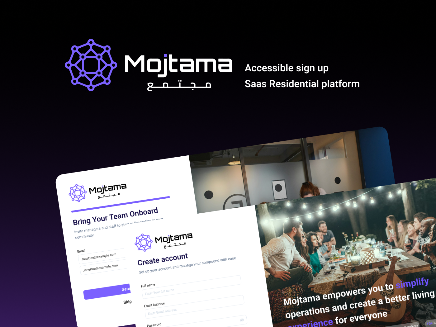
Accessible Sign-Up Flow for a Residential Management Platform

Accessible Sign-Up Flow for a Residential Management Platform
This project focused on creating an accessible three-step sign-up flow for a SaaS platform that helps residential compounds manage residents and operations.
The flow includes:
- Account creation (name, email, password)
- Organization setup (name and logo)
- Team invitations (optional and skippable)
Accessibility Decisions:
- Clear step structure and progress indicators to reduce cognitive load.
- Properly labeled input fields and keyboard-friendly navigation for assistive tech users.
- High color contrast and non-color error cues for visual accessibility.
- Accessible file upload with ARIA feedback for logo setup.
- Optional invitation step to minimize cognitive pressure.
- Real-time validation with screen reader announcements.
Result:
A simple, inclusive onboarding experience that improves completion rates and ensures all users — regardless of ability — can easily sign up and get started.
Tools used
From brief

Topics
Share
Reviews
4 reviews

Neat work, Manar, feels like a smooth move-in day already 🏡
A few notes from me:
- If you still have control over this, I think the logogram and logotype would appear better if vertically center-aligned. They’re in different shapes, so aligning them by baseline creates empty space above “Mojtama”
- To preserve legibility, I’d suggest slightly increasing the dark gradient overlay on the imagery to the right. It already works well, but edge cases could appear. For example, on the first page, the word “simplify” in purple over the brownish oud can be a bit hard to read.
- …or you could also tweak the copy so that colored words don’t overlap lighter backgrounds.
- For the border radius on Role/Admin, this might be one of those designer-only details 😄 but using consistent radii with the rest of the shapes would make it even cleaner.

Great job!

Congratulations on the project, Manar!
I noticed that among your accessibility decisions, you mentioned reducing cognitive load with a clear step structure. I’d love for you to think about two specific points related to that.
Since you already have a progress bar for the account creation steps, do you think it would be helpful for users to know how many total steps there are? It’s often good practice to give users a sense of progress and control. It might also be useful to let them go back to a previous step, which would make the flow feel even smoother and more user friendly.
The second point is about the image on the right side. It feels like it draws too much attention away from the form, making the form appear secondary even though it’s the user’s main focus. How might you shift the visual focus back to the form so it becomes the primary element?
On the sign up screen, you have a section labeled “Seamless experience” with a few avatars. What’s the purpose of that element and the message it’s meant to convey? Consider whether it’s adding value or if the layout could be cleaner without it.
Good job overall!

Good work on your project Manar. Well thought out and implemented accessibility decisions. To make this even better, here are some of my thoughts:
- Different eye icon for showing/hiding password depending on user choice.
- Add persistent password requirements. Show a checklist under the input field telling users requirements upfront and how close they are to achieving them with real-time validation using checkmarks.
- Include clear and visual error messages for both email and password.
- Provide success feedback on the click of buttons to let users know their information is being processed by the system when they login/signup.
You have a great start but these would make your project outstanding.
You might also like

Events Managment App


Mobile Onboarding: Casa di Pasta


Accessible Signup & Login Experience — Brainex


Accessible Signup Form


Auction


Entrant - Analytical Dashboard

Visual Design Courses

UX Design Foundations


Introduction to Figma

Design Terminology
