RePlate: Save Food. Share Good.

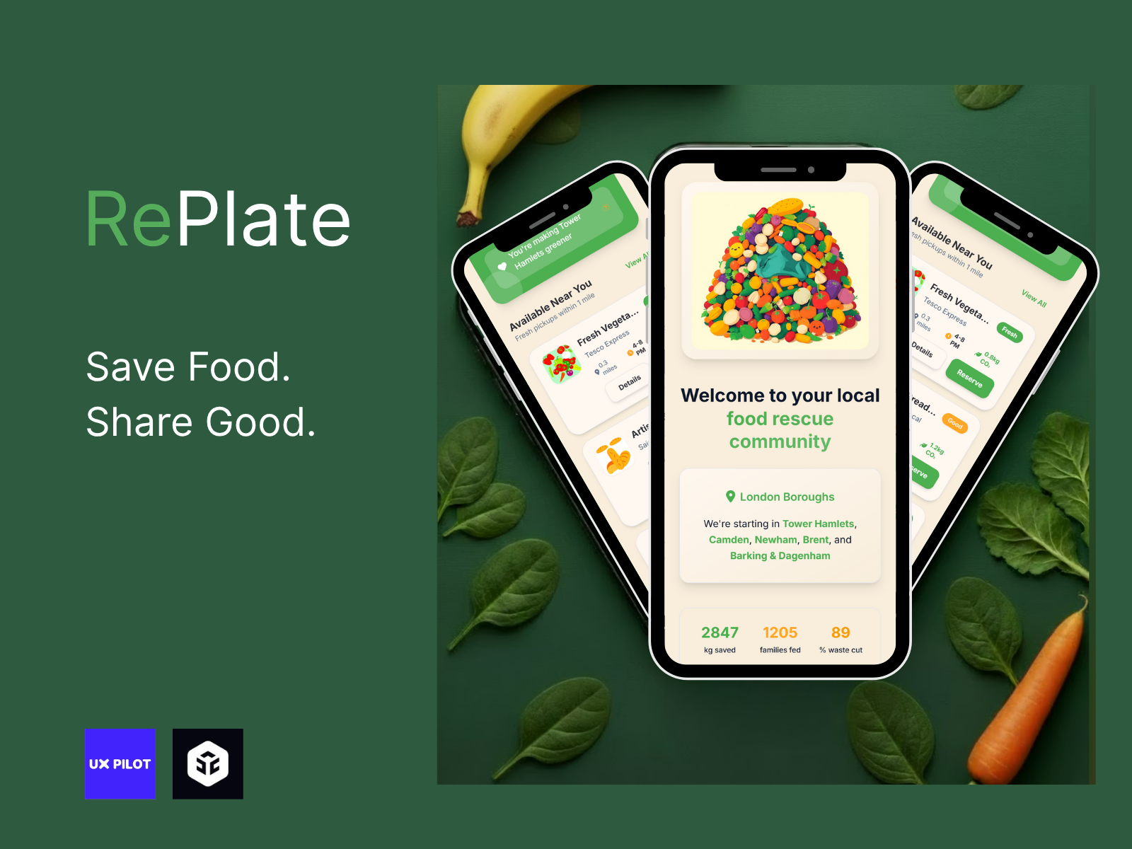
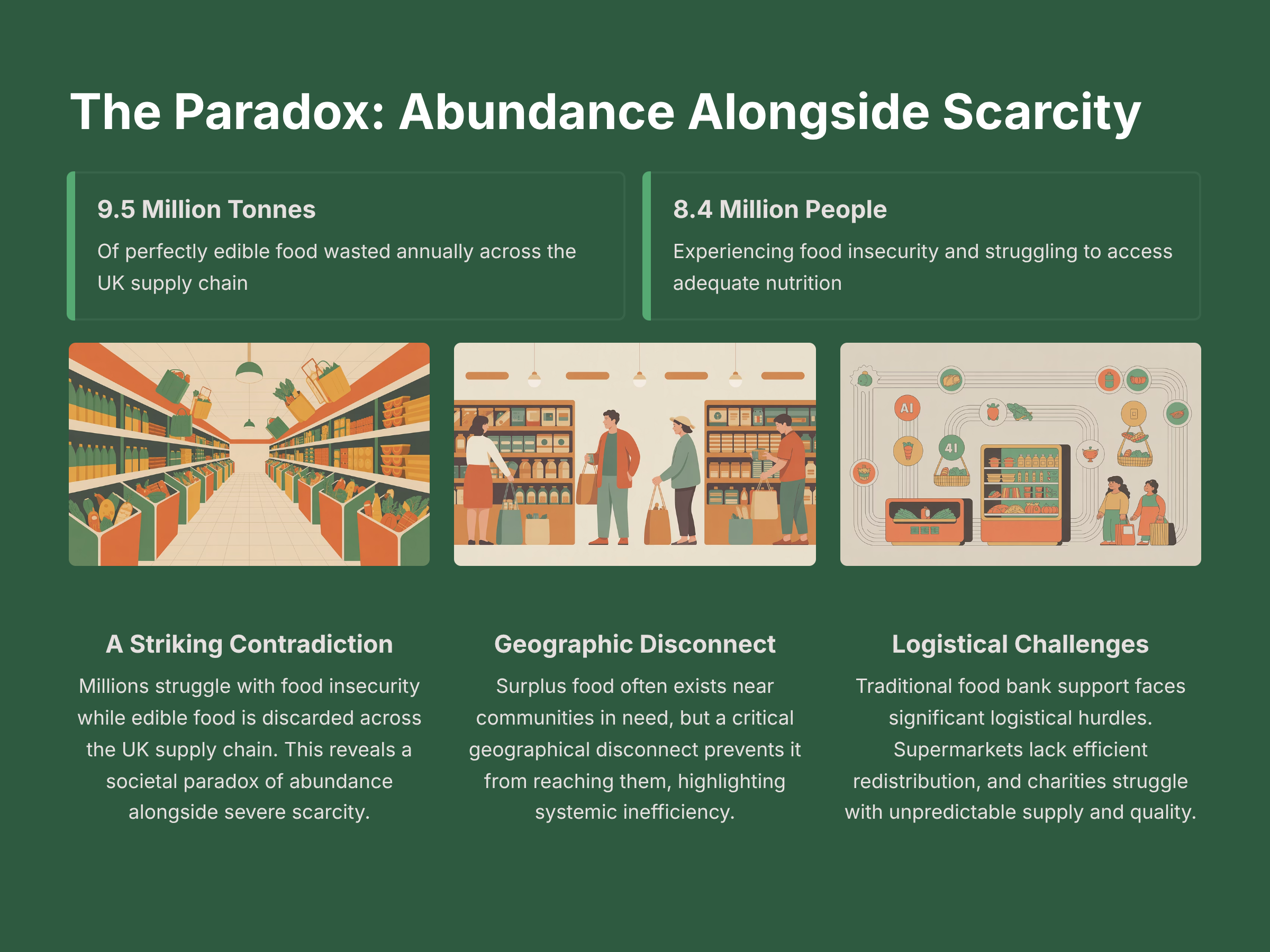
I'm thrilled to introduce RePlate, a digital platform I'm developing that tackles one of the UK's most pressing paradoxes.
My goal is to create an accessible, intelligent redistribution system that connects supermarkets with individuals in need, transforming potential waste into nourishment and hope.
Sources
WRAP (Waste & Resources Action Programme): Food Surplus and Waste in the UK 2023 Report
DEFRA: UK Food Security Report 2022
GLA (Greater London Authority): Green New Deal Fund & London Food Strategy 2023
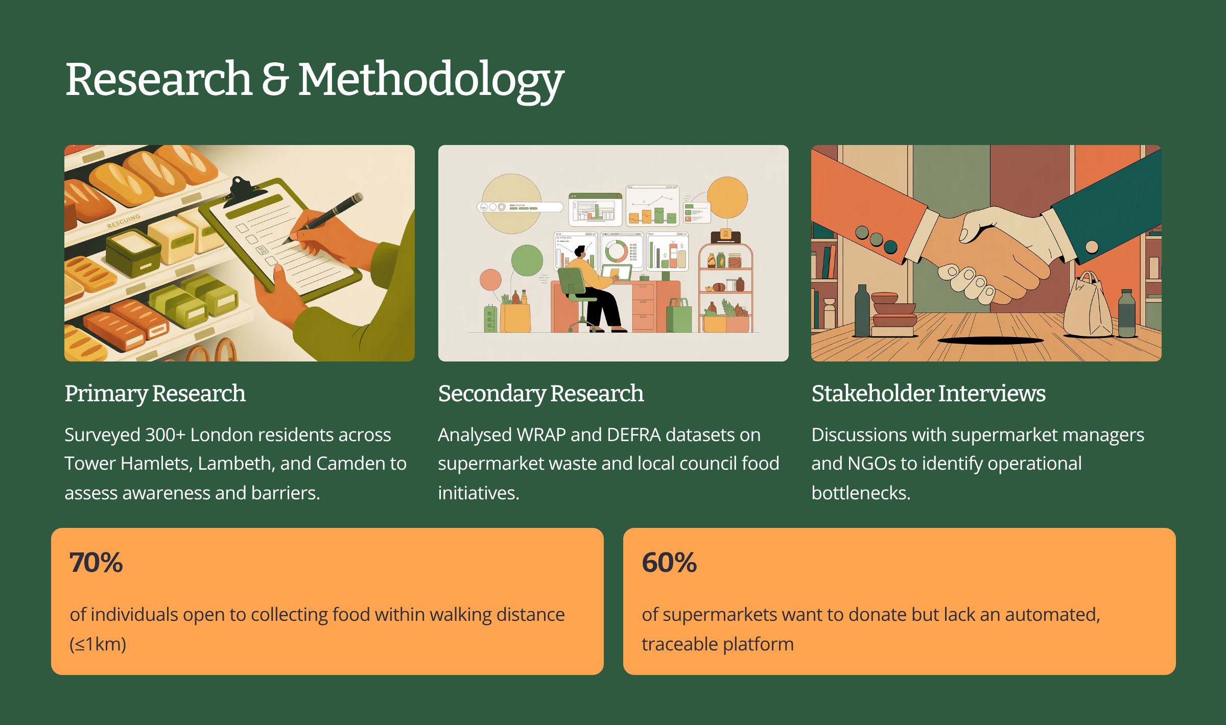
Primary user surveys and stakeholder interviews conducted across Tower Hamlets, Lambeth, and Camden, 2024
From Idea to Prototype
In this case study, I will guide you through my structured process, from the initial concept to the final prototype. This journey is segmented into key phases, each designed to ensure a robust and user-centric outcome for RePlate.
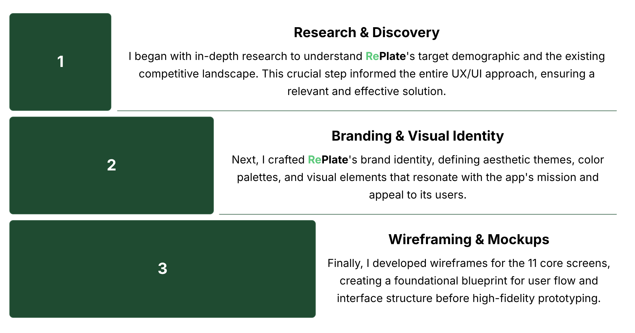
The case study will conclude with a reflection on the challenges encountered and key learnings gained while bringing RePlate's prototype to life using UX Pilot.
Competitor Analysis
To gain insight into existing market solutions and identify potential gaps, I conducted a detailed analysis of three prominent platforms. This helped define RePlate's unique positioning.
Below is a visual comparison highlighting their approaches:
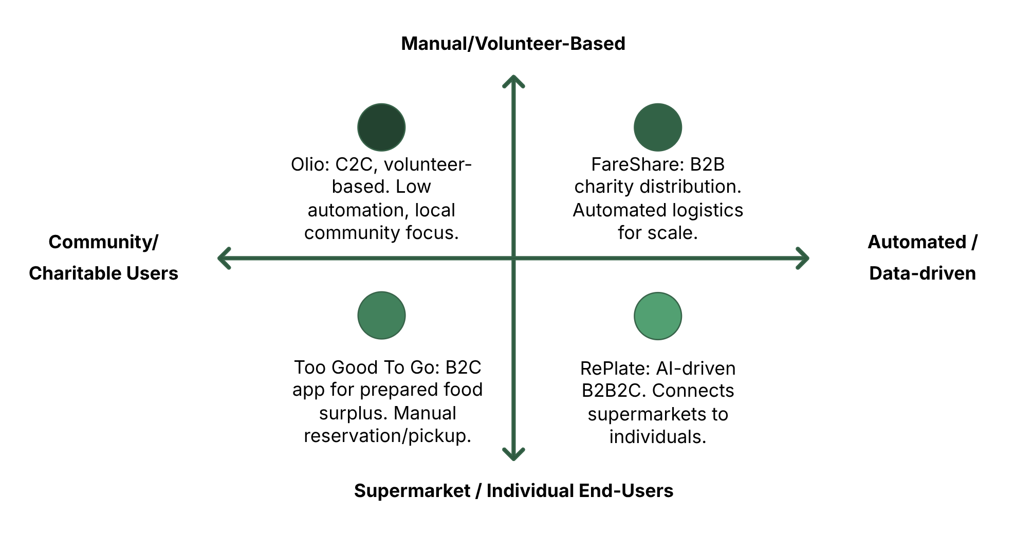
This analysis solidified RePlate's distinct niche as an AI-driven, transparent platform. Its core mission is to connect supermarkets directly with verified individuals within local communities, effectively reducing waste while simultaneously empowering people with easy access to fresh food.
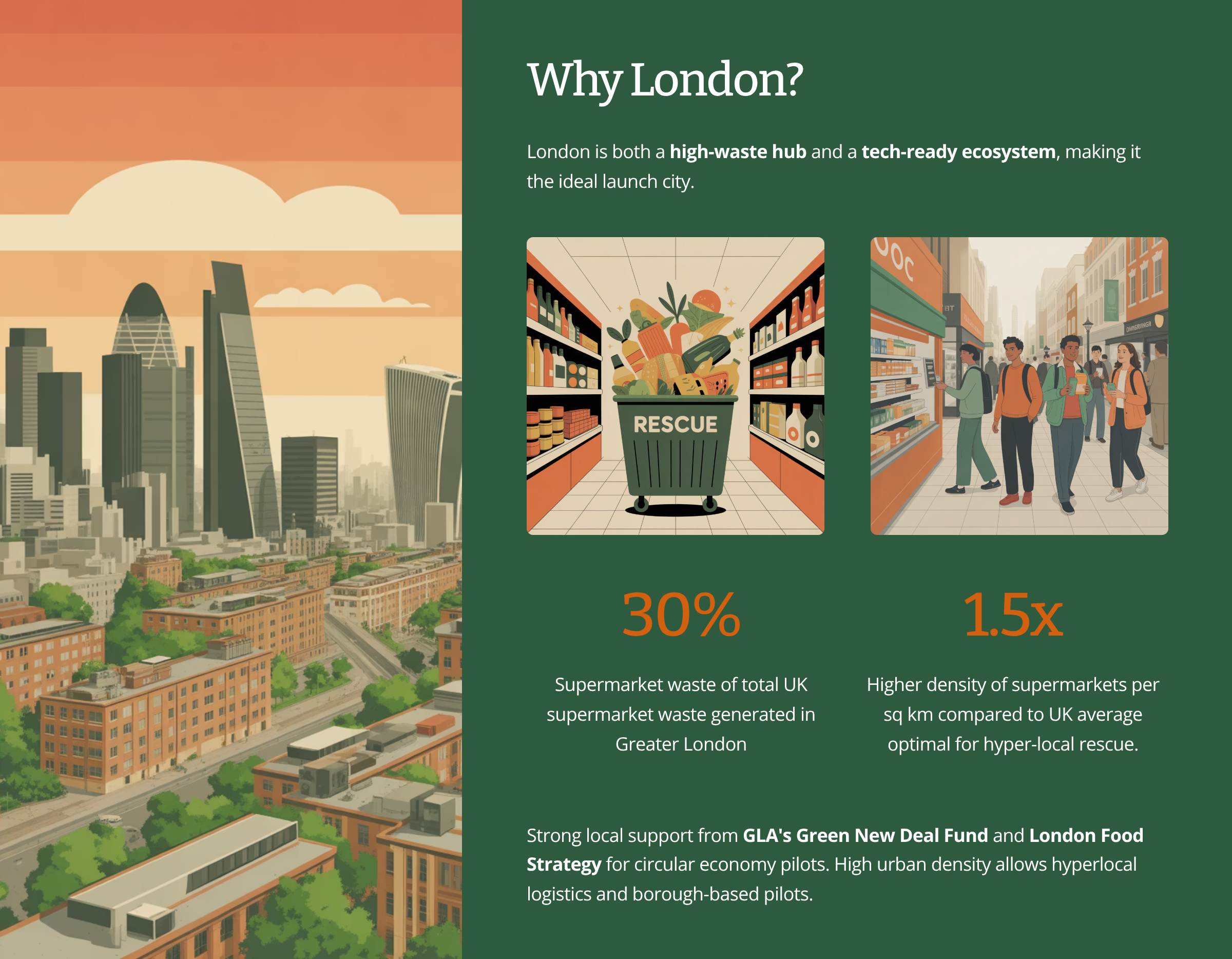
Focusing the Pilot: Choosing Boroughs Within London
Because London is such a large and diverse city, I wanted to go further than simply identifying it as a pilot location. Instead, I focused on specific boroughs to ensure the RePlate pilot would have a clear, measurable local impact. Each borough in London has unique demographics, community initiatives, and levels of food insecurity, so narrowing the focus allows for more targeted partnerships and user engagement.
Key London Boroughs for RePlate
- Tower Hamlets: Highest poverty rate in London (above London average), youngest median age (30), high student population, dense supermarket network, 34.6% Bangladeshi population
- Newham: Above-average poverty rates, diverse population, high proportion of low-income households, good supermarket density
- Camden: Above-average poverty rates, large student population due to proximity to universities, mix of low-income residents and students
- Brent: Above-average poverty rates, diverse ethnic communities, significant proportion of households under £35k
- Barking and Dagenham: Above-average poverty rates, high proportion of single-parent families, working-class demographics
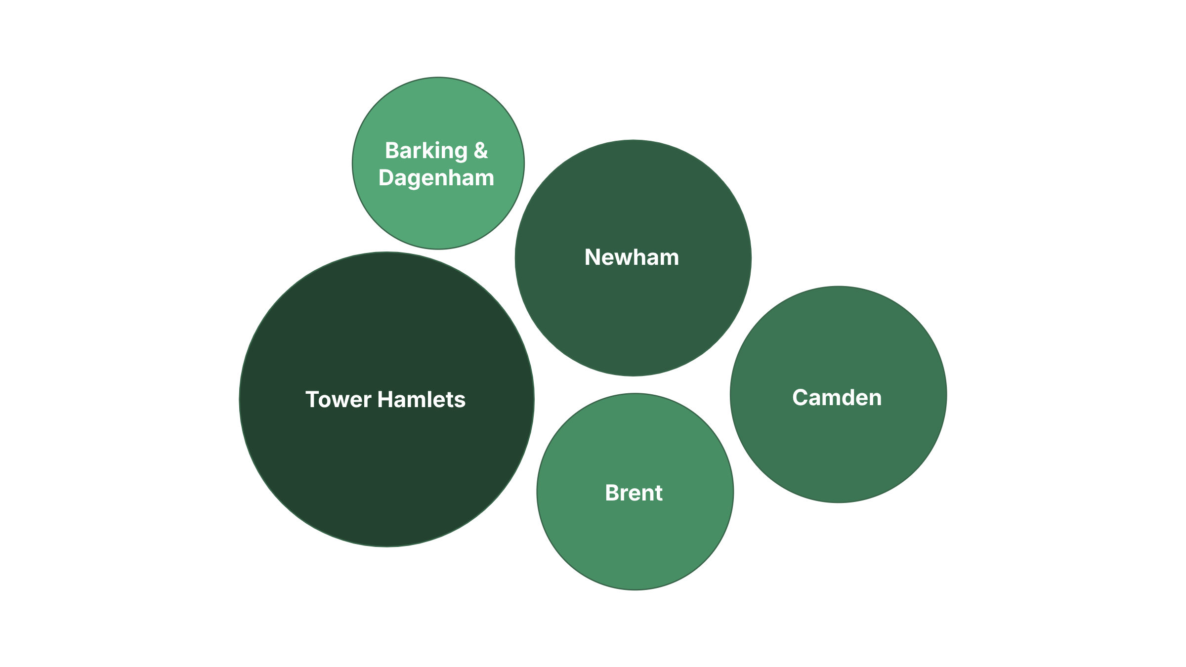
Larger circles represent greater opportunity for RePlate's impact based on demographic concentration and infrastructure.
These boroughs combine high concentrations of the target demographic (low-income households, students, single parents) with sufficient supermarket density for effective food redistribution.
Now let's look at RePlate's target demographics within these boroughs.
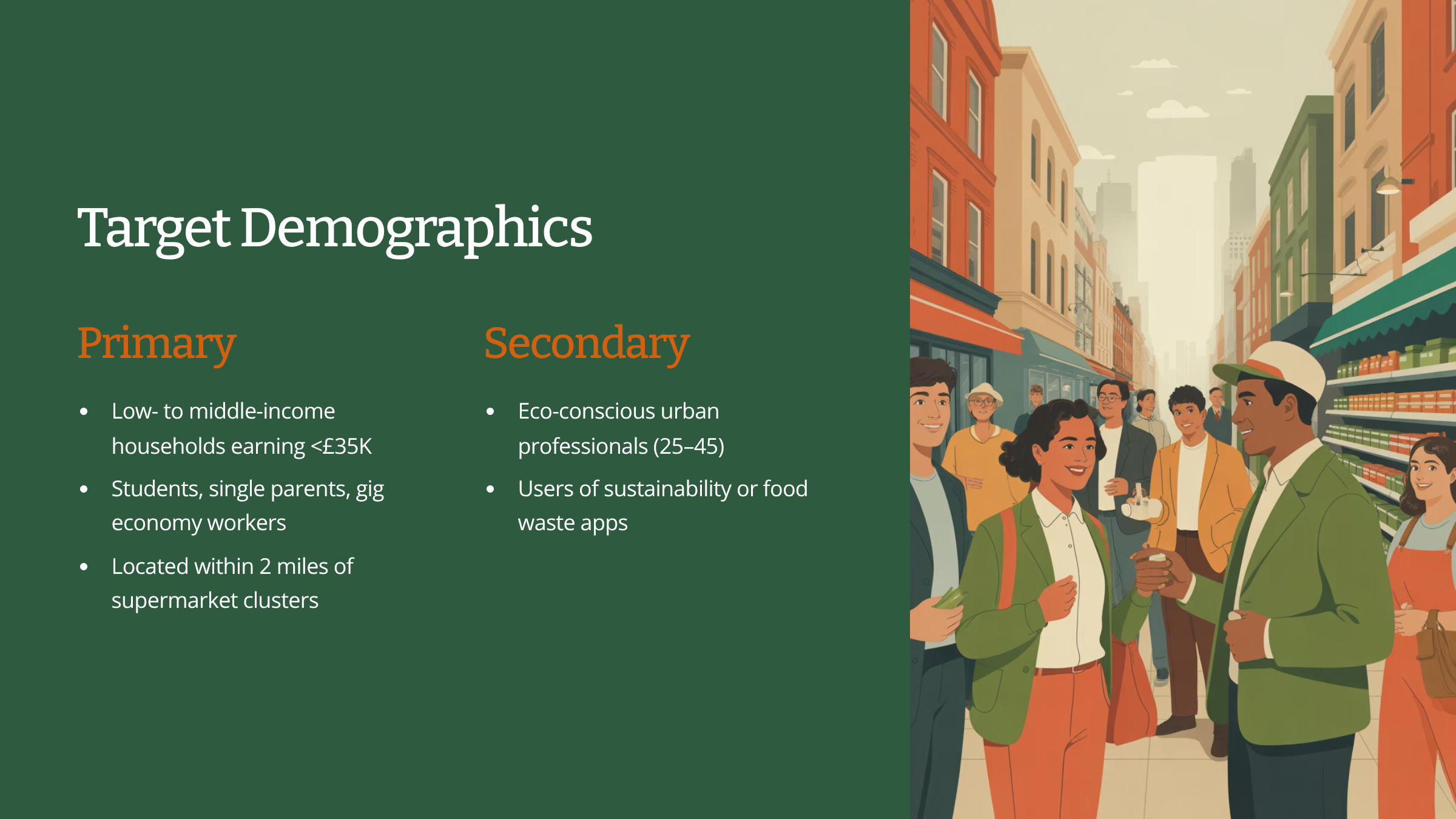
These diverse groups share two fundamental characteristics critical for RePlate's success: proximity (ensuring the feasibility of food pickup) and motivation (a strong desire to actively participate in reducing food waste).
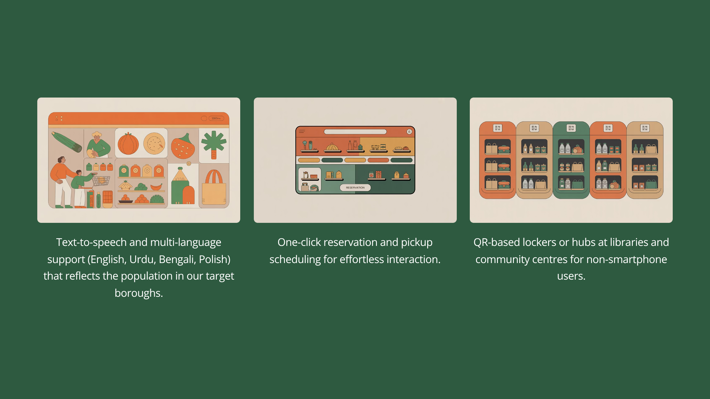
Accessibility & Inclusivity
Now that the target geography and demographic have been defined, it’s important to consider Accessibility and Inclusivity from the very start of the design process. The selected boroughs: Tower Hamlets, Camden, Newham, Brent, and Barking & Dagenham are among the most culturally and linguistically diverse areas in London, with wide variations in income levels, digital literacy, and access to technology.
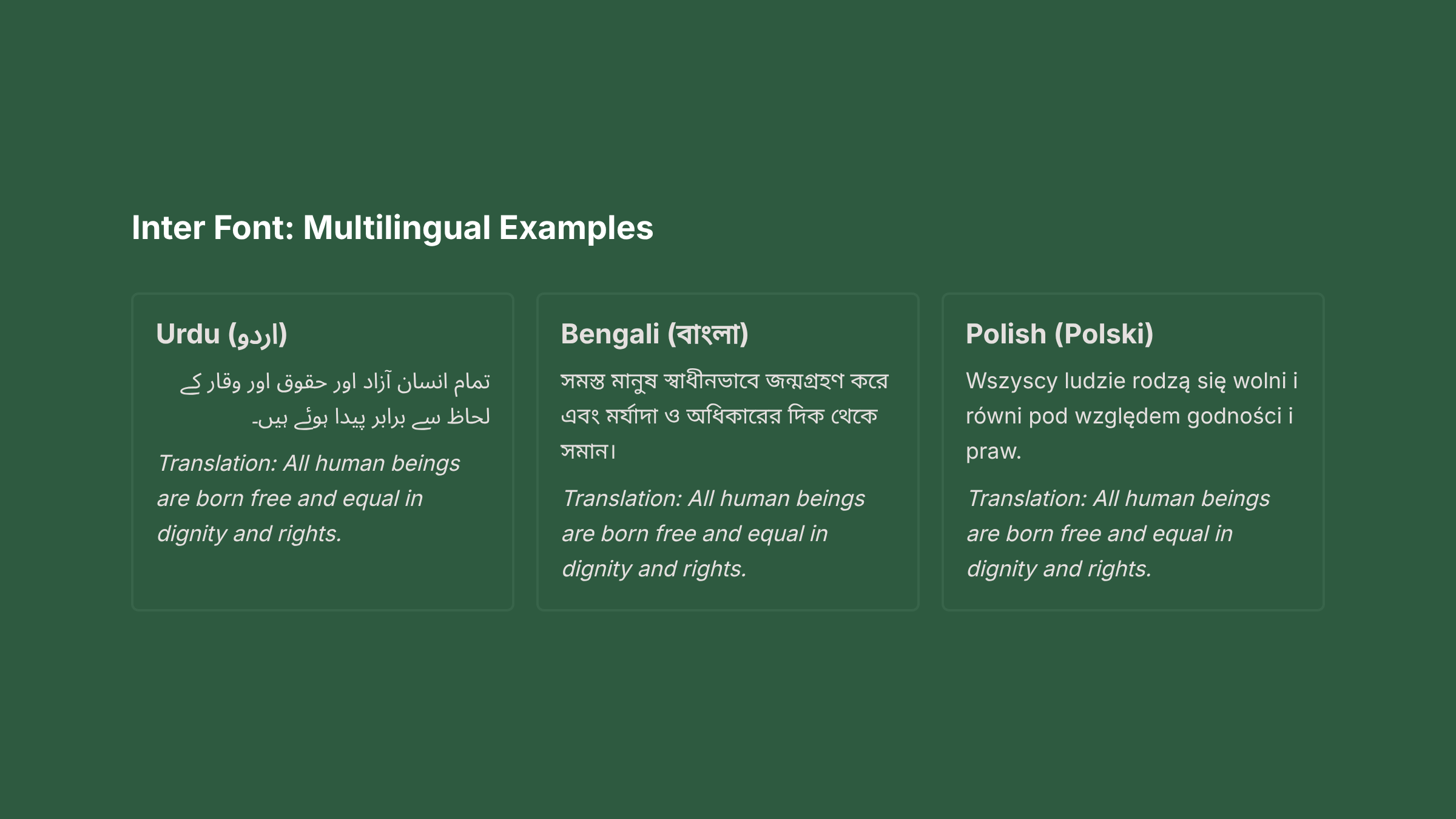
Designing Replate for these communities means ensuring that everyone can participate, regardless of age, language, or ability. This includes using clear, legible typography, high-contrast color combinations, intuitive layouts, and multi-language support (e.g., English, Urdu, Bengali, and Polish). Accessibility features such as text scaling, voice assistance, and simplified navigation will be built into the core design rather than added later.
By embedding accessibility and inclusivity into the foundation of the design process, Replate can genuinely serve its mission — to make food redistribution equitable, human-centered, and universally usable.
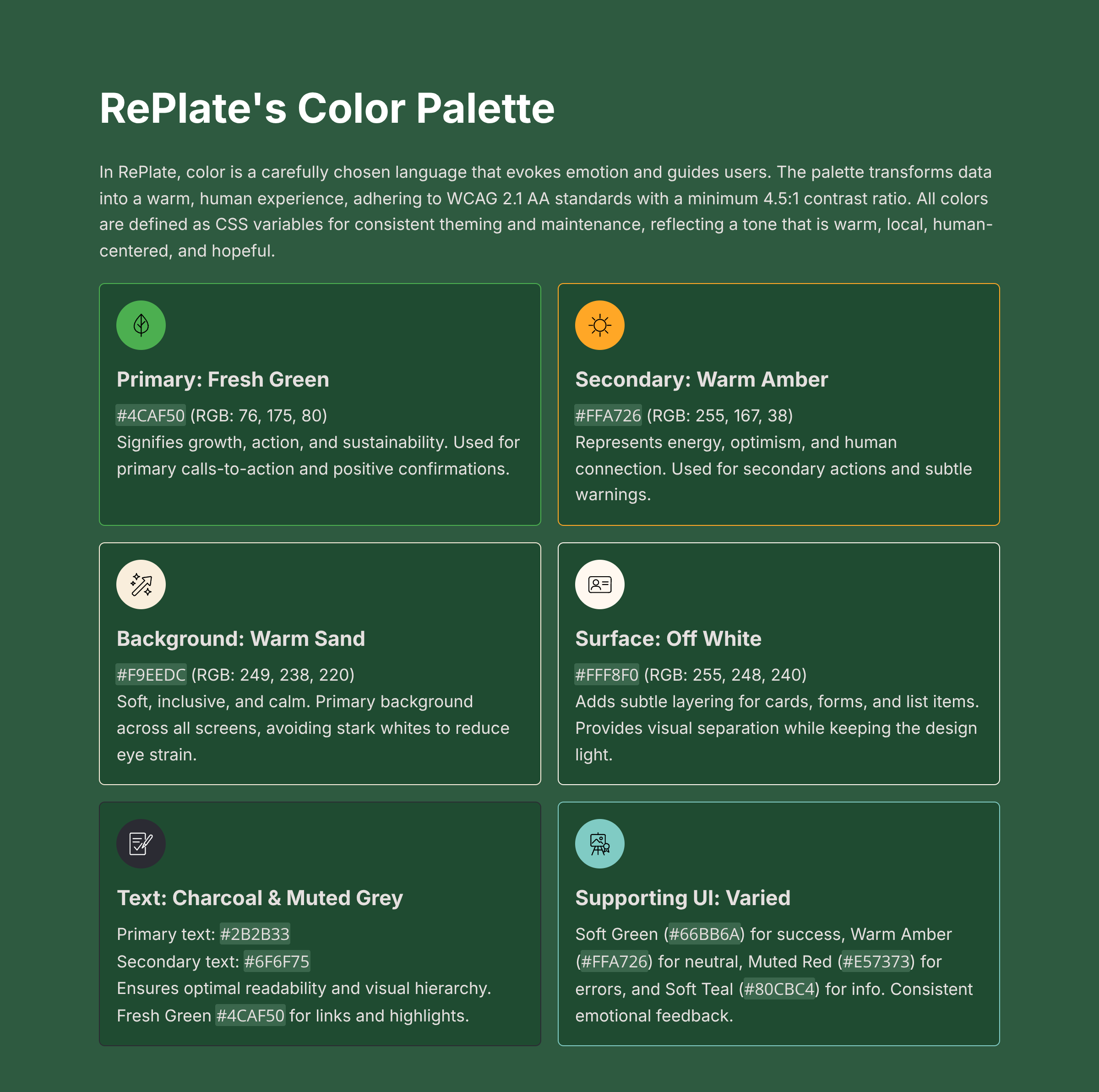
Branding and Visual Approach
With accessibility and inclusivity established as core principles, the next step was to define RePlate’s visual identity and color system. My approach was to create a design language that felt warm, trustworthy, and human, reflecting the platform’s mission to bring communities together around the shared goal of reducing food waste.
Rather than relying on sterile or overly “tech” aesthetics, I focused on organic tones, rounded elements, and friendly contrasts that evoke nourishment and optimism. The aim was to build a brand that not only functions effectively but also feels emotionally resonant approachable to users from all walks of life across London’s diverse boroughs.
Typography: Inter
Selected for its geometric clarity and superior digital optimization, Inter performs exceptionally well on mobile screens and supports a wide range of languages. It is used for all main headings (H1: `2.5rem` / 40px, H2: `2rem` / 32px, H3: `1.5rem` / 24px), body text (`1rem` / 16px, `line-height: 1.5`), buttons, and navigation elements.
Key weights include Regular (400), Semibold (600), and Bold (700).
Overall, RePlate’s visual identity is characterized by rounded corners, generous spacing, and soft shadows, mirroring its focus on community and inclusivity. Illustrations are flat, minimal, and narrative, focusing on shared meals, food rescue, and community scenes.
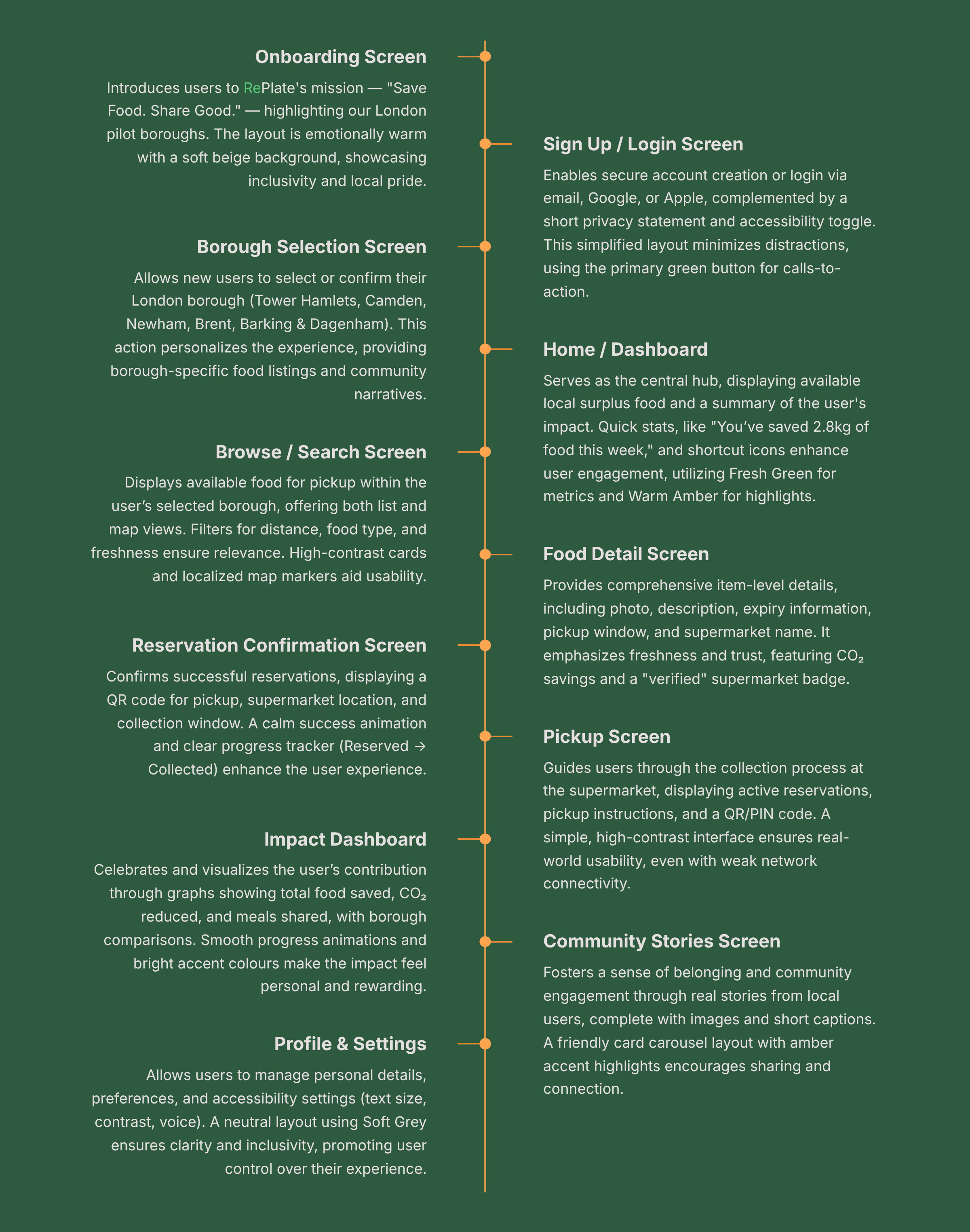
Core Screens for MVP
The main user journey from finding food to collection is designed to be seamless:
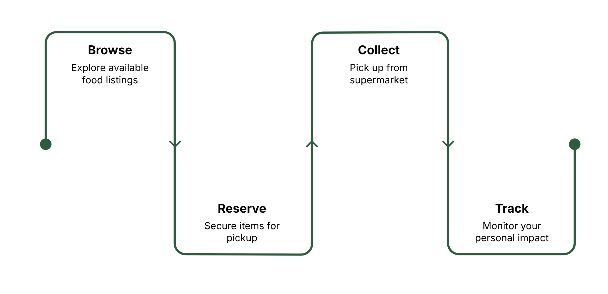
This section outlines the 11 essential wireframe screens designed for RePlate's Minimum Viable Product (MVP). These screens meticulously map out the user's journey from initial onboarding to managing their profile, ensuring a seamless, intuitive, and engaging experience.
First Iteration AI Prompts (Page Context and Page by Page) can be found here.
From brief

Share
Reviews
1 review

I love the research you did! You understood the audience and their needs perfectly, and you also thought deeply about accessibility.
That’s incredible work! I also like the topic; it’s very relevant and important right now. You did a really great job!
The colors you chose are beautiful and represent the brand very accurately. I’d just recommend checking the contrast, especially between the fresh green and warm sand, to enhance readability.
You might also like

Smartwatch Design for Messenger App


Bridge: UI/UX Rebrand of a Blockchain SCM Product


Pulse Music App - Light/Dark Mode


Monetization Strategy


Designing A Better Co-Working Experience Through CJM


Design a Settings Page for Mobile
Product Thinking Courses

Ethical & Responsible Product Design


Product Vision & Strategy


Product Management Foundations
