Reimagine Asana - A modern & Dynamic Color System
The challenge
Is to reimagine Asana's branding with a fresh color system.
And the goal is to create a modern and dynamic color palette that conveys energy, innovation, and trust while enhancing usability and accessibility.
Why it matters?
The reimagined color system aims to improve user engagement, enhance brand recognition, and create a more enjoyable and productive work environment.
The vibrant orange commands attention and injects a sense of excitement and innovation. It’s used strategically for primary calls to action to guide the user and emphasize key elements.
____________________________________________
Check the full project to read about it all!
Reviews
2 reviews
The presentation is visually stunning and highly professional. The use of dynamic visuals, animations, and transitions makes it engaging and memorable.The storytelling approach effectively communicates the thought process behind the redesign, making it easy to follow and understand.
Showing a modern and dynamic color system that breathes new life into the platform’s design. The attention to detail, consistency, and visual appeal are outstanding. However, the redesign could benefit from a stronger focus on accessibility, practical implementation, and user validation. Overall, it’s a creative and inspiring take on Asana’s UI, with the potential to elevate the user experience further with some refinements.
Great work!
The presentation experience itself was fantastic. You clearly know how to build a Figma slide deck. The colors and the explanations all hit the right notes for me as well. I really like the presentation of the components on the UI components slide.
My one constructive criticism, the UI example on slide 27 appears to be monochromatic with light blue and dark blue. For me it's too monotonous without the use of white or orange. And since the light blue/dark blue wasn't shown in the accessibility slide, it leaves me wondering if that contrast was explored.
Great job overall!
You might also like
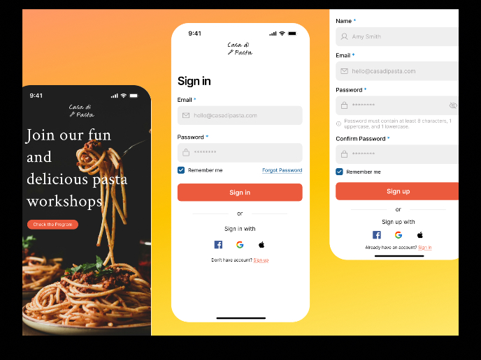
Mobile Onboarding: Casa di Pasta
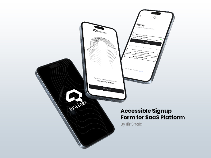
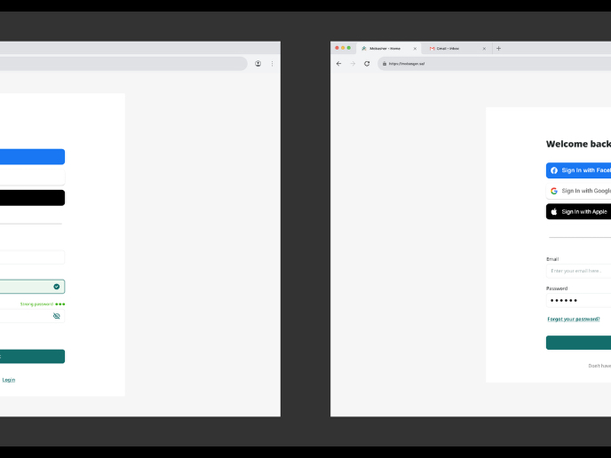
Accessible Signup & Login Experience — Brainex
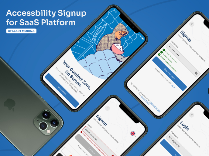
Accessible Signup Form
Auction
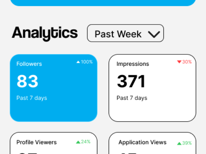
Entrant - Analytical Dashboard
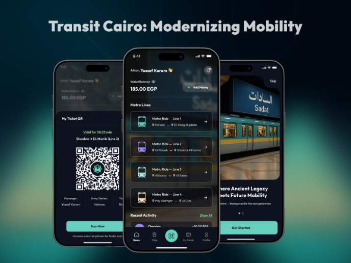
Transit Cairo — Digital Mobility Redefined
Visual Design Courses

UX Design Foundations

Introduction to Figma


