Redesigning The LinkedIn Profile Page Like A Product

Designing a More Intentional LinkedIn Profile
There’s a moment we don’t talk about enough in personal branding.
It’s that first 3 to 7 seconds when someone lands on your profile. A recruiter, a founder, a collaborator. They’re scanning. Not reading. Not reflecting. Just skimming for a signal that says: This person might be worth knowing.
I wanted my profile design to respect that moment.
Why I Redesigned It
As a product designer, I’ve always believed that good UX isn’t just for products. It should reflect in your presence too. I asked myself: What if my LinkedIn profile acted more like a product homepage?
That meant it needed:
- Clear structure
- Intentional entry points
- Strong proof, not fluff
- Just enough personality to be memorable
And most importantly, it had to respect the different intentions people have when they visit.
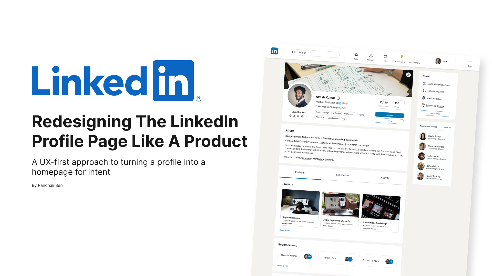
Starting Strong: A Header That Answers the “Who”
I treated the top of my profile like the hero section of a landing page.
It’s the first thing visitors see, and it needs to do three things fast:
- Tell them who I am
- Show where I’m based
- And offer a clear way to connect
Instead of packing in fluff, I let the basics breathe:
- A clean headline with just my name, role, and company
- Location that hints at timezone and work context
- Social badges for discoverability
- A short tag stack showing what I work on and care about
You’ll notice the tags aren’t just buzzwords. Alongside “UX Research” and “Figma,” I’ve included tools like “Whimsical” and themes like “Gamification.” That’s intentional. These add texture and help people place Akash here quickly in the kinds of work he gravitates toward.
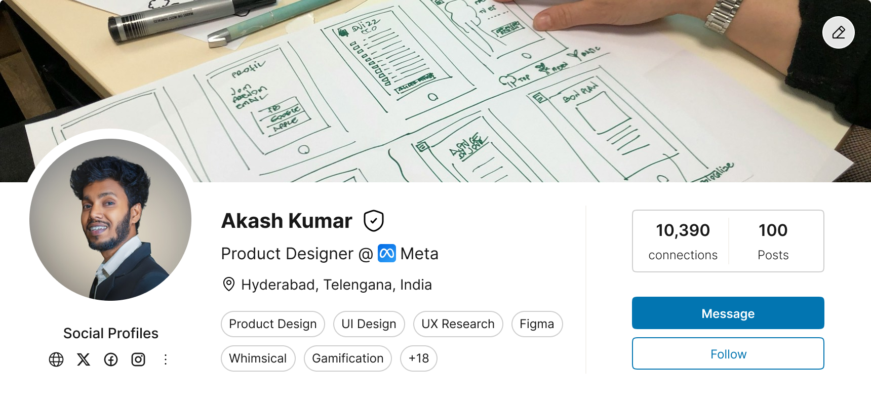
The header as a lightweight but high-signal landing zone
From Clutter to Clarity: The New Structure
Instead of letting all content blend into a long scroll, I split the profile into three focused tabs:
- Projects: Proof of work, up front
- Experience: The story of my roles
- Activity: Social context and recent posts

Three-tab structure to prioritize visitor intent
This tabbed approach gives control back to the visitor. Whether you're a recruiter, peer, or collaborator, you can zero in on what you care about.
Prioritizing Proof Over Prose
In the Projects tab, I showcase just three key pieces out of a larger body of work.
Each project card includes:
- A title and thumbnail
- A short, sharp description
- And a "Show All" CTA
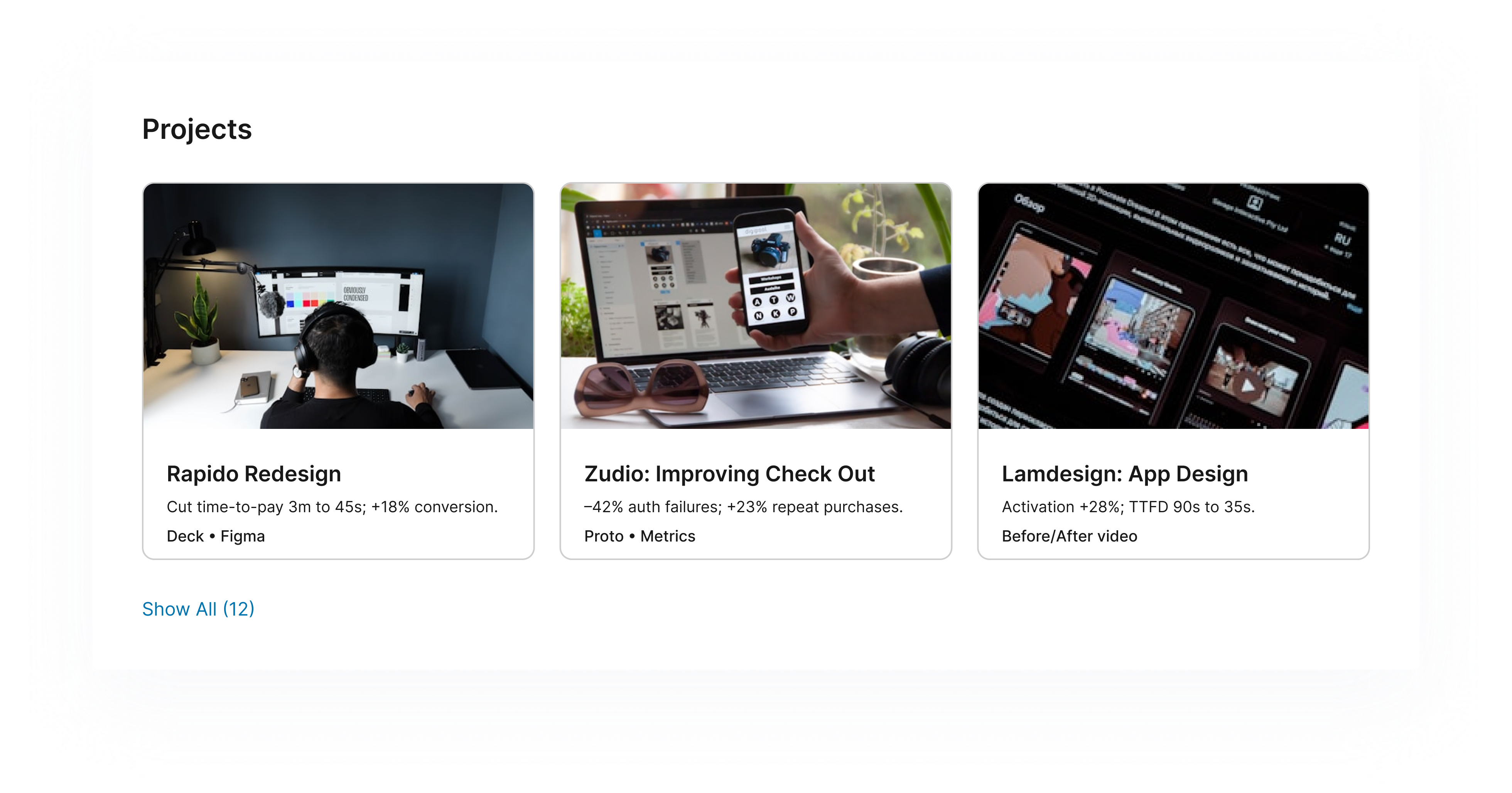 Showing 3 of 15 projects: signal over noise
Instead of overwhelming people with a wall of images or slides, this lets the best work lead. And if someone’s curious, they can dive deeper.
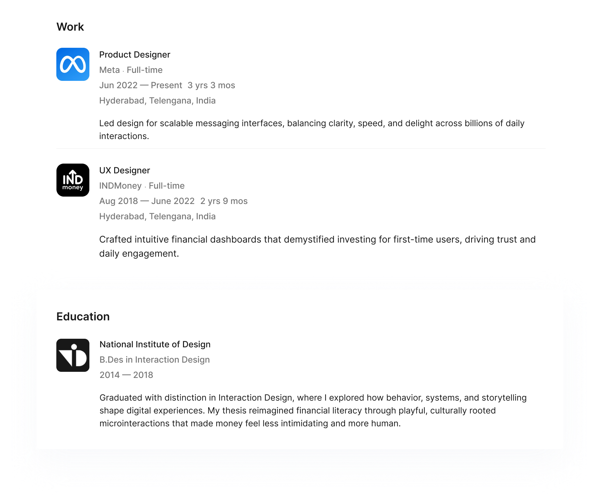
The Experience Tab: Resume, but Cleaner
Rather than mimicking a full resume, the Experience section is stripped down.
Each role includes:
- A short title and timeline
- A very short description of work done
- No long descriptions. No laundry lists.
This section exists to provide career clarity, not content overload.
Keeping it light while still covering the basics
The About Section: Personality in a Paragraph
The About section keeps things human. A one-line headline, a short paragraph ( 400 characters max), and a quick list of what I’m open to.
Instead of going all-in on storytelling, I chose to keep it friendly, functional, and clear.
It is:
- Structured
- Proof-led
You can read it in under 20 seconds. That matters.

Keeping it scannable and impactful
Recommendations and Endorsements: With Context
Both endorsements and recommendations are included. But I chose to leave them where they belong, below the projects.
This decision was intentional. I want people to see what I did before they read what people said.
The Activity Tab: Clean, Categorized, Contained
Instead of letting posts clutter the main experience, I moved them to their own tab with filter chips (Posts, Comments, Videos, etc.).
This gives anyone interested in my public thinking a smooth way to explore it. But it doesn’t distract from the work or resume.
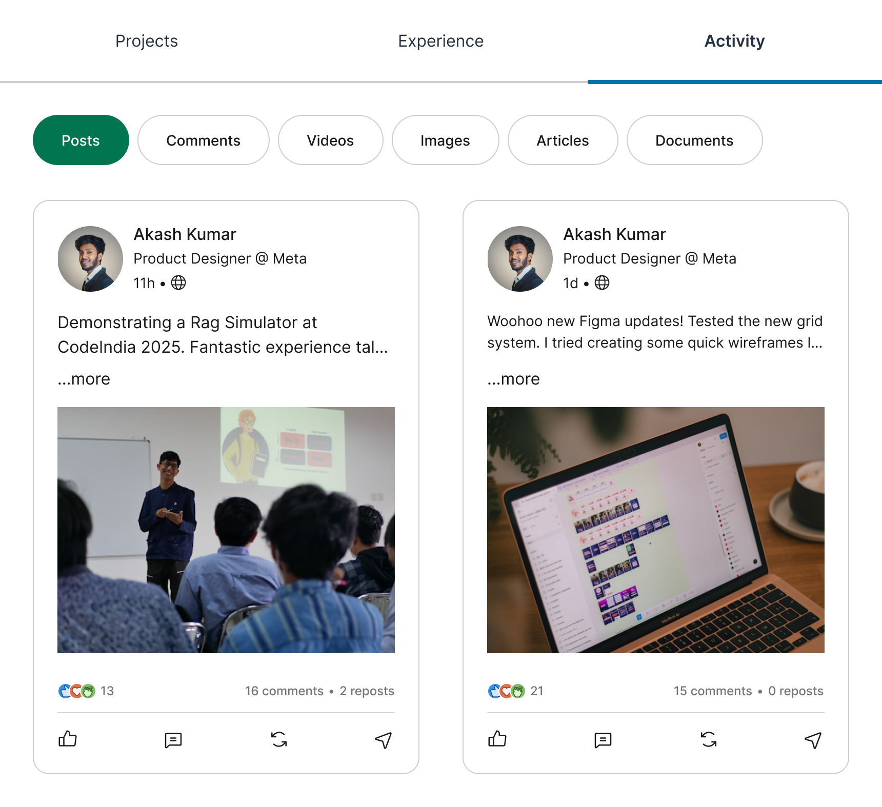 Activity stays discoverable, not dominant
The Contact Sidebar: Simple, Static, Complete
No CTAs, no animated buttons, no forms. Just:
- Website
- Phone
- Resume link
These fields are static by design. I want this section to feel reliable and respectful, not salesy.
Lessons from the Redesign
This redesign wasn’t about making a fancier LinkedIn. It was about making it feel clear, fast, focused, and a little more human.
Here’s what I learned:
- Tabs beat scroll when the visitor has intent
- Leading with projects builds trust faster than bios
- Short doesn’t mean shallow, it means thoughtful
Final Thoughts
If a profile is a product, then the goal is not just to be seen. It's to convert intent into connection.
This redesign is my attempt to do just that, while respecting the person on the other side of the screen.
Tools used
From brief

Topics
Share
Reviews
1 review
Hi Panchali,
The redesign looks good & clean, you kept the main look&feel of Linkedin, while adding your flavour. Make sure you work with column layout guides, so that your design is responsive, for multiple desktop sizes.
I would expect to see more details about what are the current problems that need to be solved, based on more research, rather than jumping straight to a solution.
What I see you mainly treated is replacing vertical scroll with tabs, while also adding projects. This is fine, but it needs to be supported by some user testing. On what data do you base the learning point you mentioned you had that tabs behave better than vertical scroll?
Also, under the three main tabs you proposed you are organizing multiple topics like for example under "Projects" you have projects, endorsements and recommendations. I wonder do people really expect to see those topics in the "projects" tab? If you do such content grouping, you need to validate your assumptions, maybe with some card sorting, to see how multiple people would group pieces of information.
Keep creating, you're on the right track!
You might also like

HealthFlow: Designing a Simple and Insightful Wellness Dashboard


Improving Dating App Onboarding: A/B Test Design

FORM Checkout Flow - Mobile


A/B Test for Hinge's Onboarding Flow


Accessibility Asse


The Fitness Growth Engine

Content Strategy Courses

UX Writing


Common UX/UI Design Patterns & Flows


Building Content Design Systems
