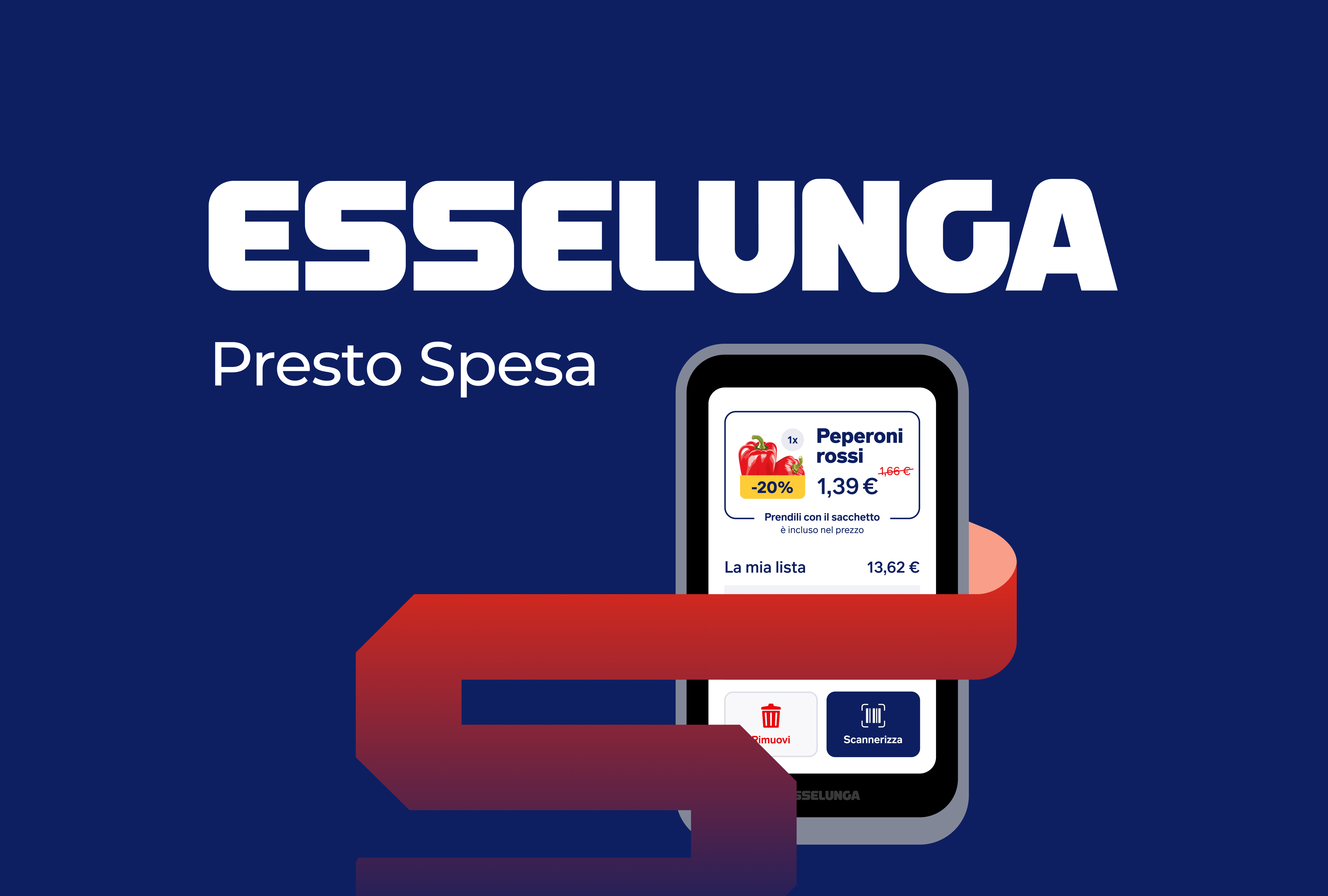
Redesign: Esselunga Presto Spesa

Esselunga is an Italian company operating in the retail sector with supermarkets and superstores.
The Presto Spesa service was created to streamline the self-service shopping experience. However, the company’s current device does not effectively reflect this concept. Therefore, the aim of this work is to improve both the UI and UX of the virtual shopping list device.
Process
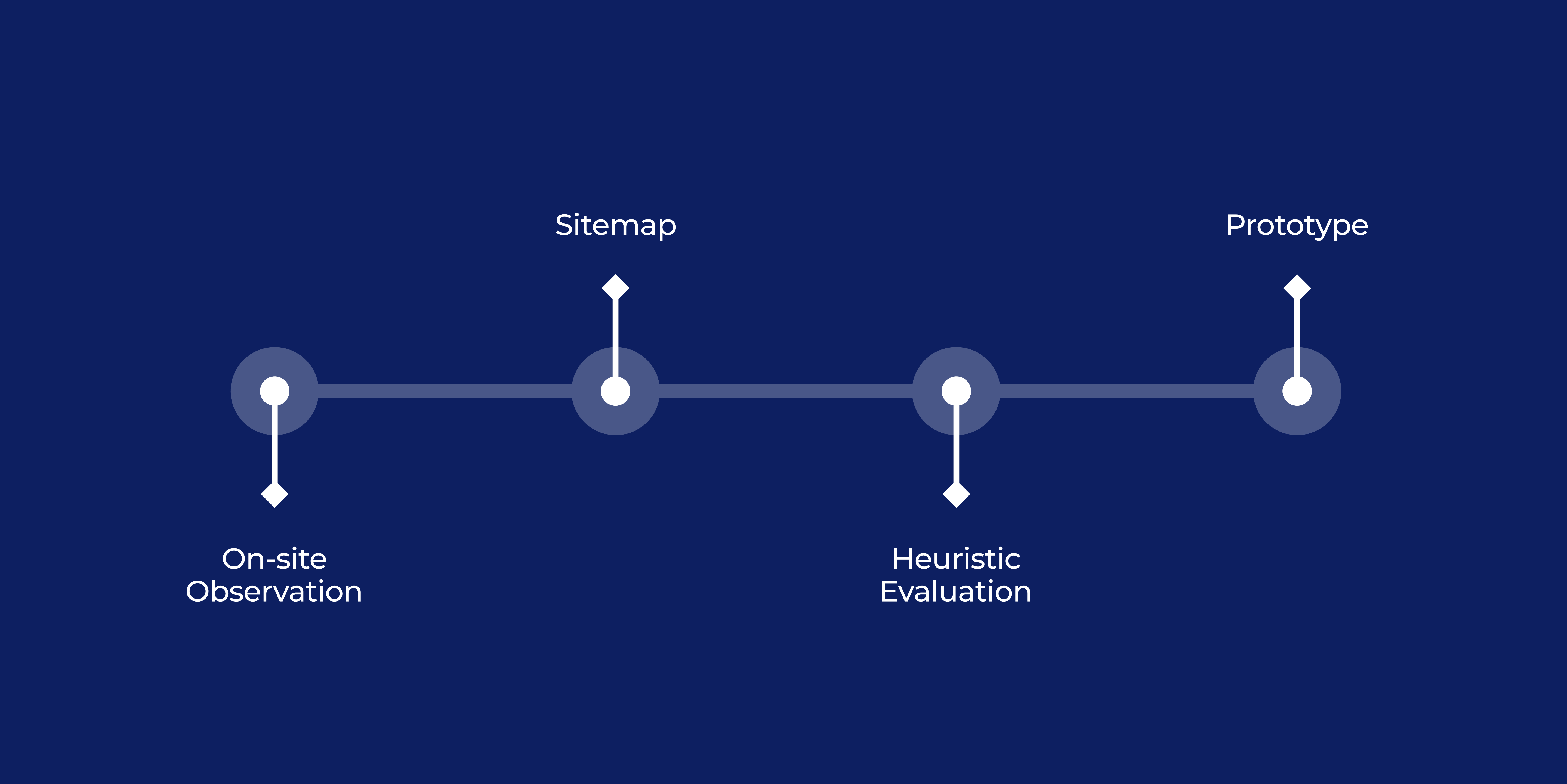
To achieve this, I used 4 steps:
- Observation: How people used the device, major challenges, and most used features.
- Information Architecture: Organization of content on pages, and navigation structure using sitemaps.
- Heuristic Evaluation: Usability study to verify compliance with heuristics.
- Prototype: Redesign with Figma.
Comparison
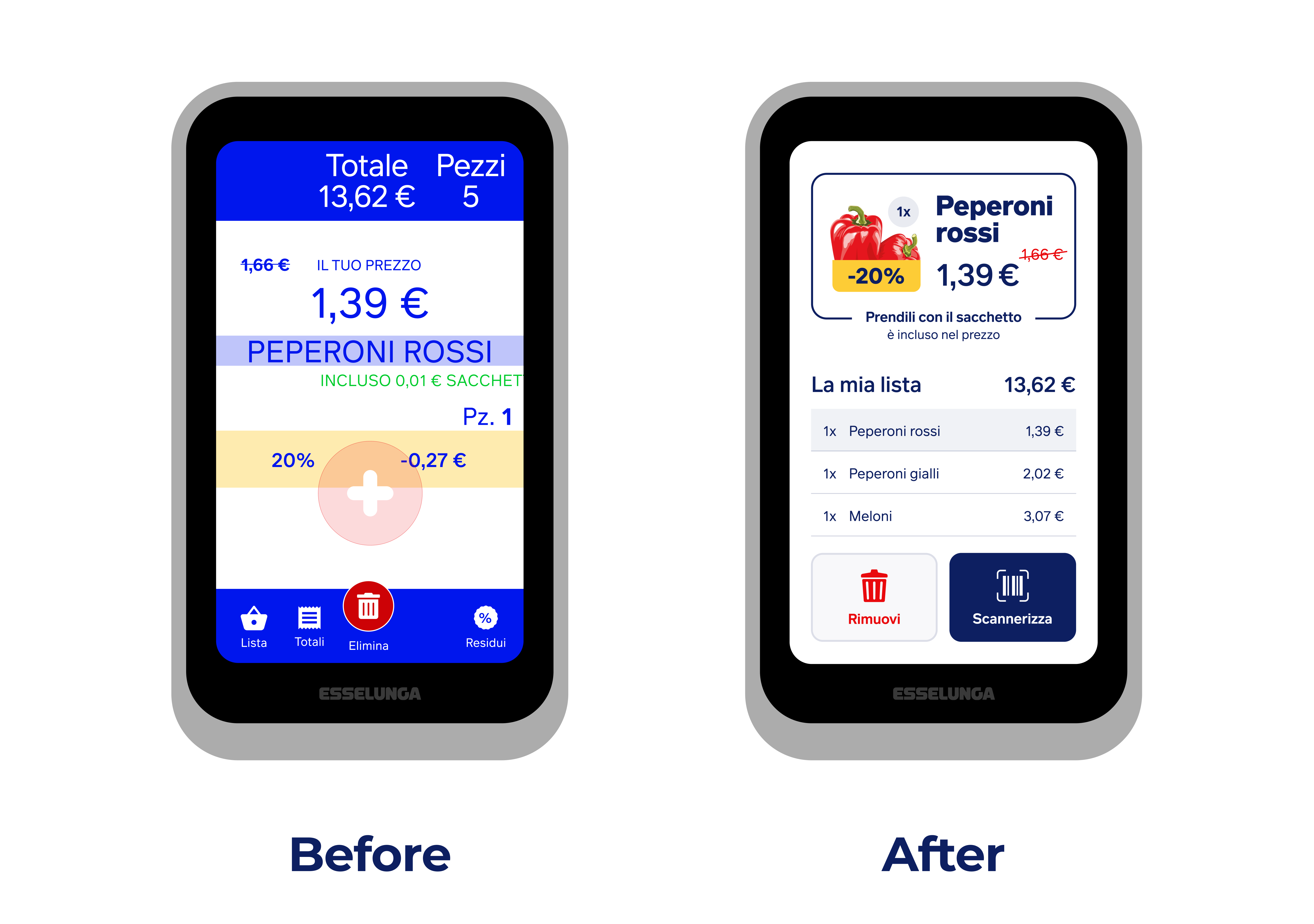
The overall structure of the information has been placed on a single page, giving more importance to buttons (enlarging the touch surface) and the last item entered (using illustrations). In addition, the list and its total count are always available and accessible for you to check.
Reviews
1 review

Congratulations on the project, Andrea Esposito. I really liked the way you solved the proposed problem, and the way you presented the project was also very well done.
One concern I had was regarding the product names, such as Peperoni Rosse. Due to the current font size, some products might end up with names that are not very visible. My suggestion would be to place the name right below the photo, using a slightly smaller font size. This way, you free up more space to display the product price without compromising the readability of the name.
Congratulations on the project, and if you have any questions, I’m here to help.
You might also like
SiteScope - Progress Tracking App


FlexPay


Mobile Button System


CJM for Co-Working Space - WeWork


Ubani Design System


Accessible Signup Form for SaaS Platform
Popular Courses

UX Design Foundations


Introduction to Figma

Design Terminology
