Re-designing a scanning app's App Store screenshots for better ASO as an exercise
Project Goals:
- Create an updated set of app store screenshots for TurboScan Pro* based on best creative practices and insights from competitor designs.
- Develop two variations of the app store screenshots (background, copy treatment, composition, etc.).
- Provide a brief explanation of the changes made and the rationale behind those design decisions.
*This project was a personal design exercise. Concept UI redesign based on publicly available information.
Tools:
- Figma
- Powerpoint / Google Slides
Role:
- UX / Visual Designer
- Digital Strategist
Client / Team:
Independent Practice Project - not associated with TurboScan (all rights reserved)
- Mindy Kilgore
Duration:
- 1 week
- October 2025
Planning
Methodology:
Competitive Audit: Audit TurboScan competitors’ app store experience in comparison to TurboScan’s app store screenshots.
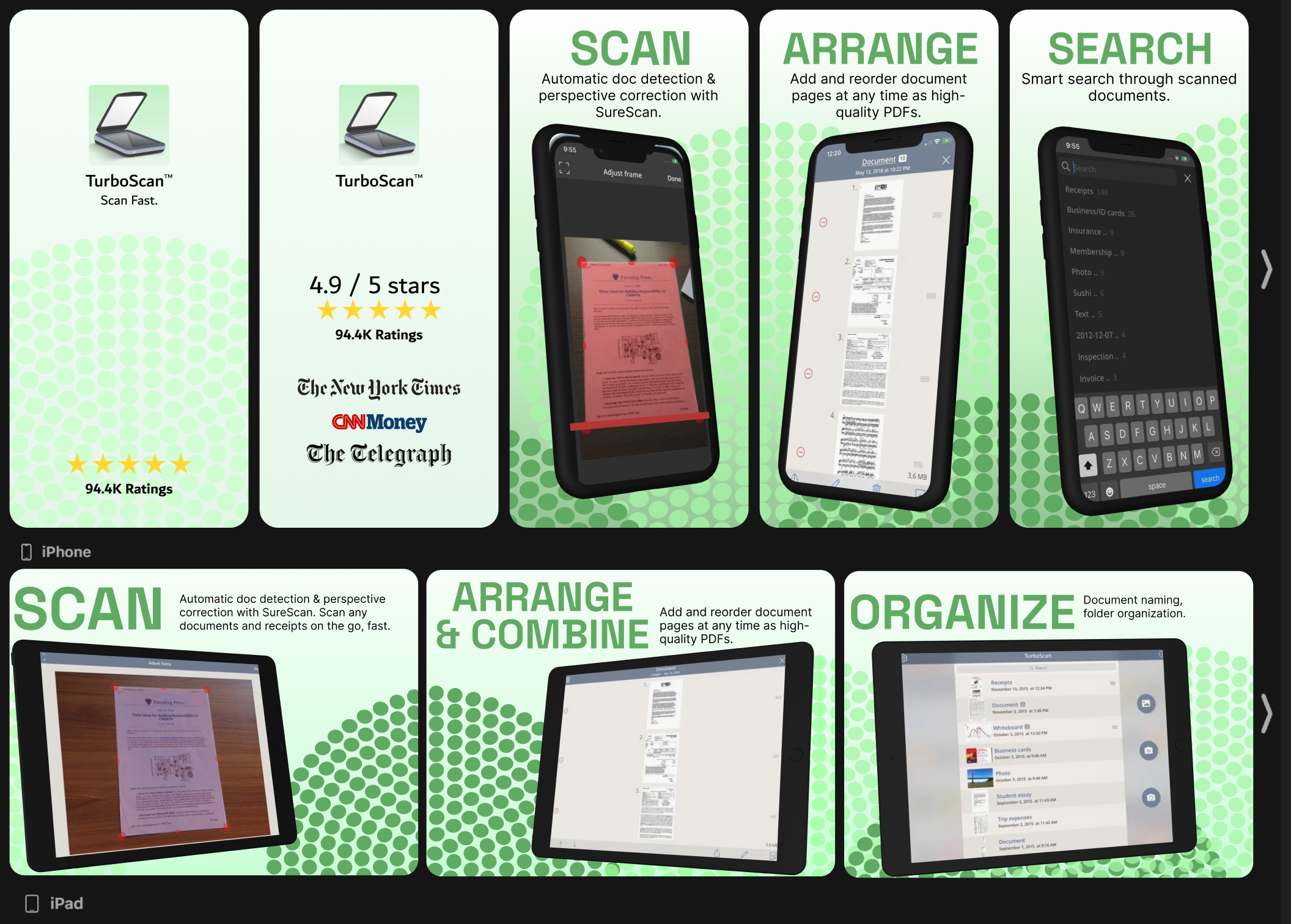
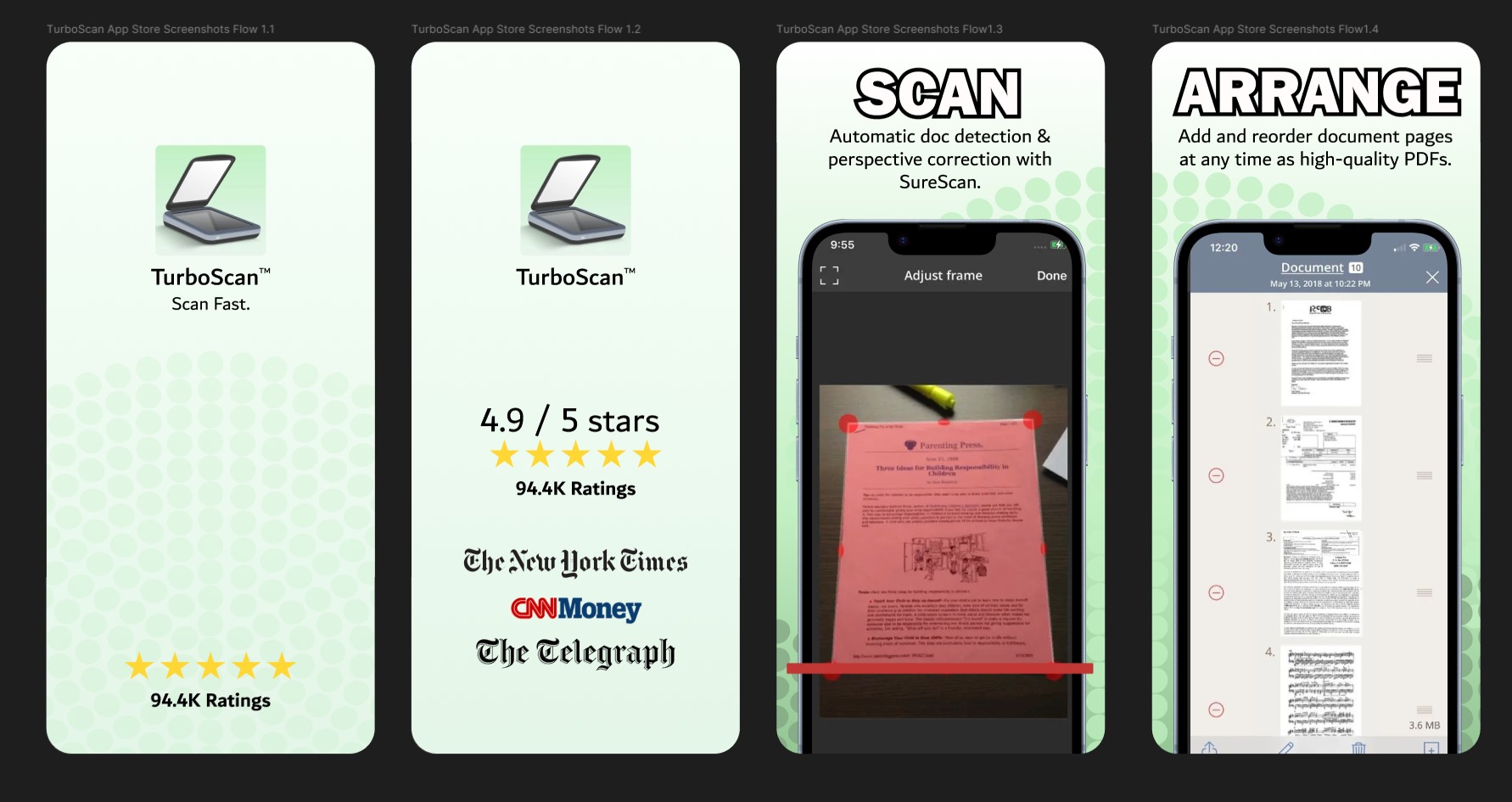
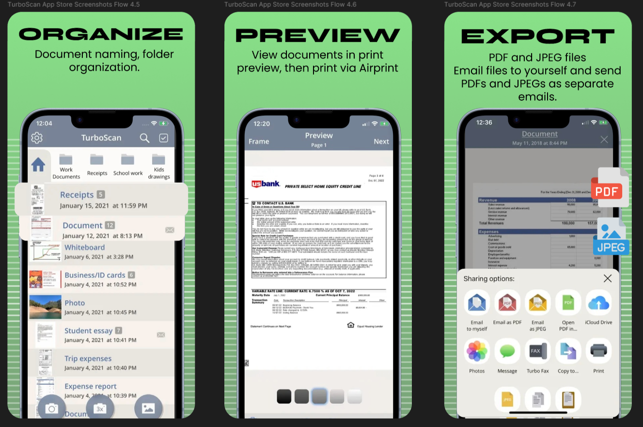
High fidelity mockups: Reimagine and update the app store screenshots for the TurboScan Pro: Document & Receipt app, aligning it with current design trends, ASO best practices, and successful elements from top competitors.
Before:
Research
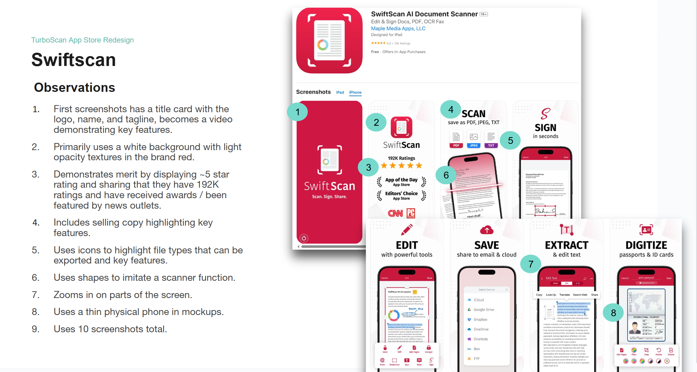
I completed a competitive audit for popular scanning apps on the app store, examining competitors Docly, Scanner Pro, Scanner Hero, iScanner, and SwiftScan:
Common Patterns / Opportunities:
- Brand color in background and use of textures / objects to add visual interest.
- Use of phone mockups in displaying screens.
- Including copy (a title and short - medium sentence) highlighting key features.
- Icons displaying what file types can be exported.
- A title card and screenshot displaying merit (rating, total ratings, total users, awards, news outlet features).
- Zoomed in areas that pop off of mockup.
Sketches
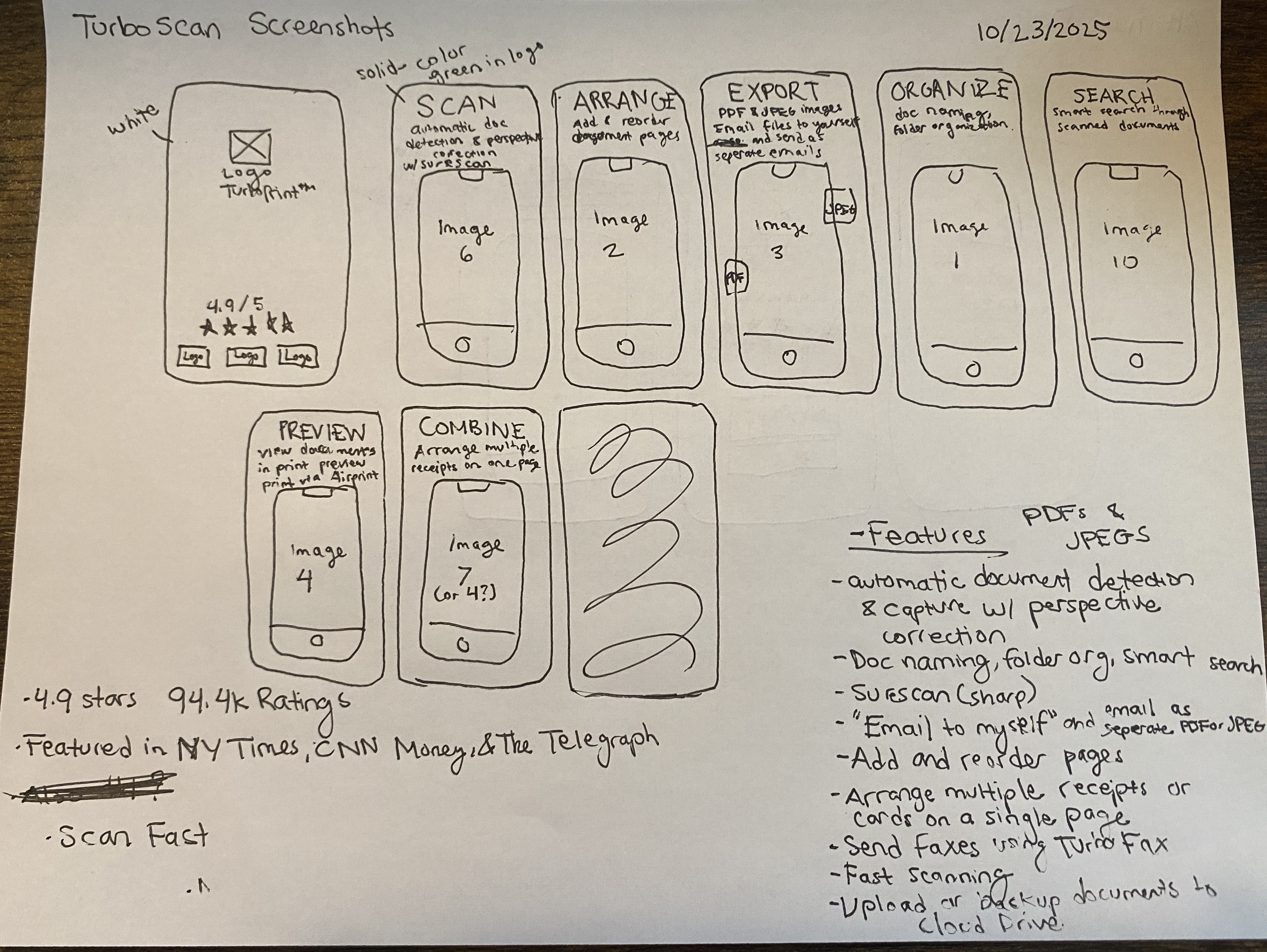
I created paper wireframe sketches based on the findings from the competitive audit and ASO best practices.
Copy:
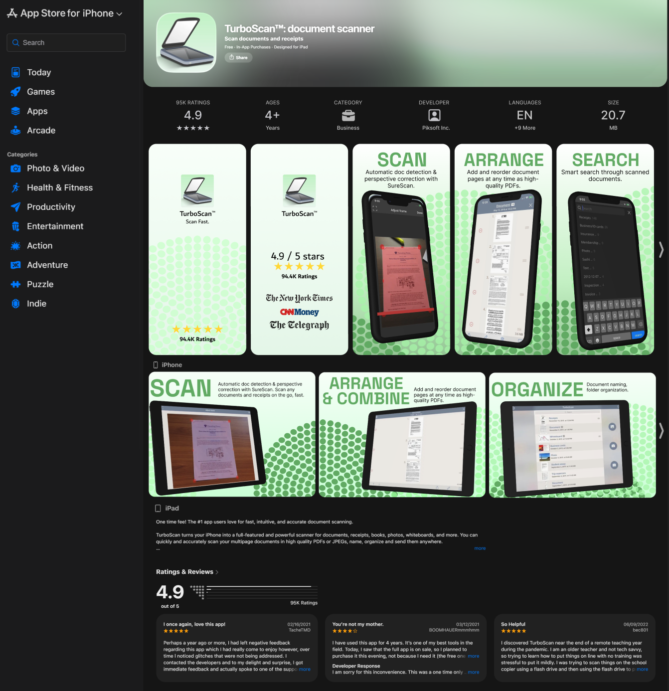
- Gathered merit from TurboScan ratings and app store description (4.9 stars, 94.4K ratings, featured in NY Times, CNN Money, & The Telegraph).
- Gathered app store assets and list of features from TurboScan app store description.
Layout:
- Title page with rating and merit.
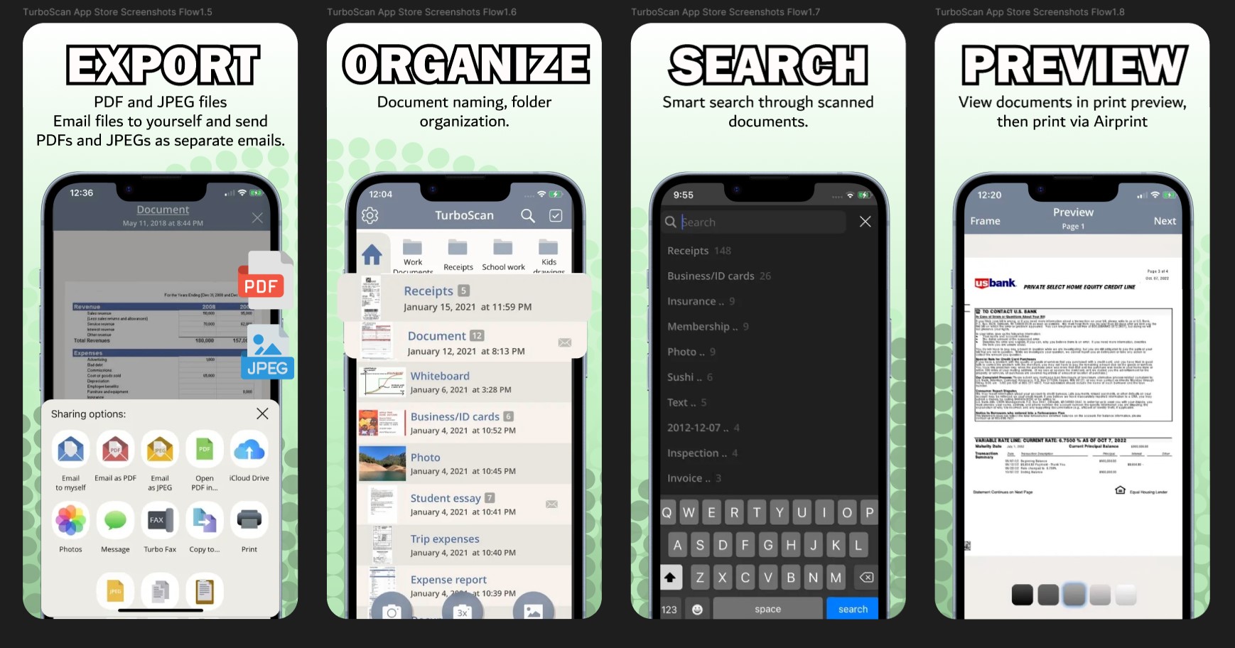
- Screenshots include a phone mockup and title with a sentence description of features.
- Include icons for exportable files.
Hifi Wireframes
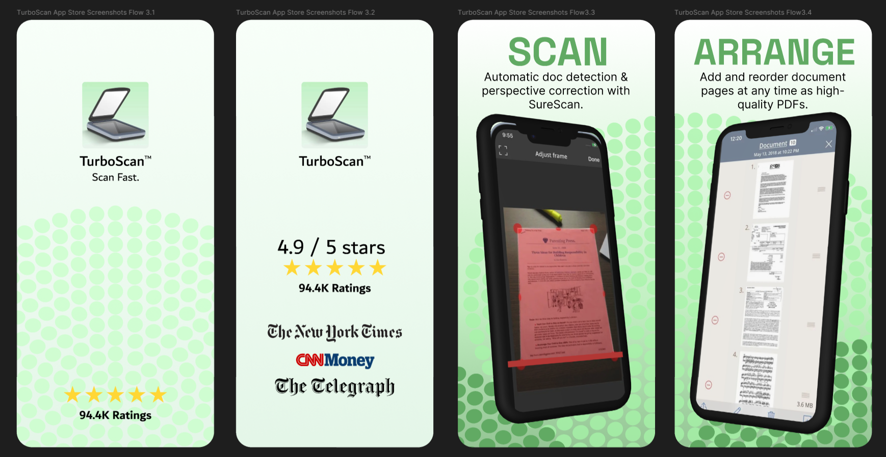
- Title card: Logo, tagline (Scan Fast, from name and claim of 3 second scans in description), star rating, and rating count.
- White and variations of brand green gradient and texture for background (brand consistency and evokes print / dpi associations with dot texture).
- Merit page: Display more merit (4.9 stars, 94.4K ratings, news outlet features).
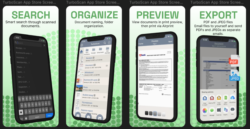
- Titles and descriptions of features paired with previous app store screenshots.
- Phone mockups with visual enhancements (red bar for scanning, pop out sections, icons for exportable files).
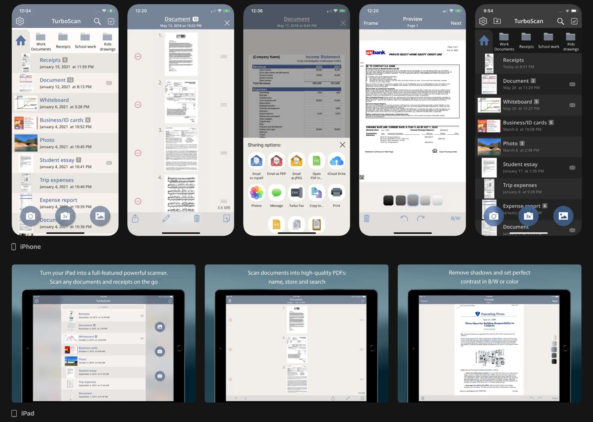
Alternate Version:
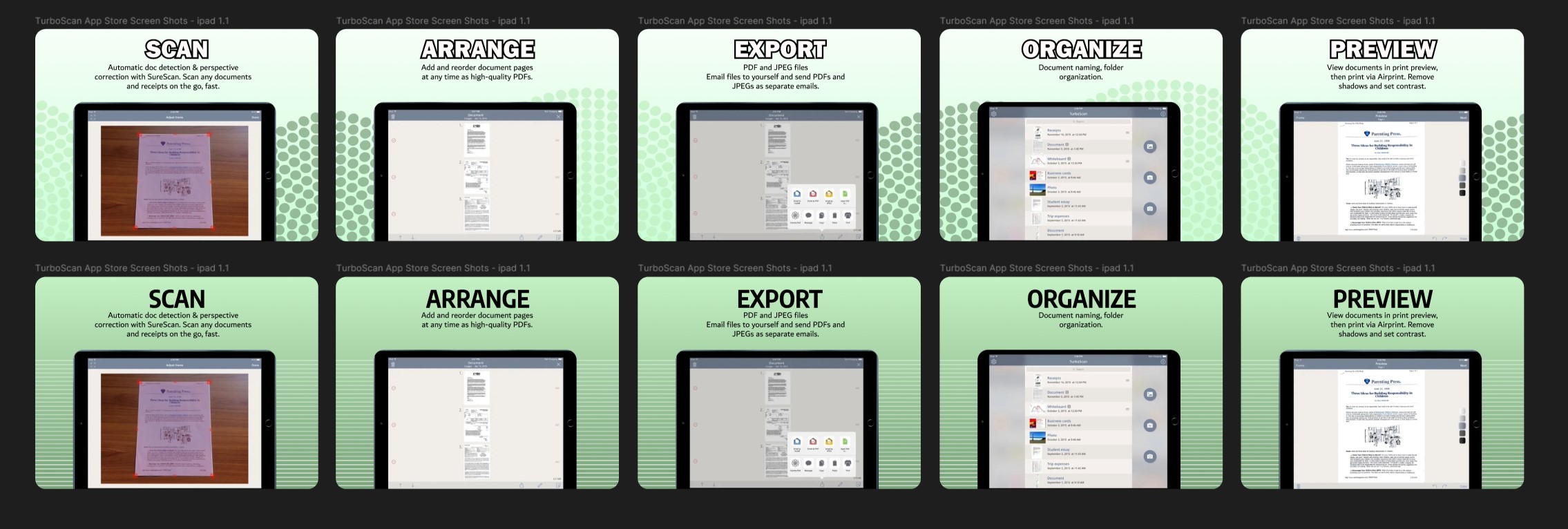
iPad Designs:
Iteration
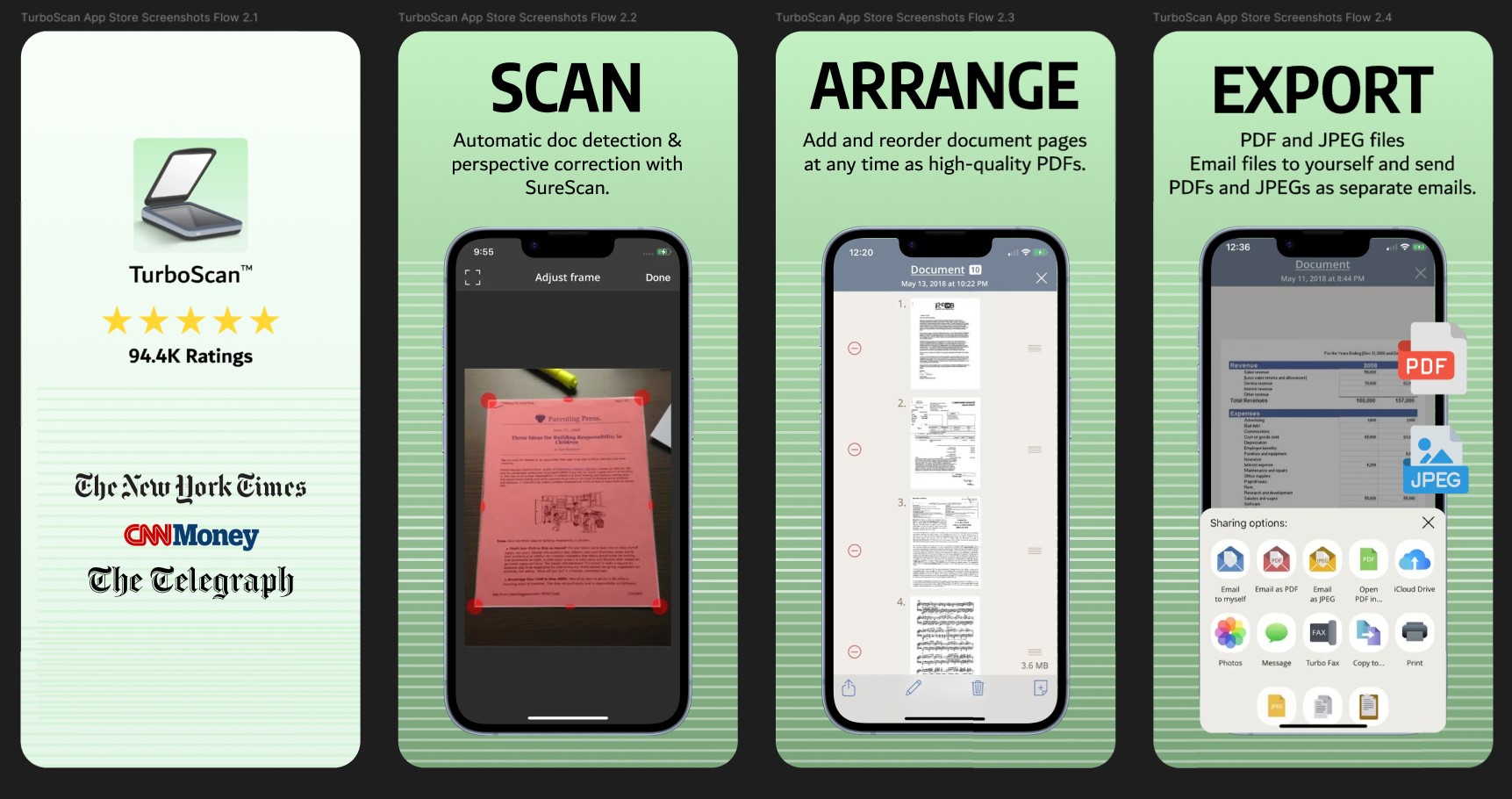
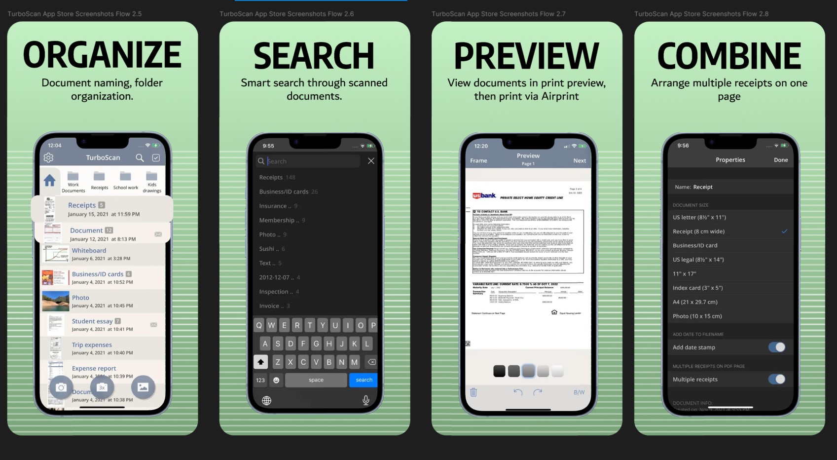
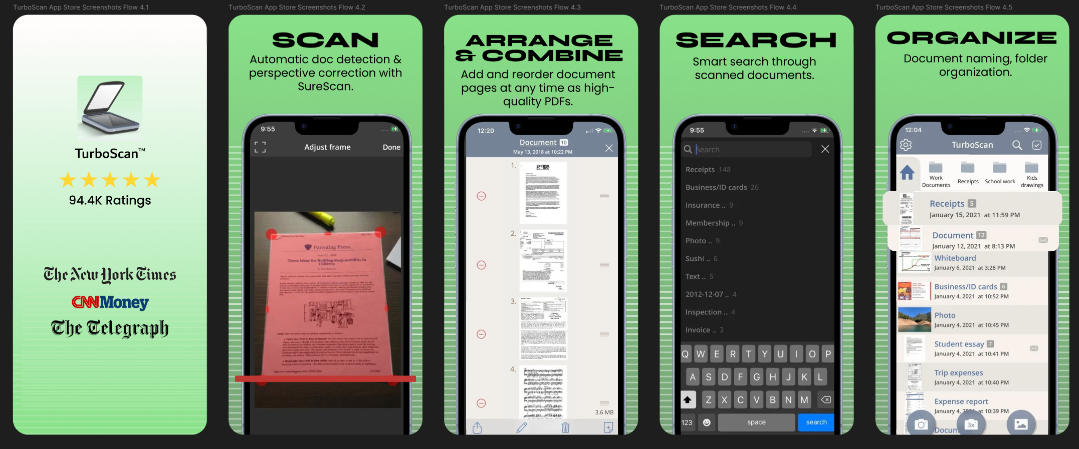
Upon finishing version 1 of the TurboScan high fidelity screenshots, I received feedback that the previous screenshots were close to competitor versions but still did not reflect 2025 design trends. The user journey could also be improved in the screenshot order. I redesigned version 2 to incorporate the following changes:
- More saturated colors and more playful fonts for headers
- 3D phone and iPad mockups
- Assymetrical design
- Screenshots re-ordered to reflect step-by-step user journey
Alternate Version:
iPad Version:
Project Images
Apple App Store mockup for updated v1 and v2
Takeaways & Next Steps
- Practiced incorporating 2025 design trends into ASO-forward app screenshots.
- Improved on copy and user journey presented by screenshots, ASO layering.
- Learned a lot about scanning apps!
Reviews
3 reviews
Great work!!
Great initiative on reimagining the Scanning App screenshots! You have a strong foundation here.
To understand your direction better, could you share the rationale behind the chosen font and color palette? Currently, the combination feels a bit visually heavy and impacts the overall clarity.
A few specific observations for improvement:
- Visual Hierarchy: Since the title is already bold, the underline feels redundant(iPad). Removing it would reduce visual noise.
- Alignment: Check the grid on the iPad section; a few elements seem to have drifted out of alignment.
I’d recommend reassessing the contrast and whitespace. A cleaner approach will boost legibility and make the UI much more inviting
Very Professional work Mindy - Seems you are a Organizer.
As a Mentor, let me help you give some guidance on the improvement. You can do.
- the bold text you are using in the App Store. Screenshot doesn't look trustworthy at all. Keep it black, and also the subtext needs to be great and dimmed out. Make that thing medium that would look perfect.
- What's missing is branding is what you lack. You do have a research brain as well as a good arrangement of visual identity that puts you at least about beginners but your clarity and font choices and background distribution needs a lot of work.
• Background is too shiny compare to the screen. That means my eyes are on background versus the screen that you are trying to show which is really bad, make it as subtle and less focus.
- when the screen has too much of inside, use darker background so that my whole attention remains on elements rather than on the white shiny background, which is an eye source. Design also seems very bald with a blueish grey colour – 2012 vibe. Make it bold and fancy use a darker colour of blue that generally gives a signal of trust.
🔥 So much more review that I can give you just on your screen - 👉 check my uxcel profile, and if you need anyone on one mentorship for free – connect me there & will quickly arrange something😇
You might also like

edX Sign-Up Page Redesign

Beautify Login page WCAG principles

Design Prioritization Workshop

Sanyahawa - Personal Portifolio_login page
eWallet App Development Project
Uxcel Halloween Icon Pack
Popular Courses

UX Design Foundations

Introduction to Figma


