Profile Card

Profile Card color Exploration
Reviews
1 review

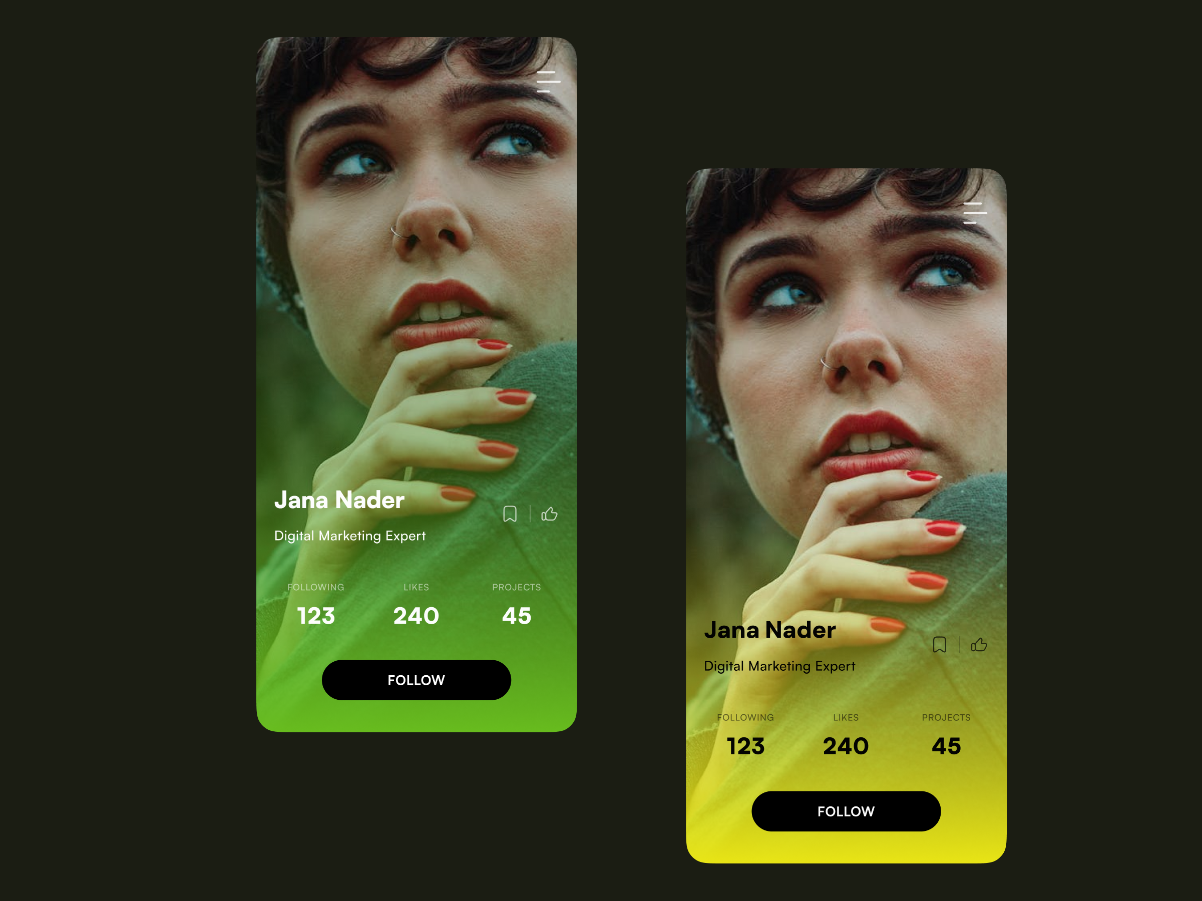
Your profile screen designs are visually striking and modern, with high-quality, engaging profile pictures that draw attention. The vibrant gradient overlays are eye-catching, though the green might obscure some details, and the yellow appears more balanced. The typography is clean, but slightly increasing font sizes could enhance readability. The "Follow" button stands out well, though ensuring adequate contrast for all text is crucial for accessibility. (p.s. you could have showed how it will look when the person is followed, e.g. different position of the same CTA button)
The information hierarchy is well-organized, making it easy to scan user stats. Ensure buttons and icons are adequately spaced for easy tapping, provide clear visual feedback for interactions, and maintain consistent styling throughout the app. Additionally, incorporating a visible navigation option and a brief user bio could enhance usability and context.
You might also like

HealthFlow: Designing a Simple and Insightful Wellness Dashboard


Improving Dating App Onboarding: A/B Test Design

FORM Checkout Flow - Mobile


A/B Test for Hinge's Onboarding Flow


Accessibility Asse


The Fitness Growth Engine

Popular Courses

UX Design Foundations


Introduction to Figma

Design Terminology
