ProdActive - Color System

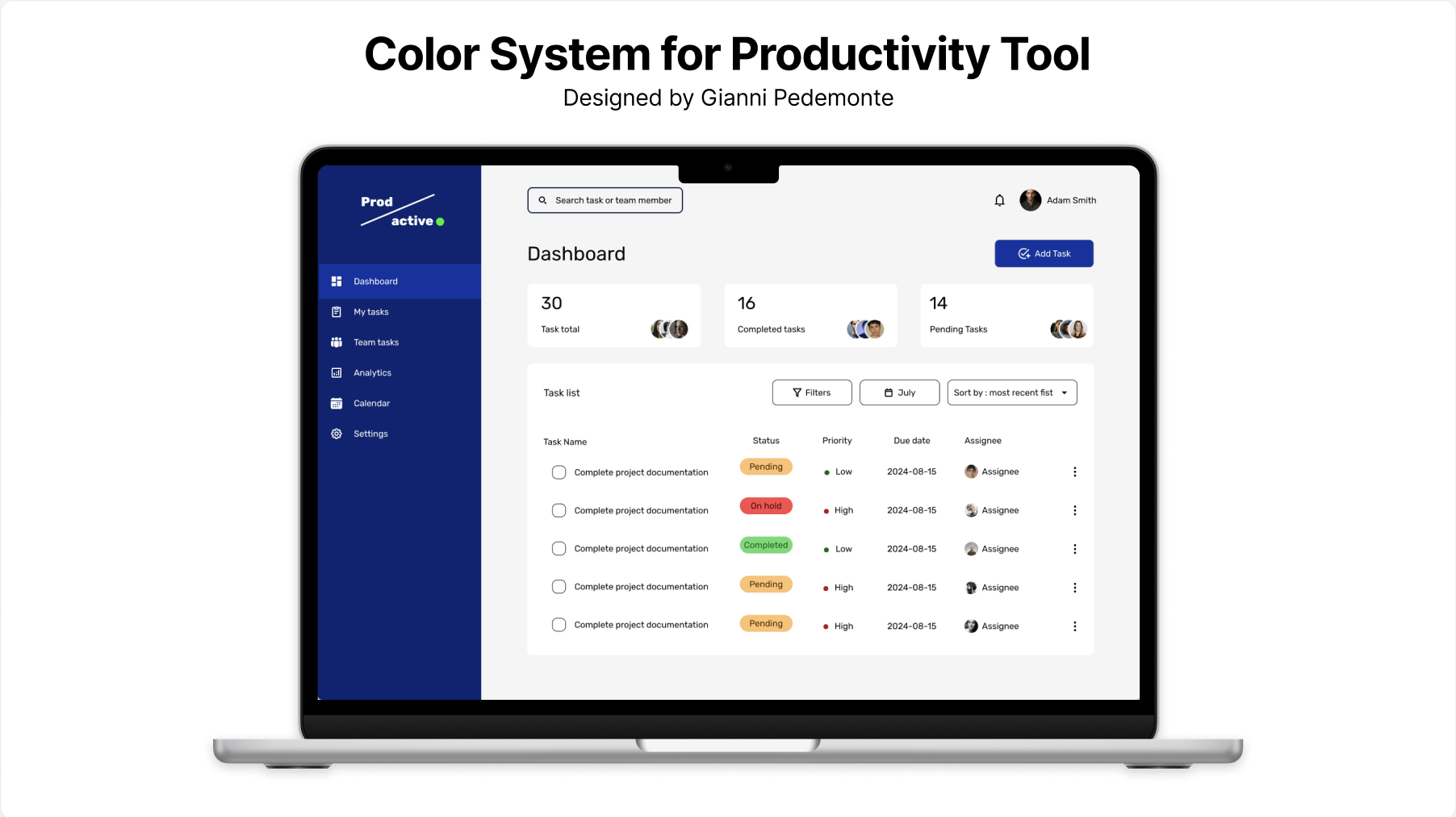
For the purpose of developing this Color System I decided to create a UI design for a fictional productivity toll called ‘ProdActive’ using Figma.
The Color System is designed to reflect the following brand principles:
- Professionalism
- Trust
- Efficiency
Yes, I know what you might think, the color Blue can be associated with sadness and aloofness AND also feelings of calmness and relaxation. It is often described as peaceful, tranquil, secure, and orderly.
Businesses that want to project an image of security often utilize blue in their advertising and marketing efforts. It is also often used to decorate offices because research has shown that people are more productive and creative when working in blue rooms.
Thank you for your attention
----------------------------------------------------
WCAG tester https://accessibleweb.com/color-contrast-checker/
https://www.verywellmind.com/the-color-psychology-of-blue-2795815

Reviews
2 reviews

Gianni, thank you for sharing your ProdActive Color System project—it’s clear you’ve put a lot of work into it!
That said, I have many questions about your design and presentation...
First, I was very (really... very) confused by your description of blue as a colour of sadness and aloofness. While I get where you’re coming from, I don't think this negative association is necessary. In design, blue is overwhelmingly tied to trust, calm, and security—attributes that align perfectly with your brand principles of professionalism, trust, and efficiency. I’d recommend keeping your presentation focused on the positive aspects of your design choices.
I also don’t quite understand the need for so many colours. With multiple blues, reds, yellows, oranges, and greens, the palette feels a bit overwhelming. If you have more than 15 colours—especially when many are variations or tints—it might be better to simplify and create more consistency. The goal should be a cohesive palette that works harmoniously.
A couple of specific things jumped out at me: you refer to a “Pure White” with the HEX value of #2F8733, but this is actually a green shade that isn't used, and you instead use a true white (#FFFFFF). This inconsistency could confuse users.
Additionally, the primary blues don’t all seem necessary. Rather than using so many, you could focus on creating different shades of one blue to handle the varying levels of background, light, and shadow. This would help streamline the design.
When you say the secondary colours communicate task statuses without being overwhelming, I have to disagree. The amount of colours and the way they’re presented actually feels very much overwhelming. It’s hard to trust the research behind a colour palette when the presentation of those colours and their HEX values are hard to read or inconsistent. For example, you list "Lust" as #EB1A1A on one page and then #FC4A4A on the next—why the change? Similarly, "Melon" shifts from pink to brown, which is confusing.
Another issue is that your secondary colours closely resemble the system colours for error, warning, and success, but then you introduce yet another set of colours for those states. This adds to the confusion. You also list tertiary colours like "International Orange" (#B30F0F), but this is clearly red, which further blurs the lines between states and colour purposes.
Lastly, in your WCAG slide, you mention testing some colours for contrast, but you only tested 9 out of the 20 colours in your presentation. I’m left wondering about the rationality behind it and contrast compliance for the remaining colours.
I don't know your level of experience in design or if you are used to presenting your work in this format, but this would be a mess to show in a meeting.
I feel this project needs more thought and refinement. If you'd like, I’d be happy to help you review and revise the most pressing issues to make your presentation stronger and more cohesive.
Keep up the spirit and your hard work!

Hi Gianni. I'm not sure if you're a beginner or intermediate, that may have influenced the level of detail of my review.
But essentially, I love that your contents are well laid out, and there is clear hierarchy. The side bar is clearly 'separated' from the content window.
You wrote a majorly around the color system, I'm not sure if you want the review to be only around the color scheme. You may need to be clearer next time so you can get more specific feedback.
The color system you have chosen is like what you will find in 70% of most dashboards😊. Blue is more like a default primary color and I doubt anyone will associate it with sadness and aloofness as you mentioned.
But I think you may need to work on your typography. Play around different weights to have better hierarchy. For example, the table header is not clearer differentiated from the table contents.
Your contrasts also may need some work. You can use a contrast test plugin to check. For example, the "completed tag/badge". Some of the colors can also not be differentiated by color blind users e.g. red/green.
Lastly, I think you should work on consistency for your icons. You mixed outline and filled icon styles in your side bar nav menus. You can stay with one unless with change of states - default and selected state.
Thanks.
You might also like

edX Sign-Up Page Redesign


Beautify Login page WCAG principles


Design Prioritization Workshop


Sanyahawa - Landing page Design

Uxcel Halloween Icon Pack

eWallet App Development Project

Visual Design Courses

UX Design Foundations


Introduction to Figma

Design Terminology
