Reviews
2 reviews
I really like what you put together from a UI perspective, but it would have been nice to understand why you made such decisions. Very solid work Faith!
- The text on the green box is not clear, we need to ensure there’s enough contrast between the text and the background color, especially for users with visual impairments. You might want to check it against WCAG guidelines for color contrast.
- 'Startup', 'Growth', and 'Enterprise' are descriptively named, aligning well with potential customer segments. However, I didn't get the code names. Consider if the names could better reflect the value or the service level provided.
- The bold colors for illustrations are attention-grabbing.
- Using different colors for each plan is confusing. It could be beneficial to use one color to maintain consistency and avoid any confusion. You might want to highlight the most popular or recommended package to guide users in their choice.
- Visual differentiation could be emphasized for features. Maybe icons or graphics could be used to represent the features, making the differences more discernible at a glance.
7 Claps
Average 3.5 by 2 people
You might also like

Project
Islamic E-Learning Platfrom Dashboard
Visual Language & Color I wanted the interface to feel like a quiet room you'd actually want to sit in and study. The warm neutrals - off-wh

Project
Pulse — Music Streaming App with Accessible Light & Dark Mode
Platform & DeviceFor this project, I designed Pulse, a mobile music streaming application for iOS devices (using the provided mobile templat
Project
SiteScope - Progress Tracking App
🧩 Project OverviewThis project showcases the design of a mobile login and sign up experience for a construction progress tracking app. The

Project
Mobile Button System
As my first ever ux design attempt, I tried to go with a simplified approach with only a few button types and states. I kept the color palle

Project
FlexPay
The onboarding was designed to reduce financial anxiety, create a sense of instant reward, and encourage early action. Instead of overwhelmi

Project
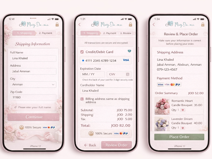
May.Da.Ma Candles & more
Visual Design Courses

Course
UX Design Foundations
Learn UX design fundamentals and principles that create better products. Build foundational knowledge in design concepts, visual fundamentals, and workflows.

Course
Introduction to Figma
Learn essential Figma tools like layers, styling, typography, and images. Master the basics to create clean, user-friendly designs

Course
Design Terminology
Learn UX terminology and key UX/UI terms that boost collaboration between designers, developers, and stakeholders for smoother, clearer communication.


