Packaging Digital


Digital Print Design Landing page Design in Figma
Tools used
From brief

Topics
Share
Reviews
1 review

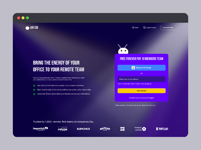
The floating fully-featured navigation on top of the wide hero background really solidifies this for me as a nod to one of the oldest business practices, printing, that continues to evolve. You’ve managed to represent the technological advancement of modern printing solutions through this neatly composed navigation bar. It feels informative and self-sufficient for a landing page: contact details (phone, email, socials, store location, search), clear branding, and essential page links like About Us and Gallery. Everything a potential customer might need to start their journey is already visible.
I believe I’ve said this before, so here it goes again: we’re living in an abundance of resources, and I personally think “lorem ipsum” has run its course. Even with free tools, it takes one short prompt to create a decent copy that fits your brand tone.
Using real or at least thoughtful copy, even for design practice, has a lot of benefits:
- It helps you understand the natural rhythm and hierarchy of real content.
- It improves visual balance because real words vary in length and flow differently than placeholder text.
- It communicates intent, showing that you think beyond the layout.
Every little detail matters in design, and words are as much a design element as color or shape. You’re already halfway there, just give your text the same care you’ve given the visuals and it’ll stand out even more 🖨️
You might also like
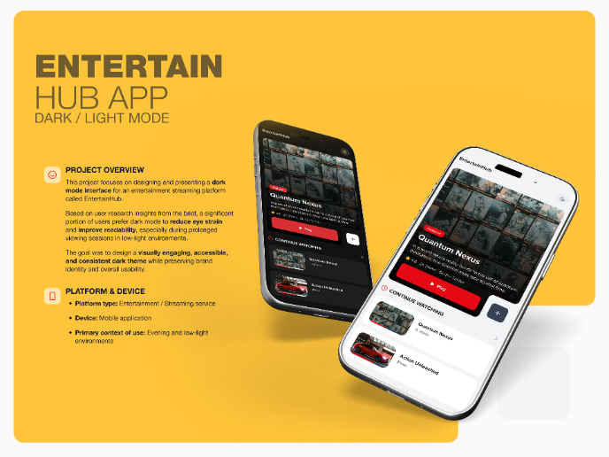
EntertainHub App (Dark / Light Mode)

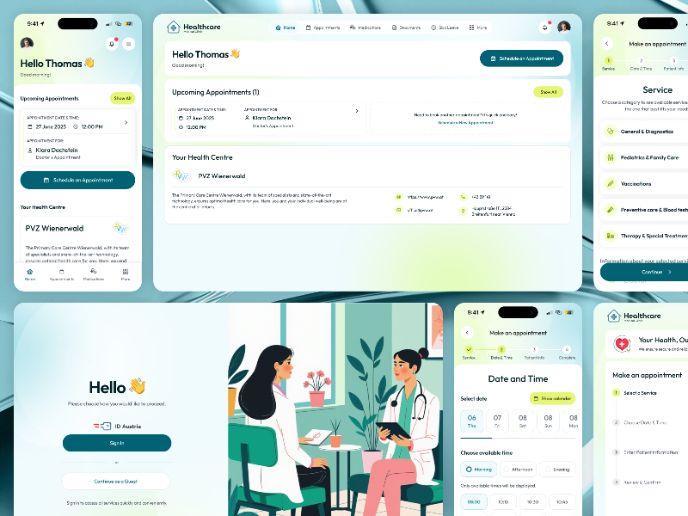
💊 Healthcare Desktop & Mobile App UX/UI Design

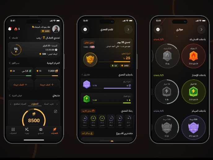
Fitness Challenges App

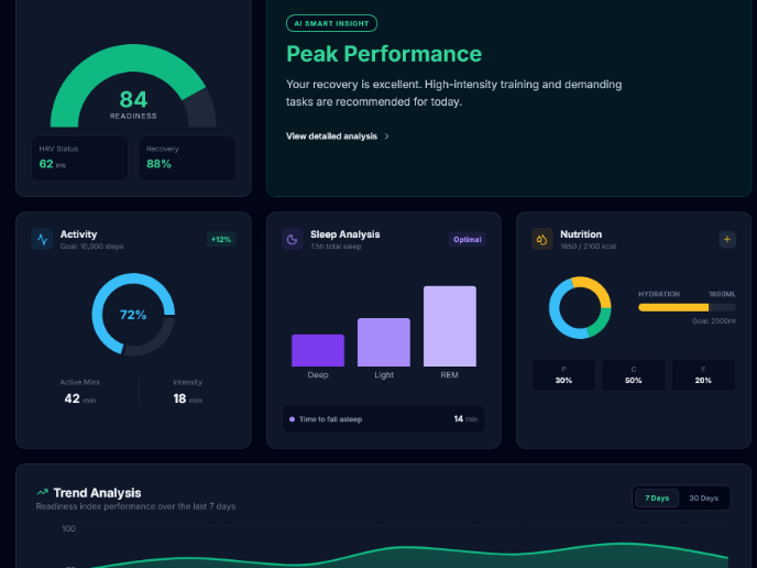
Personal Wellness Dashboard


Events Managment App
SaaS Signup Design

Content Strategy Courses

UX Writing


Common Design Patterns


Building Content Design Systems
