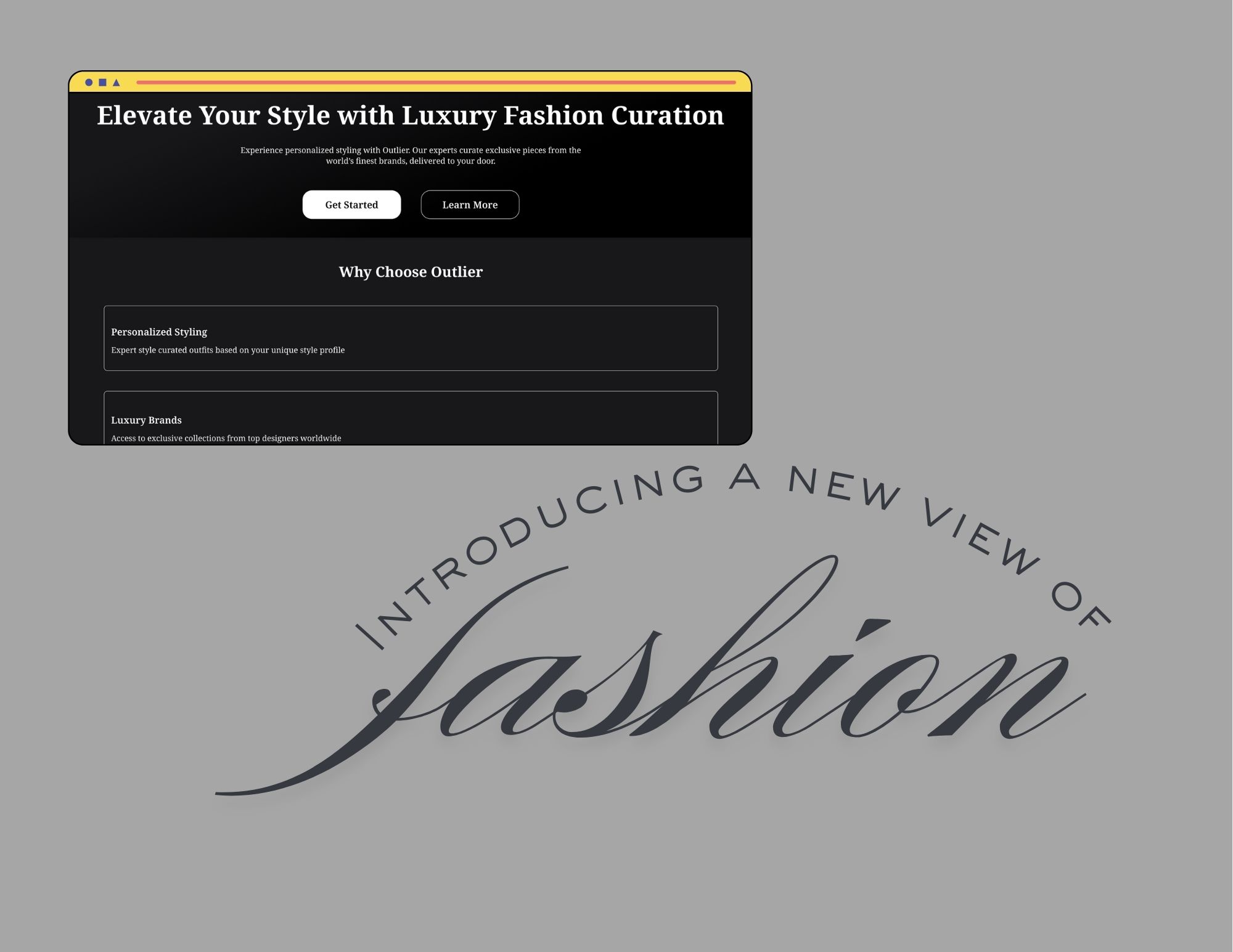
Outlier Landing Page
I chose to design for "Outlier" - a luxury fashion subscription service that curates personalized outfits from high-end designers. This service targets fashion-conscious professionals seeking convenient access to premium clothing. I used a dark color palette (zinc-900, black) with white accents to create an elegant, premium feel. This approach aligns with luxury fashion brands while ensuring excellent readability.
Tools used
From brief
Topics
Share
Reviews
1 review
Hello Kendra, nice to see your project. I appreciate you embraced the interaction in the prototype and your concise introduction for the case study.
Here are some suggestions I would like to contribute:
- While the simplicity of content fits the overall mood of luxury fashion, the landing page still lacks the sophistication need for this kind of website. That would be the proper ratio between the main headline content and the body, the spacing between them and even the variety in using neutral colors (black, gray, white and their shades).
- Let's consider using large and relevant image to make the page more engaging.
- The CTAs should be repeated in the body or somewhere below the body. If the user interests in the body content, he/she does not need to scroll all the way up to click the CTA buttons.
Love to hear more from you. Have a great day, Kendra.
3 Claps
Average 3.0 by 1 person
You might also like

Project
edX Sign-Up Page Redesign
OverviewThis project focused on improving the accessibility and user experience of the edX sign-up page. The original design had usability a

Project
Beautify Login page WCAG principles
This accessible signup form design follows WCAG principles by ensuring the interface is perceivable, operable, understandable, and robust fo

Project
Design Prioritization Workshop
A structured session to evaluate product ideas, prioritize high-impact features, and define a clear implementation plan.

Project
Sanyahawa - Landing page Design
I designed this with one goal in mind: make creating an account quick and easy Many sign-up pages feel crowded and confusing, so I focused o
Editors’ Choice
Project
Uxcel Halloween Icon Pack
🎃 Introducing the Uxcel Halloween Icon Pack! 🎃 This custom Halloween-themed icon set was created to enhance the seasonal user experience o
Project
eWallet App Development Project
✨ Experience the future of digital payments with our innovative eWallet App design! Our concept combines powerful fintech capabilities with
Content Strategy Courses

Course
UX Writing
Learn to write microcopy that communicates clearly and concisely to improve user experience, build trust, and boost conversions across digital products.

Course
Common UX/UI Design Patterns & Flows
Learn how to use tried and tested UX/UI design patterns and flows to solve recurring design problems faster and build interfaces that feel intuitive

Course
Building Content Design Systems
Master systematic approaches to creating consistent, reusable content across your entire product ecosystem
