Online Education App UI

Key Features Highlighted:
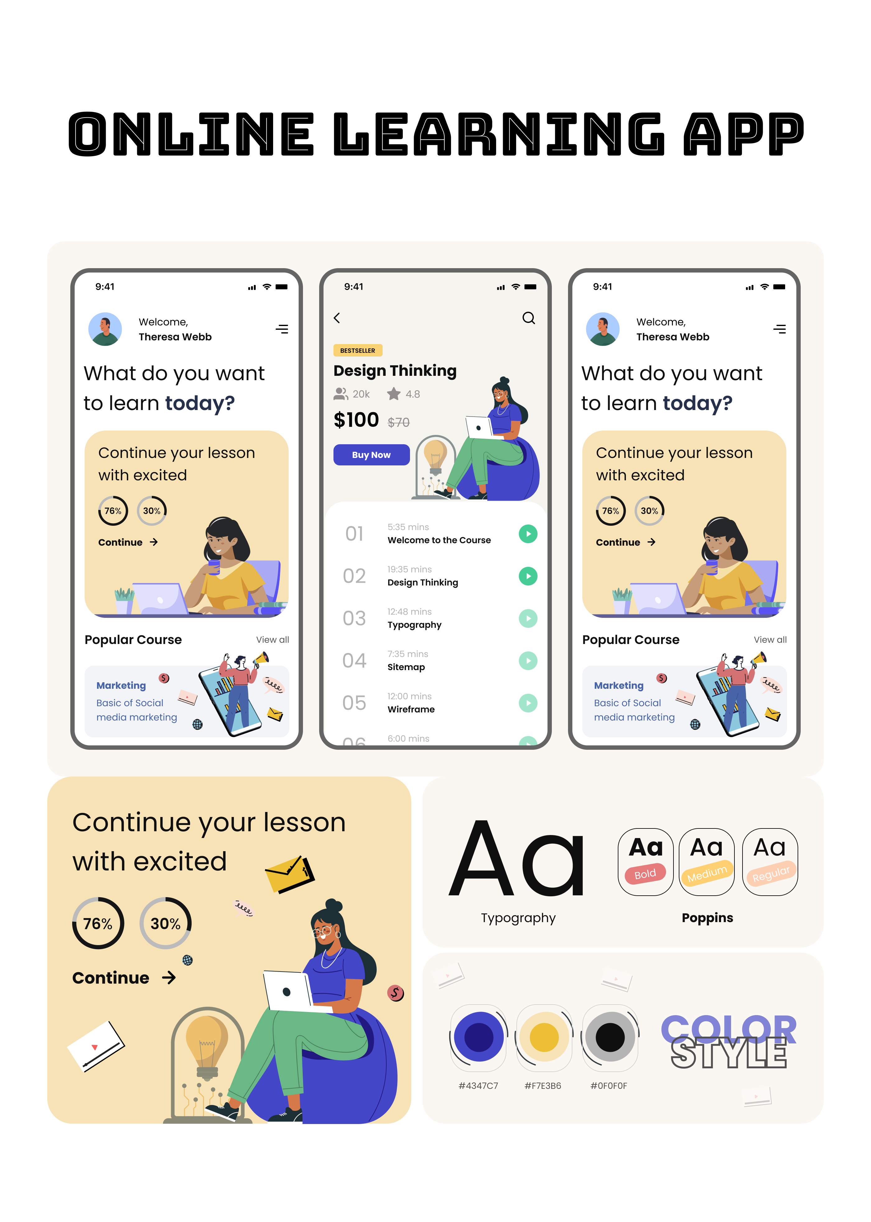
- Personalized Dashboard: Upon opening the app, users are greeted with a personalized dashboard. Theresa Webb is welcomed by name, and the app immediately prompts "What do you want to learn today?" This focus on personalized learning is reinforced by the "Continue your lesson with excited" section, showing a clear call to action to resume a previous course. Progress is visually displayed with percentage indicators (76% and 30%) and a "Continue" button.
- Course Discovery: The dashboard includes a "Popular Course" section, suggesting relevant learning material. The example shown is "Marketing: Basic of Social Media Marketing," indicating a focus on in-demand skills. A "View all" option suggests easy access to a broader course catalog.
- Seamless Navigation: The bottom navigation bar provides quick access to key sections: Home (represented by a house icon), Courses (represented by a graduation cap icon), and Profile (represented by a person icon).
- Detailed Course View: The middle screen provides a detailed view of a selected course, "Design Thinking." It lists the course price ($100, discounted to $70), suggests related topics, and features a prominent "Buy Now" button. The course content is structured into easily accessible lessons (01-05), allowing users to jump directly to specific topics.
- Interactive Learning Elements: The app incorporates interactive elements such as a progress bar, visual cues for lesson completion, and possibly integrated features for note-taking or direct communication with instructors.
- Branding and Customization: The app allows for customization with features like font selection (Poppins is highlighted) and color palette adjustments, enabling users to personalize their learning experience.
Tools used
From brief

Topics
Share
Reviews
2 reviews

Hi Ankita 👋 The overall UI feels polished and well-structured, especially with the personalized dashboard and course progression details. That said, since the brief is about empty states, it would be great to see how you approach them in this app. Empty states are key touchpoints to guide users when there’s no content yet, so adding those screens would make your project align more strongly with the brief. Looking forward to your update!

Hey Ankita,
I think your project is well done and has a lot of merit. However, I’m unable to fairly assess it against the brief’s criteria, as it doesn’t currently include any empty states, which are a key requirement. Since empty states play an important role in guiding users and enhancing usability, I’d love to see how you approach them within your design.
I’d be happy to swing back once they’re added so I can give a more complete review.
Looking forward to seeing more from you soon!
You might also like

Improving Dating App Onboarding: A/B Test Design

FORM Checkout Flow - Mobile


A/B Test for Hinge's Onboarding Flow


Accessibility Asse


The Fitness Growth Engine

Uxcel Halloween Icon Pack

Content Strategy Courses

UX Writing


Common UX/UI Design Patterns & Flows


Building Content Design Systems
