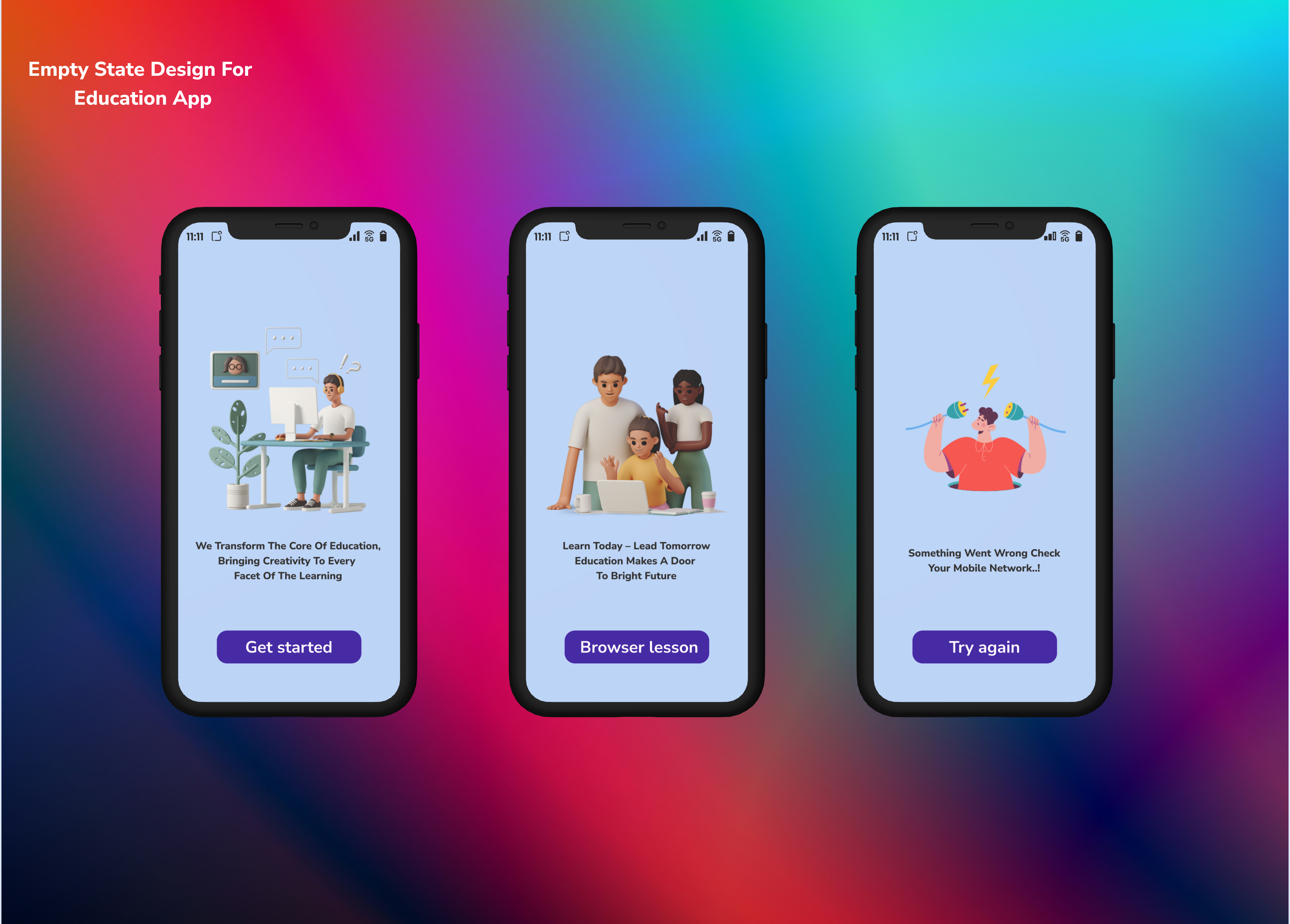
Onboarding screen empty
Education application error screen show
From brief
Topics
Share
Reviews
4 reviews
Hi Muthuselvan, nice work on the onboarding empty state! 🎨 The color scheme is appealing, and the screen clearly communicates an empty/error state. For improvements, consider making the illustrations consistent across screens, simplifying the microcopy to be more concise, and adding a clear CTA or navigation option so users know what to do next. Overall, a solid start! ✅
The colour scheme is appealing. However, as mentioned by other members, the style of illustrations should be consistent across screens.
The microcopy can be improved by making it concise and to the point. My suggestion would be to use the microcopy to indicate the screen's function and current state and include a call-to-action button to guide users further.
Another point I'd like to mention is to provide a Navigation menu or Back button in case the users want to explore other areas of the app.
Looking forward to more designs from you!
Nice display but the illustrations are inconsistent, and the copy may be complicated for users.
Color contrast is fine, but the illustrations you have used are inconsistent which will confuse users.
You might also like

Beautify Login page WCAG principles

edX Sign-Up Page Redesign

Design Prioritization Workshop

Notion Login Page Accessibility Optimization

Sanyahawa - Landing page Design

Healthy Dashboard
Content Strategy Courses

UX Writing

Common UX/UI Design Patterns & Flows


