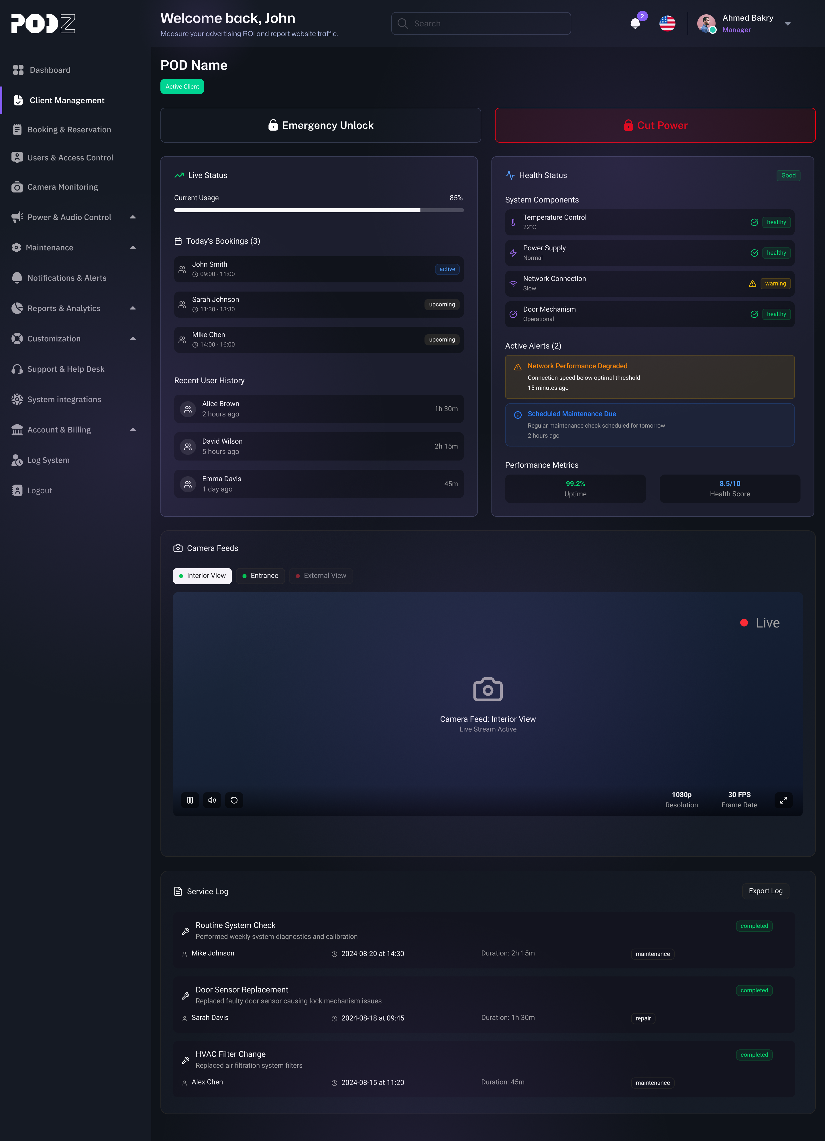
PODZ Project

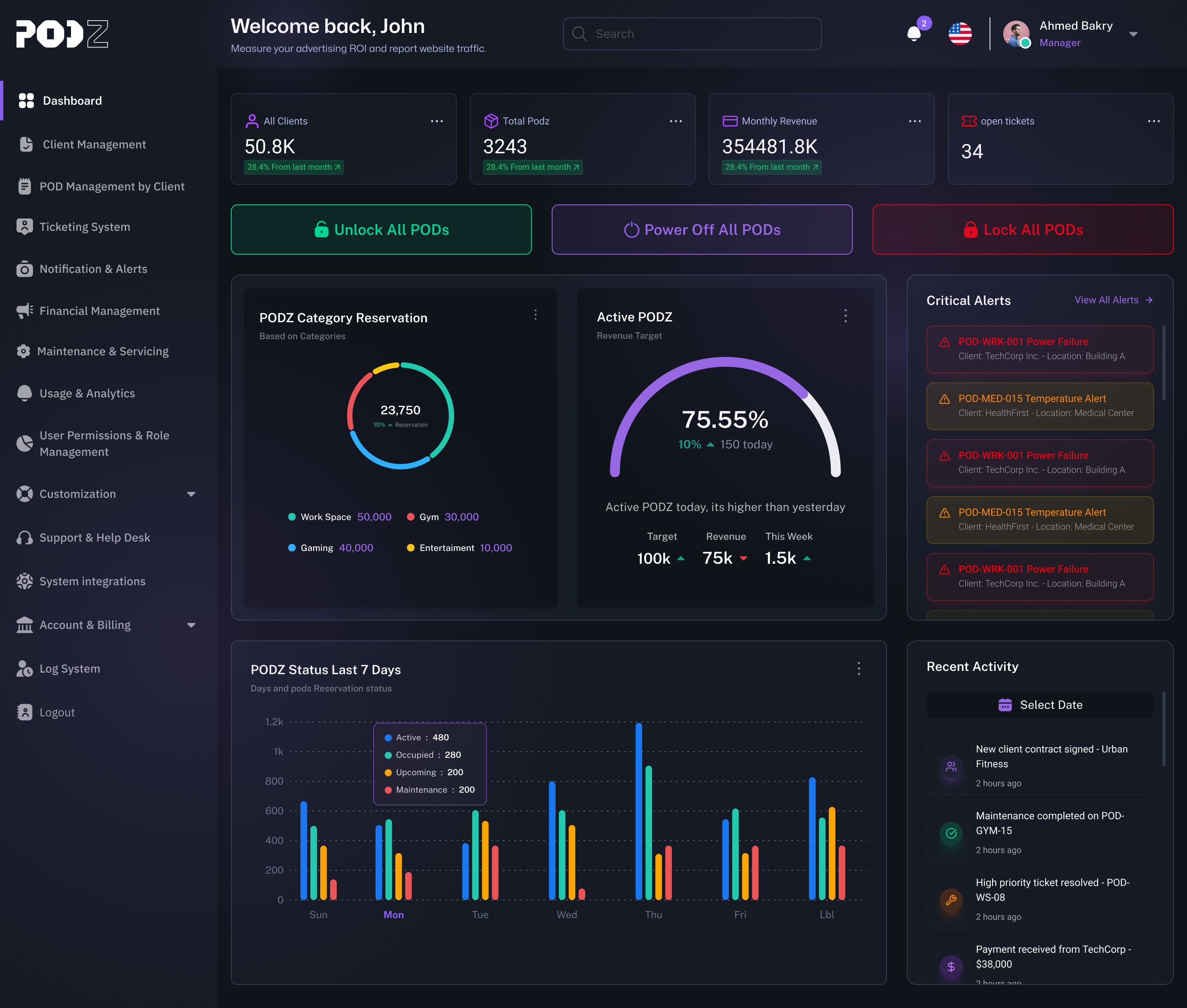
This project is a comprehensive SaaS (Software-as-a-Service) dashboard platform designed for companies that own, manage, or lease networks of smart digital advertising displays, referred to as PODs (Point-of-Display).

Reviews
6 reviews

Hi Assem
From a conceptual standpoint, Podz Project feels experience-driven rather than purely interface-driven. Anything centered around audio or podcast consumption needs to balance immersion with usability, and the direction here seems to lean toward clarity and focus.
What I appreciate in media-related concepts is when discovery doesn’t overwhelm the user. If your layout supports easy navigation between episodes, playlists, or recommendations without visual clutter, that shows good information hierarchy thinking. Audio products succeed when the UI fades into the background.
To strengthen it further, I’d explore differentiation. What makes Podz distinct in behavior or interaction compared to existing podcast platforms? Whether through smarter curation, contextual playback states, or unique engagement loops, sharpening that strategic edge would elevate it from clean execution to compelling product vision.

Great job, Assem! The idea and product presentation are well thought out and clear.

This is a really big and ambitious project, Assem. You can tell right away how much time and effort you put into it.
I really like the level of detail you explored, both in terms of the industry itself and the smaller services within it. It’s clear you went beyond surface level ideas and spent a lot of time thinking through the experience. Generating this many core screens also shows a lot of commitment and consistency.
What would help strengthen the project even more is a bit more context. I’d love to know whether this was built completely from scratch, what the main goal of the project was, and if there’s any intention to take it into development. I’m also curious how you decided which features to include and what guided you while shaping them.
From an accessibility point of view, the contrast across the app generally feels fine. The one thing I’d suggest double checking is the dark red color when it’s used for text. In some places it feels a bit hard to read.
Cheers!

Incredible project, Assem Khalifa — congratulations on the information hierarchy and the structure of both the website and the platform.
One important point to consider is the use of colors in the dashboard. Since the brand is strongly associated with dark mode and neon accents, this can sometimes make it harder for users to quickly identify the most relevant information. An interesting approach to test would be using more neutral, subdued colors for the main content, while reserving neon accents for notifications and activity highlights.

This looks really great! Very clean UI, clear information hierarchy, and it's very scannable.
I personally would have liked to see more of the process (any research you did, sketches / ideation, lofi wireframes, prototyping, design rationale, etc.) to consider it a polished case study.
Keep up the good work!

great
You might also like

Smartwatch Design for Messenger App


Bridge: UI/UX Rebrand of a Blockchain SCM Product


Pulse Music App - Light/Dark Mode


Monetization Strategy


Designing A Better Co-Working Experience Through CJM


Design a Settings Page for Mobile
Visual Design Courses

UX Design Foundations


Introduction to Figma

Design Terminology
