Onboarding Design for Travel App: Trivelo
The onboarding design for Trivelo, a travel app, is crafted to provide a seamless introduction to new users while highlighting the app's core features and benefits. The design utilizes engaging visuals, interactive elements, and concise messaging to make a strong first impression. Users are guided through a step-by-step process that introduces personalized trip recommendations, easy booking options, and destination discovery features. The goal is to quickly educate users on how Trivelo can simplify their travel planning while ensuring a delightful and intuitive experience right from the start.
Tools used
Topics
Share
Reviews
3 reviews
The overall design layout, color palette, and presentation. The visual flow is smooth, and the use of illustrations adds a soft, engaging touch to the composition, making the design feel approachable and friendly.
However, I would love to see more insight into your design process. Including elements such as research, mockups, or wireframes would strengthen the project by showing the journey from concept to final product. In your project description, it would be beneficial to explain who your target audience is, where the concept originated, and the reasoning behind choosing an illustrated style. Why did you feel this style was the best approach for this particular project?
While the designs themselves are aesthetically pleasing, understanding the process behind each design decision will provide more depth and context, allowing others to appreciate both the creative and strategic thinking involved.
The illustrations you’ve chosen really add a fun and unique touch to the design—great job on that!
I’d recommend looking at the text readability, though. It feels a bit small and thin, and the color contrast could be improved to make sure it’s easy to read. Increasing the font weight or adjusting the color might help a lot in making the text more legible and user-friendly.
Keep up the good work!
I love the design and the use of colours and illustrations! I would love to see more about the development of the design from research and sketches etc your process behind the development of the app. The primary and secondary buttons are also
distinguishable so great work!
You might also like
Accessible Signup Form
Auction
Entrant - Analytical Dashboard
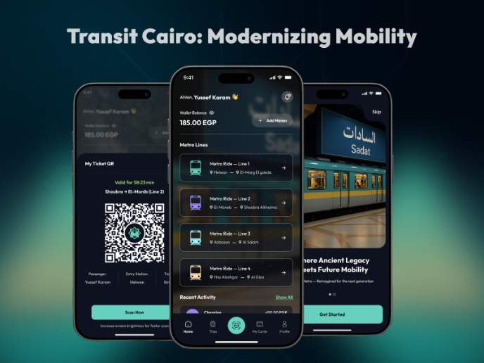
Transit Cairo — Digital Mobility Redefined
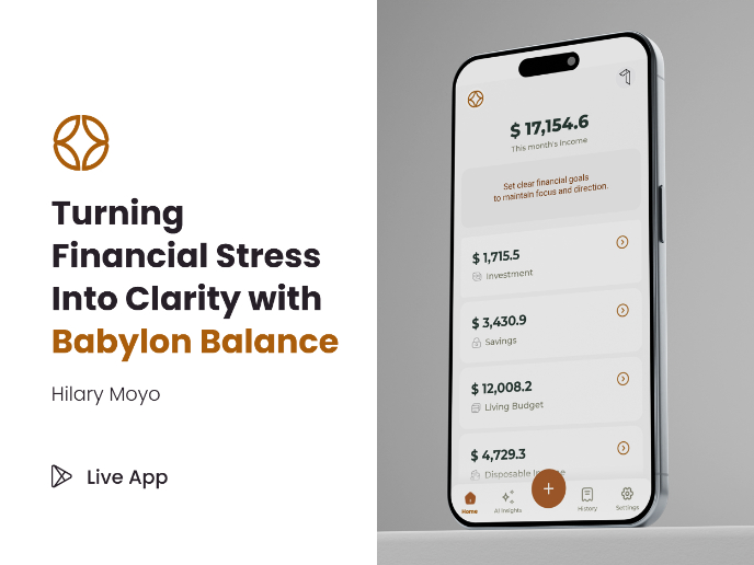
Babylon Balance - Designing Financial Clarity Through Constraint
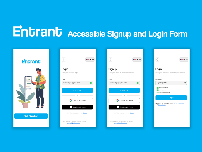
Entrant Accessible Signup and Login Forms
Popular Courses

UX Design Foundations

Introduction to Figma


