Notion Color System Update
This design brief explores a reimagined color system for Notion, staying true to its minimalist black-and-white interface while introducing subtle pops of color. Inspired by Notion’s use of primary hues in hand-drawn illustrations and marketing, the new system balances structure and personality. The palette is organized into primary, neutral, secondary, tertiary, and system colors to support both product UI and brand expression across light and dark modes.
Tools used
From brief
Topics
Share
Reviews
4 reviews
The Notion Color System Update case is short but effective. You clearly highlight the need for a scalable and consistent color system, which is a challenge in any growing design system. The before/after comparison is especially useful to show how you improved clarity and usability.
To make it stronger, consider adding:
- A quick note on how the update impacted accessibility (e.g., contrast ratios).
- One line on collaboration: did you work with devs, PMs, or other designers?
- Any tools you used (like Figma variables or tokens) that made the process smoother.
It’s a solid foundation that could become a standout systems case with just a little more story behind it. 🎨✅
It’s incredibly well done. The palette feels fresh and modern while still respecting Notion’s clean, minimal aesthetic. I especially appreciated how subtle the changes were. Nothing felt forced or loud, and yet the updated tones brought a sense of clarity, softness, and depth that elevated the overall experience.
Really impressive work.
keep it up
Lovely work Cahee — the palette feels clean and true to Notion, and if you add a quick note on accessibility or collaboration it’ll be even stronger, but overall it’s a really thoughtful and polished case!
You might also like

Accessible Signup & Login Experience — Brainex
Mobile Onboarding: Casa di Pasta

Accessible Signup Form
Auction
Entrant - Analytical Dashboard
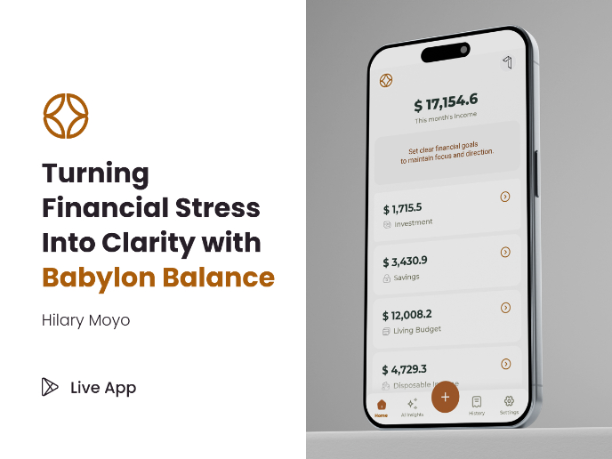
Babylon Balance - Designing Financial Clarity Through Constraint
Visual Design Courses

UX Design Foundations

Introduction to Figma


