Notion - Color System
Primary colors – Orange
Orange is often connected with energy, excitement, and creativity. This color has an effect that can boost spirits and spark motivation, helping people stay active and enthusiastic about completing tasks. It will encourage productivity in activities that need a burst of energy and fresh ideas.
Orange will be the main color for the look of this made-up productivity app. It will be used for active links, "call-to-action" buttons, and all the most important parts, to grab attention and encourage users to act.
Tools used
From brief
Topics
Share
Reviews
1 review
Great job!
Your color combinations feel harmonious and your explanation of the psychology behind the primary colors is great. It's clear you’ve considered how color influences mood and user perception.
Since you are building a color system that is to be used in a application I would recommend also including system colors accompanied by their tints and shades. This would be "Info", "Warning", "Error" and "Success" state colors.
You could also create a "Do's" and "Dont's" in terms of which colors should be used together and what they should be used for.
Other than that, great work!
You might also like
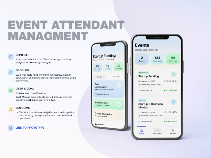
Events Managment App
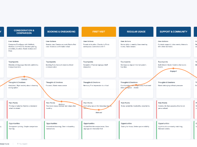
Customer Journey Map — Offsite Co-Working Experience
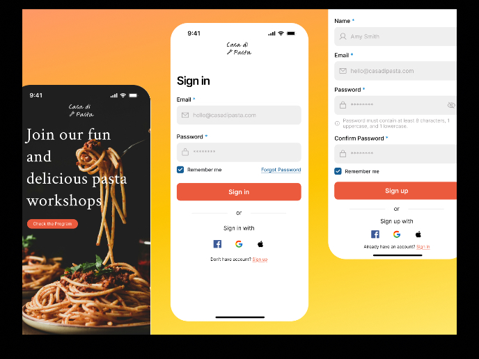
Mobile Onboarding: Casa di Pasta
Accessible Signup & Login Experience — Brainex
Accessible Signup Form

Accessible Signup Form
Visual Design Courses

UX Design Foundations

Introduction to Figma


