New Leaf - UI Design
The New Leaf application was designed to simplify booking professional lawn care services for busy individuals. A user-centric framework was developed using card sorting, followed by iterative prototyping with Adobe XD. Initial hand-drawn layouts were refined through user feedback, creating an interactive prototype showcasing intuitive workflows and seamless interactions. The project enhanced skills in UX design, prototyping, and user feedback integration, resulting in a polished, user-friendly solution available for exploration online.
Reviews
6 reviews
Great job! This project looks really good, I'd love to see more frames from this design.
If I were to change anything, I'd mainly consider making the log-in and sign-up buttons full-width. This is a very common practice on mobile and allows the user to select the buttons without having to aim with their finger at the center of the screen.
nice start, let's increase fundamental area in typography, color and layout.. more explore layout on design collection website like dribbble, awwards, or another.. Taste the process
Impressive work on this project! The design feels intuitive and user-friendly. You might consider making the login and sign-up buttons full-width for better accessibility on mobile devices. Adding a brief introduction or a preview feature could also help users get familiar with the app before committing. Great effort—looking forward to seeing more!
Great job! This project looks really good, I'd love to see more frames from this design.
If I were to change anything, I'd mainly consider making the log in and sign up buttons full width. This is a very common practice on mobile and allows the user to more easily select the buttons without having to aim with their finger to the center of the screen.
Besides that I suppose the heading could be a bit bigger and an intro / FAQ / onboarding could be added, so that the user can read more about the app before having to log in or register, alternatively an even better option is allowing the user to navigate the app without requiring an account, so that the user can get a feel for what is offered before making any kind of commitment.
Great job & keep it up!
Such a clean work!!!
Hey Jordan,
I really like the harmonious colors, they really come together nicely.
The contrast is neat and works for me.
I feel like the sizing could be more generous and I also lack som kind of legal or privacy links - but the design really speaks to me otherwise. The company logo and name should also be present. The heading could maybe use a more exciting font or typeface.
Good job!
You might also like
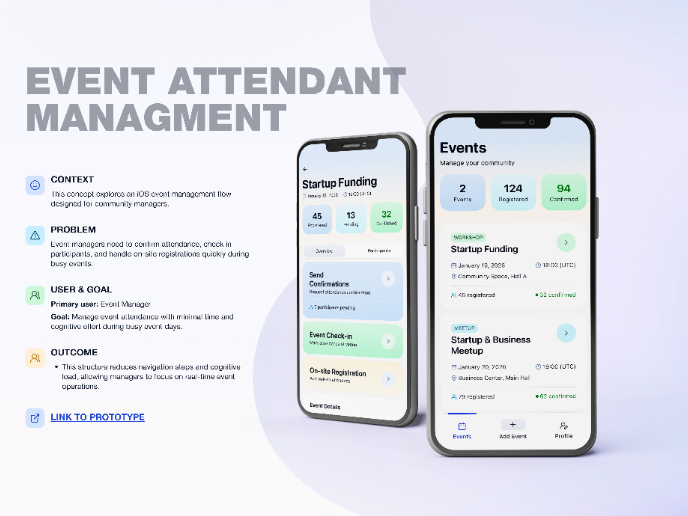
Events Managment App
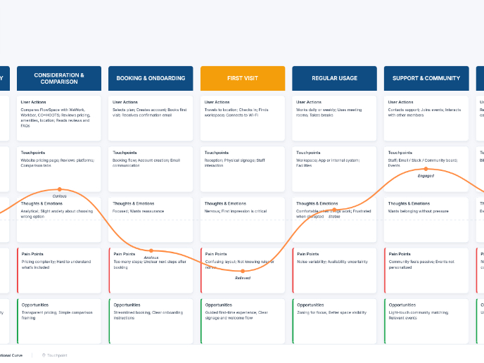
Customer Journey Map — Offsite Co-Working Experience
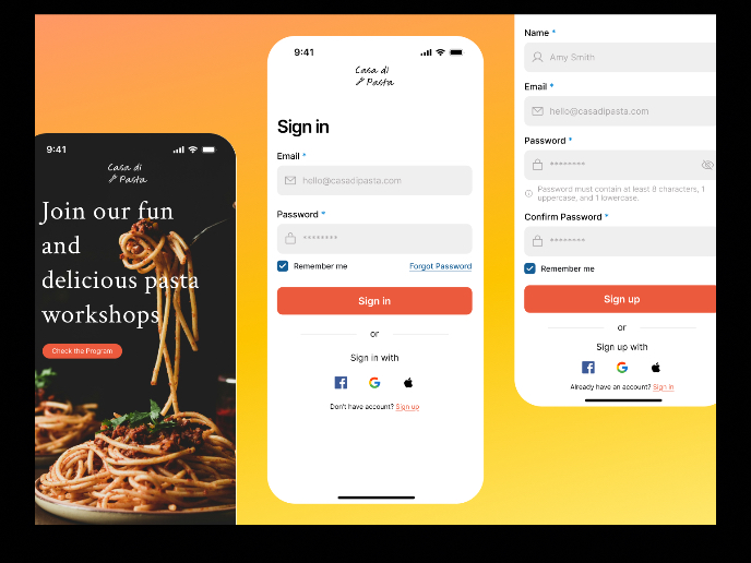
Mobile Onboarding: Casa di Pasta
Accessible Signup & Login Experience — Brainex
Accessible Signup Form
Accessible Signup Form
Popular Courses

Introduction to Figma

Design Composition

