Nav Bar - UP9

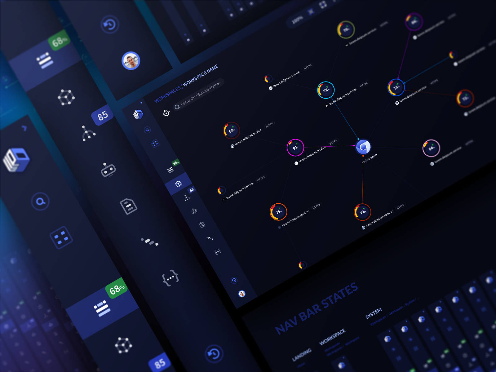
It was a lot of fun working on one of the many iterations to conceive the navigation bar for the UP9 app.

Reviews
4 reviews

Loved the concept! You've got a solid foundation here. To make it even more eye-catching, I think it would help to add more close-up visuals. This will really emphasize the details and draw people's attention to the finer points of your design.
Additionally, consider adding some explanatory notes. Share what led you to make certain decisions and the thought process behind them. This context can help others appreciate the depth and reasoning of your design choices. For instance, if you chose a specific color scheme or layout, explain why you felt it was the best fit for the concept.
Overall, it's a fantastic start, and with these tweaks, it will be even more compelling and engaging.

I love the overall design of your nav bar—it looks very neat and minimalistic, and the iconography is fantastic. However, it really needs a design rationale. What kind of app is this and who are its users? Providing more background and reasoning for your design choices would be helpful. The different states you’ve designed are nice, but what’s the default state? In the non-expanded state, why are there no icon labels? Do you feel the icons are self-explanatory enough for your users? If so, it would be great to explain how you came to that conclusion. Overall, excellent work, but adding these details will make your design even stronger.

Cool. Love the design!

Love the color combination and all the details used. Would have loved to see more of this project. Keep up the good work :)
You might also like

HealthFlow: Designing a Simple and Insightful Wellness Dashboard


Improving Dating App Onboarding: A/B Test Design

FORM Checkout Flow - Mobile


A/B Test for Hinge's Onboarding Flow


Accessibility Asse


The Fitness Growth Engine

Popular Courses

UX Design Foundations


Introduction to Figma

Design Terminology
