Lux Landing Page
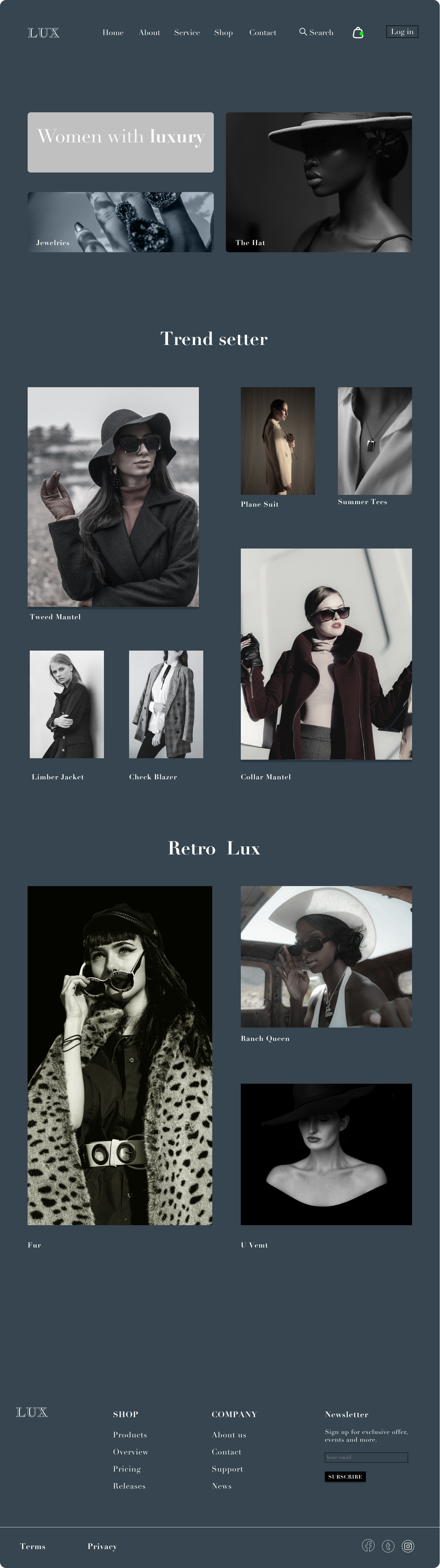
Lux is a Vintage modern luxurious brand.
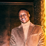
Our mission is to taggert every race and age bracket.
Breakdown:
Pallets:
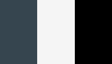
Charcoal Gray (#36454F), Soft White (#F5F5F5) and Pure black(#000000).
Charcoal Gray (#36454F): for a more dramatic and sophisticated appearance.
Soft White (#F5F5F5): for primary elements such as headers, call-to-action buttons, and important highlights to create a strong, elegant appearance.
Pure black(#000000): represents pure black. Black is a powerful, sophisticated, and elegant color often associated with luxury, exclusivity, and high fashion. Using black strategically on a luxury fashion website can create a dramatic and refined look.
Text and Typography:
Soft white (#F5F5F5) for text on dark backgrounds (e.g., black or charcoal gray) to ensure readability and contrast.
Headings and Titles: For sections with darker backgrounds, #F5F5F5 can be used for headings and titles to draw attention.
Accents:
Use Soft white (#F5F5F5) sparingly for accents, borders, or icons to add a touch of sleekness and luxury.
Didot: Known for its stylish and sophisticated appearance, often used in high fashion magazines.
Competitor:
Out of a number of many competitors Net A Porter as been slightly seen as a competitor.
Lux is precise with the numbers of displayed item on the Landing page, overwhelming costumers with lots of display could get them confused while they get stocked on the landing page without making a decision.
Most luxurious clients have an idea of what they are looking for. Lux Homepage takes you directly to your taste fitting clothes and accessories.
Tools used
From brief

Topics
Share
Reviews
2 reviews

The idea seems very nice and I think the overall aesthetic does convey luxury. A few notes for improvement:
- Some text elements (e.g. in the hero section) don't pass accessibility tests due to a lack of contrast.
- The font you used fits the logo and bigger titles very well, but it's not as readable when used in the menu or for body text within the page. In those cases, I'd consider using another font that matches well with the one you chose
- The log-in button design can be improved to make it look more like a button and more in line with the brand
- Since this is a shop's landing page, the main goal is to get the user interested so that they buy something. Instead of just showing the categories, think: how can you get them to click and look at products? I suggest looking at websites like Asos, Zalando, etc. for inspiration

The concept is promising, and the design exudes luxury, but refining the color palette and typography could enhance it further.
You might also like

Pulse — Music Streaming App with Accessible Light & Dark Mode


Islamic E-Learning Platfrom Dashboard

SiteScope - Progress Tracking App


Mobile Button System


FlexPay


CJM for Co-Working Space - WeWork

Content Strategy Courses

UX Writing


Common UX/UI Design Patterns & Flows


Building Content Design Systems
