Lumina- A platform for emerging talent

Lumina exists to dismantle systemic barriers in the arts by illuminating emerging talent through equitable access to exposure, mentorship, and funding, thereby turning creators’ dreams into sustainable careers.
Looking to help a platform for emerging talent where they can create without worrying about Algorithm and growth
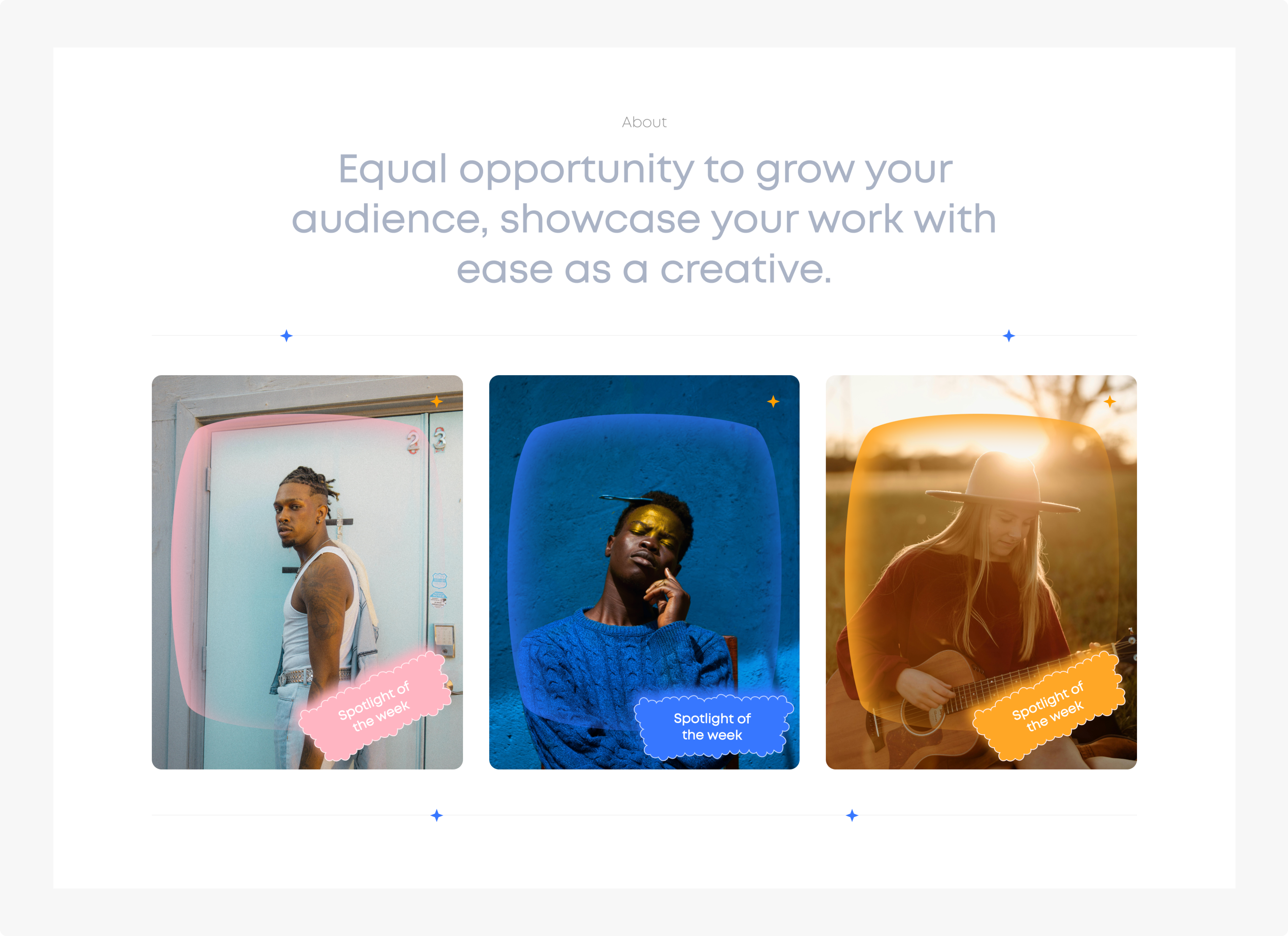
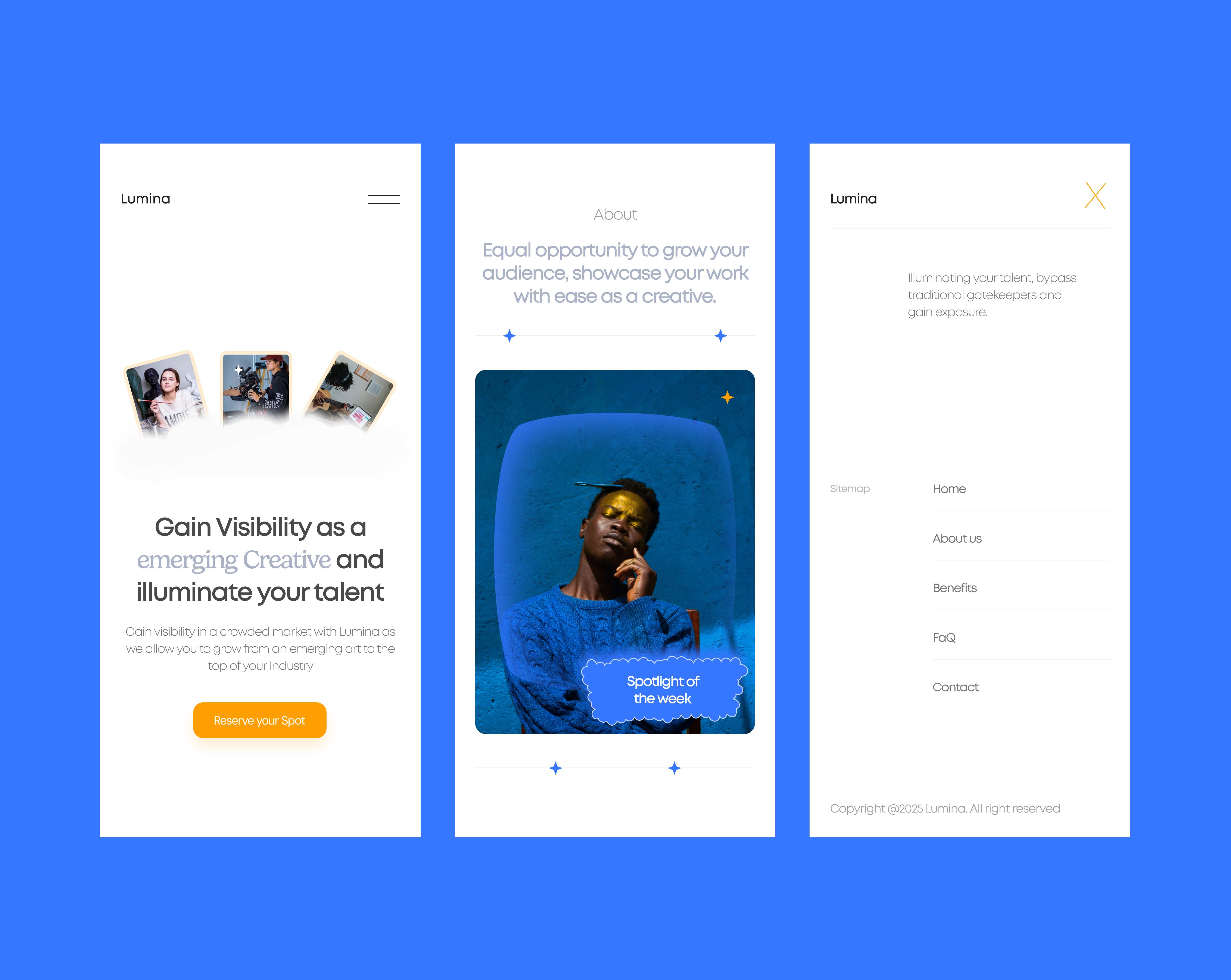
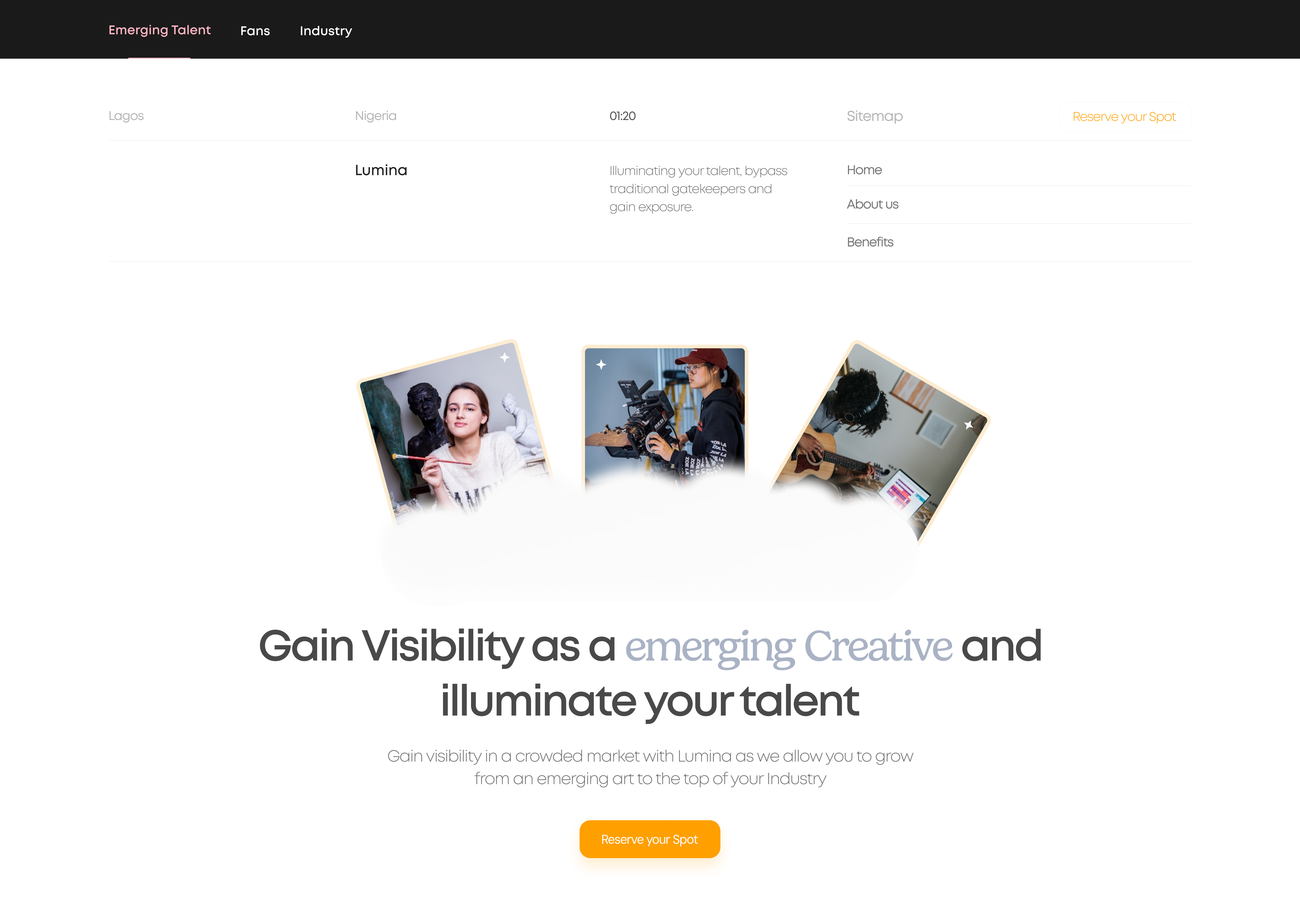
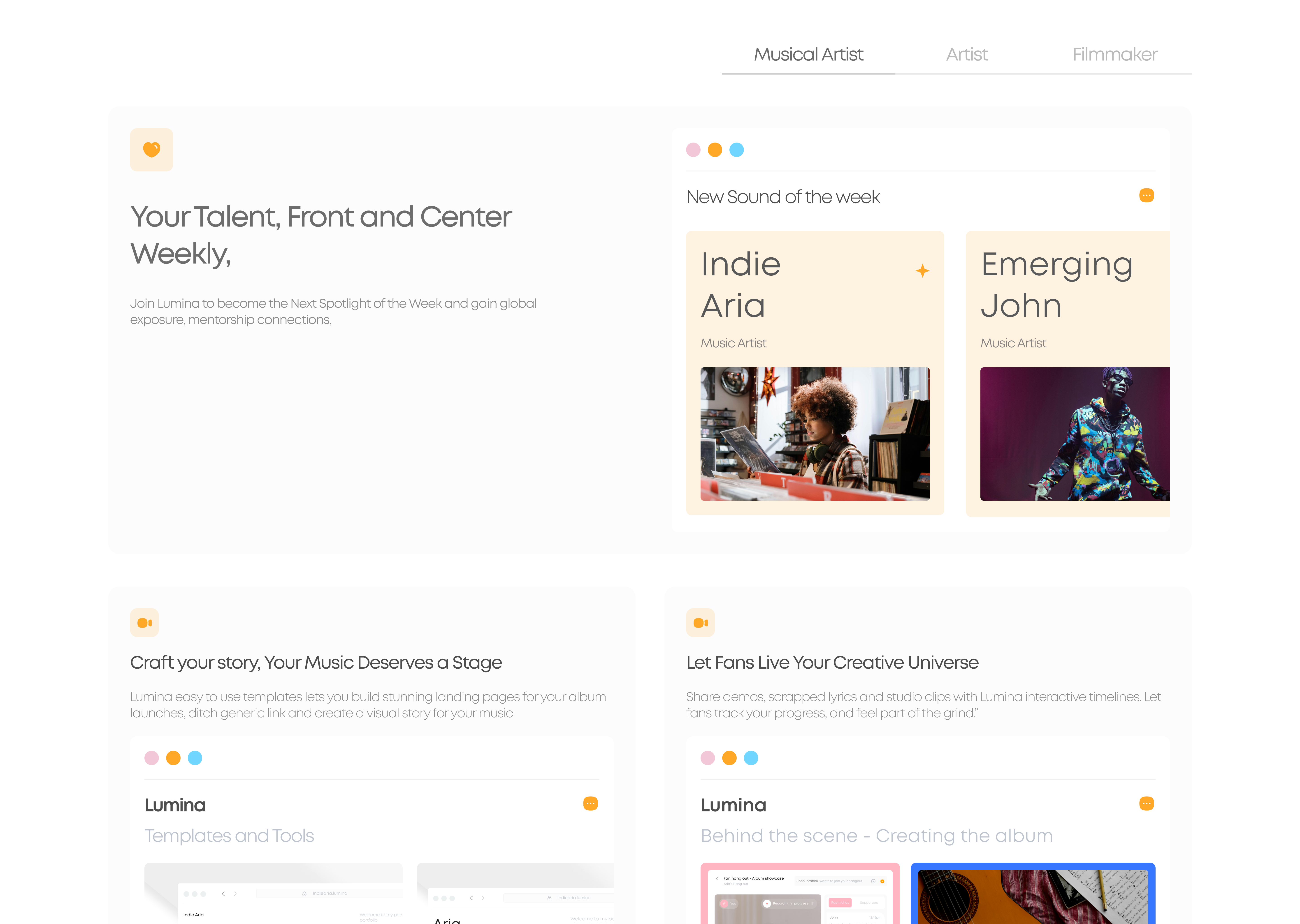
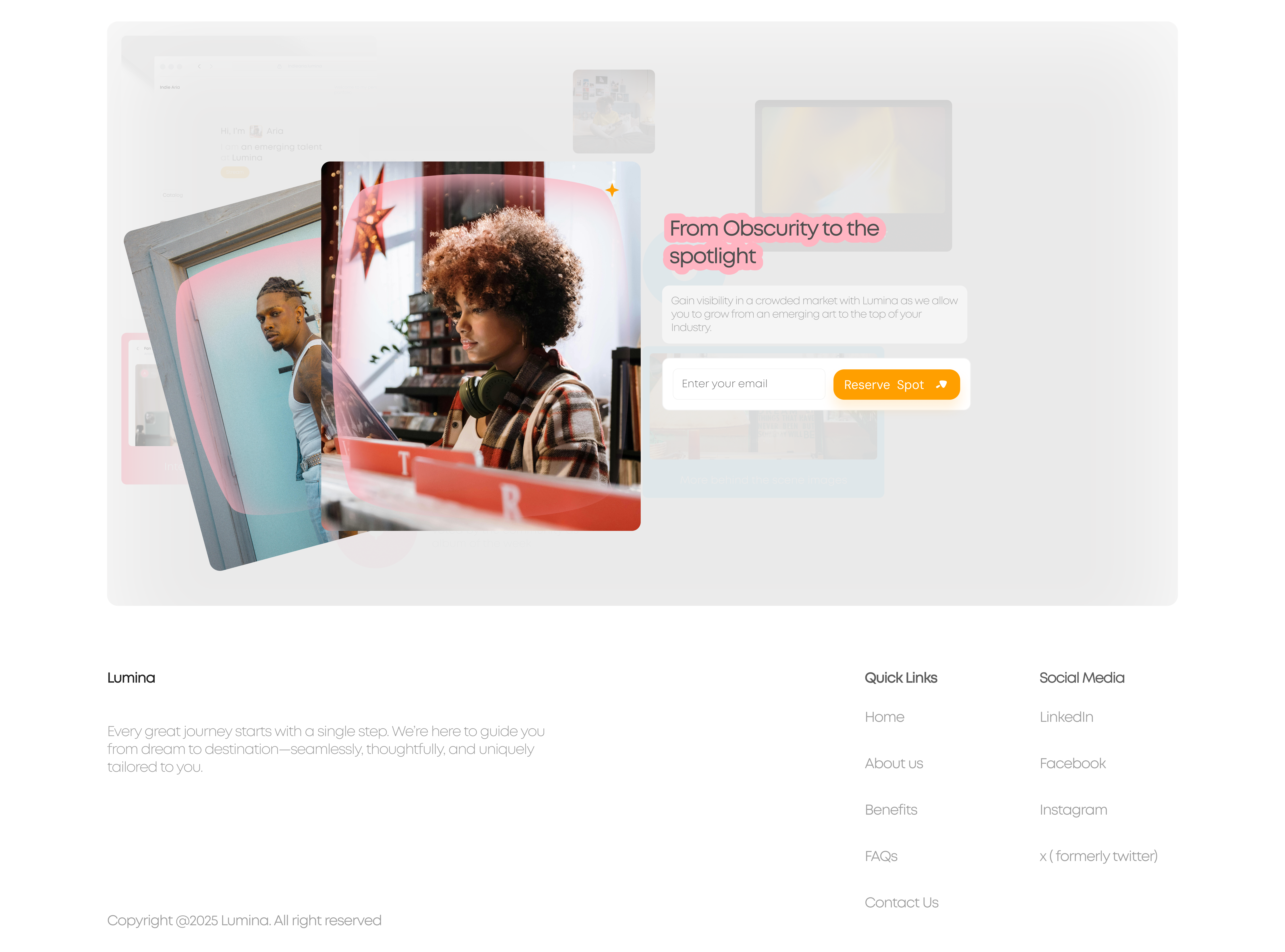
In this stage of design, I was looking to develop a waitlist/landing page to allow early testers to sign up for early testing. Here are some screenshots from the Figma file.
Reviews
2 reviews

Lumina has a clear and meaningful purpose, and the design reflects that well. The layout feels clean and easy to follow, which helps users feel comfortable.
To improve, consider adding emotional moments like a strong quote or a short success story to create more connection. The headers could be bolder to guide attention better. Try to keep CTAs like “Reserve your Spot” consistent across the page.
Adding small interactions like hover effects and transitions can bring more life to the experience. Also, moving the “Spotlight” labels to the corners will help showcase the images better. The footer feels a bit light—adding a background or final message can make the ending stronger.
Overall, a solid design with great potential. Just a few touches can make it even more engaging.

You’ve built something substantial. Very strong. The first impression of Lumina feels clean, welcoming, and professional. You’re thinking about the user’s emotions, not just the visuals. That’s not something you can fake. It shows real product thinking.
But if you want to reach the next level, here’s where you can push harder:
- Right now, the emotional flow feels flat. It starts calm and stays calm. You want the emotions to build as users scroll.
- → Add moments that shift the feeling — a bold quote, a success story, a stronger final message. Make users feel progress.
- Your typography is clean but a bit too safe. Headers and body text are too close in size.
- → Make headers bigger, bolder. Let users know instantly what matters most.
- CTAs like 'Reserve your Spot' are bright and visible, but the wording switches in places.
- → Lock it down to one exact phrase everywhere. Small things like this build big trust.
- Navigation looks clean but feels static.
- → Add hover effects, active states, and smooth transitions. Make it feel alive, not just look good.
- The 'Spotlight of the Week' labels are playful, but they sometimes block important parts of the photos.
- → Move them to the corners. Let the photos breathe. Respect the creators' work fully.
- Footer feels like an afterthought. It’s too light and empty to feel like a real ending.
- → Add a background shade or a thin divider. Maybe even a final emotional push — one last reason to believe in Lumina.
Right now, your design is clear and trustworthy.
Adding emotional pacing, sharper hierarchy, and small behavioral details will make it memorable.
You’re not far. You’re not.
You already think like a product designer who understands clarity, emotion, and consistency.
Now push into storytelling, feeling, and motion.
You have the foundation. You just need to sharpen the edges.
You might also like

Smartwatch Design for Messenger App


Bridge: UI/UX Rebrand of a Blockchain SCM Product


Pulse Music App - Light/Dark Mode


Monetization Strategy


Designing A Better Co-Working Experience Through CJM


Design a Settings Page for Mobile
Popular Courses

Introduction to Figma


3D Design Foundations

UX Design Foundations