Lulu Lemon - Push Notification Copy
Lululemon's brand is known for being friendly and relatable but not overly casual. I kept exclamation points to a minimum and copy straightforward but conversational.
How did I do?
Reviews
2 reviews
Great work, notifications copy is helpful and to the point. The length of both the headline and the body is just long enough to deliver the core message.
Hi Kelly, it looks like you put your time in ideation and re-thinking the copy.
However, without additional context and "before" screens it's hard to give a feedback. Please, update your case with more info, so everyone could give you a proper feedback.
/Yuliia
(edited)
Hi Yuliia, Lulu Lemon doesn't actually have push notifications, so I had to make these up. But I really love your feedback and will now work on re-thinking some current app's push copy. Would love your feedback for that when I post it - I'll keep you updated. Thanks!
Hi Kelly. I see, in this case very good initiative in improving the user experience!
I would suggested you to check out iOS and Android guidelines - it might be that they have a specific rules for the visual representation of the push notification.
The UX copy looks good - concise and clear message. However, I would suggested to make it even more straight to the point. Sometimes "friendliness" is redundant and keep up more valuable space as it is suppose to, especially for push notifications.
F.ex. "Thanks for your order" can become "Order is successful".
"We are processing your order. We'll let you know when it's shipped" can become "It will take 1-2 days to process your order. When order is shipped, you will receive the estimated date"
Please, check Chat GPT and Mobbin platform for more ideas and best practice.
Have a good day,
/Yuliia
9 Claps
Average 4.5 by 2 people
You might also like

Project
Islamic E-Learning Platfrom Dashboard
Visual Language & Color I wanted the interface to feel like a quiet room you'd actually want to sit in and study. The warm neutrals - off-wh

Project
Pulse — Music Streaming App with Accessible Light & Dark Mode
Platform & DeviceFor this project, I designed Pulse, a mobile music streaming application for iOS devices (using the provided mobile templat
Project
SiteScope - Progress Tracking App
🧩 Project OverviewThis project showcases the design of a mobile login and sign up experience for a construction progress tracking app. The

Project
Mobile Button System
As my first ever ux design attempt, I tried to go with a simplified approach with only a few button types and states. I kept the color palle

Project
FlexPay
The onboarding was designed to reduce financial anxiety, create a sense of instant reward, and encourage early action. Instead of overwhelmi

Project
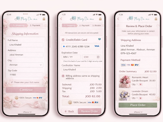
May.Da.Ma Candles & more
Content Strategy Courses

Course
UX Writing
Learn to write microcopy that communicates clearly and concisely to improve user experience, build trust, and boost conversions across digital products.

Course
Common UX/UI Design Patterns & Flows
Learn how to use tried and tested UX/UI design patterns and flows to solve recurring design problems faster and build interfaces that feel intuitive

Course
Building Content Design Systems
Master systematic approaches to creating consistent, reusable content across your entire product ecosystem


